| Image |
Comment |
| 10/03/2007 08:54:18 PM |
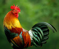
"Rooster" by noranekoComment: Coming to visit the originals from the Deja Vu III challenge:
I absolutely love the stunning colors seen on this Master of the Chicken Coop! The colors are bold and vibrant. Your PP did wonders with making the colors pop off the page. I also like how you caught the rooster in an interesting pose with it's head cocked to look behind him. Your photo is also sharp as a tack for we see all the lovely details from sheen on the end of his tail feather to some of the bumpy textures in the coxcomb (crest on his head. The square crop suits the bird well for it keeps the eye strongly focused on the body of the rooster. Well done. |
 Photographer found comment helpful. Photographer found comment helpful. |
| 10/03/2007 08:26:48 PM |
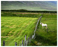
Greener Grass On The Other Sideby gsalComment: Love how you composed this shot for it is very interesting. The eye is drawn in first by the lovely greens in this land of green. It is then that our eye spots the single white horse that occupies the space. Love the title for that horse does look like she/he is contemplating leaping over the fence to get the greener grass. I also like how the fence acts as a leading line that serves to break up the image into two halves: the 'greener' side and the side with the horse in it. |
| Photographer found comment helpful. |
| 09/24/2007 10:36:01 AM |
Love by KonadorComment: I saw this many months ago and the visuals instantly captured my attention and imagination. You did a wonderful job in this composition. I love the deep red hue of the heart shadow that falls across the page. Your lighting here is wonderful for the color tone is crisp and clean white light that allows the red heart to really pop off the page. Sharpness and details of the book are in wonderful clarity allowing the viewer to read the words of the book. I found it interesting that you choose a book explaining scientific terms for the heart to be cast upon. To me this projects an idea of love defined in scientific or technical terms with specific relation to how the shadow is cast from that camera filter. It is both by luck and design that I reserved this to be my 1,000 comment after leaving comments for all entries into the Déjà vu III challenge. Thank you for being the inspiration behind a composition that has ‘haunted’ me for many months to get it right. Your tutorial on how you created this photo was instrumental in assisting me in my own offshoot composition spring to life. |
| Photographer found comment helpful. |
| 09/23/2007 08:07:19 PM |
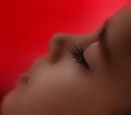
Do not disturbby DigiFotoBuddyComment: I love the soft focus that softens the look of the overall composition. It creates a soft, dreamy, sleepy mood especially since we see the child's face in slumber. Wow, he/she has lovely, long lashes and there is some wonderfully sharp details to the closed eyelid and lashes. The red background is a bold and vibrant color but because of the soft focus utilized throughout most of the composition (diffuser?) it is not a leap off the page in your eye bold but a vibrant & soft to the touch red. The original has a much closer focus on just the eye and the nose of the face. Your composition pulls back to give us a view of the full face. While not a full zoomed shot focusing primarily on one area of the face I do like that the full face is shown and that it lines up on the diagonal. The child's face divides the composition in half diagonally with the chin resting in the bottom left corner the viewer's eye travels up the face to the top of the forehead which peaks in the top right corner. That diagonal division adds visual interest to the composition. I also like the soft smooth look to the skin that differs from the original which showed the skin texture off in great detail. It further compliments the mood of a dreamy, sleepytime mood. |
| Photographer found comment helpful. |
| 09/23/2007 07:55:19 PM |
The Painter – ibkc – Selective Desaturationby BrianRComment: A good emulation off of the original. The difference is that this is a landscape scene that the painter paints rather than the seascape with boats scene. I like how you went with a paintbrush rather than a roller seen in the original. For me the paintbrush makes a stronger connection to the painter's of canvas paintings rather than a painter who does interiors or exteriors of walls. The landscape is a nice variation from the seaside scene we see in the original. However I think that the choice of scenery could have been more appealing visually. The foreground has scrub-brush bushes that in many areas have lost their foliage and are bare 'sticks'. Bushes with full greenery or various shades of greenery would add more visual appeal not to mention possibly add more color shades to the scene being painted. The colors of yellows on the rolling hillsides can be said to be 'fields of gold' but the color tones upon the water are an overly saturated blue almost purplish hue. Of course, the model and the photographer being the painter/creator of the picture I can almost hear you say "I'm the 'painter' of this composition and I can darn tootin' well choose the color tones I want to paint the scene:-)" That may be so, but for a greater audience appeal the colors should be not so oversaturated. I feel that they need to look more natural and richer in color tone variation for more visual appeal. |
| Photographer found comment helpful. |
| 09/23/2007 06:44:09 PM |
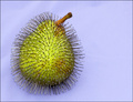
Prickly Pear Redux for Aimeethetoo, This Time in Blueby noranekoComment: One really has to really have a lot of patience and time to stick over a 100 pins into the pear. A really nice emulation of the original. Lighting is good with all elements evenly light and no harsh shadows cast that would distract the eye from the main subject. I do have a few suggestions on how you can improve the visual impact of your composition. First is to have found a pear with a more even skin color and tone. The patches of brown here & there on the pear is less appealing then one that has a even green skin tone for it looks fresh and healthy. Next the shape of the fruit can impact the appeal of the visual. A pear with the steam sticking straight up out of the top of the pear will not break up the smooth curvy shape of the pear as much as one sticking out a bit lopsided and not directly on the top. Lastly, while you have some detail here it could be much more sharper. Dare I say sharp as a pin? All the pins could be in sharp focus if you use a smaller aperture - a higher aperture of 8 or above can get you nice sharp details in the foreground & background of your image. Aimeethetoo lists her stats of her composition as aperture: 9.0, ISO: 200, Shutter: 1/400. Depending on your light source you may have to play with shutter speeds to see which yields the better exposed sharper shot. None-the-less a good shot but it just needs a little more work to get it into the stellar category. |
| Photographer found comment helpful. |
| 09/23/2007 06:32:05 PM |
Tribute to "Eyes" by librodoby jegerComment: O.K. instead of an exotic looking lady wrapped in a head scarf we get a parody with the blue-eyed young man:-) You might be getting dinged from the literalists which expect a close as possible emulation. I am just going to go on the pros and cons of the composition. You have the wonderfully bold and vibrant hue of orange which is akin to what colorful head covering we see adorn Librodo's models. The orange really pops nicely off of the black background. One con to the composition is lighting. The lighting seems to be off to the left hand side of the model. What happens is that it casts a very harsh unflattering shadow from the head covering onto the left hand side of the face. Also while the lighting illuminates the left hand portion of the face while the right fades to shadow in some spots on the nose and above the eyebrow the highlights are a tad blown such that there is no skin texture. Either have another light source shining on the right hand side of the model or have a light source shine full on with perhaps a thin cloth to defuse the harsh tone of the light on your model so that the light falls evenly on the model's face. Having even lighting will flatter the skin tones and illuminate the model more evenly. Lastly, this model has nice blue eyes, play them up. Since this is advanced editing you could do a selection on the eyes, then feather to avoid a hard edge, and then do some saturation adjustment along with Highlight/Midtone/Shadow to deepen the tones and add vibrancy to the color. Making those blue eyes pop would really add visual interest to your photo. |
| Photographer found comment helpful. |
| 09/23/2007 04:13:26 PM |
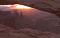
Sunrise on Washer Womanby jrtoddComment: I think you are trying to emulate Brent_Ward's ribbon winner (was a bit of a challenge to find:-) ). The canyon and rocks are indeed very beautiful and you captured some nice light rays but the richness in tones and colors are lost because your contrast is very flat. The colors and tones are very dull and I know that it must not have been like that while standing there. Those colors and contrasts really need to pop for the viewer to say "wow". It is an above average shot in the composition of elements it just needs that little extra boost in the contrasts and perhaps saturation. Adjusting the the Highlight/Midtones/Shadows and/or Contrast levels can really make the contrast between the light and dark areas pop more. A little bit more of a saturation adjustment might also benefit the photo to add a touch more vibrancy of color. None-the-less wonderful capture. |
| Photographer found comment helpful. |
| 09/23/2007 04:04:29 PM |
'Summer' by Ursulaby suemackComment: Love the bold and vibrant colors of those oranges in contrast to the cool sky blue of the sky. While the colors are bold and vibrant I think they could be a bit deeper and richer in hue - mayhap adding a bit of Contrast Adjustment would make those hues richer in color. You have some nice details in the texture of the flower. It looks like you might have had a challenge with the wind as that the bottom petal is folded over and looks soft in spots - like it was blown by the wind. It may seem small but since this is a macro all the fine elements of a small object begin to play a larger role/visual impact within the composition. That downturned petal detracts away from the flower because most of the petals are flowing in the opposite direction. The downturned petal is not the normal flow of the petals so it seems that it is against the grain. I would have liked all portions of the flower to be in sharper focus. Perhaps waiting for a lull in the wind so that it did not curl that bottom petal down and blur that portion would have made for a stronger composition. |
| Photographer found comment helpful. |
| 09/23/2007 03:55:18 PM |
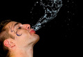
Fountain of Youthby spinnerComment: A fairly good emulation of the original. I bet it took a lot of tries just to get this fairly decent one. While this is a decent attempt, I do have a few suggestions on how to increase the visual appeal of your composition. First is while this is a good attempt in capturing the water spout it could be better if the water in flight was in much sharper detail. Dsa157 listed the stats of his ribbon winning photo as an aperture of f4, ISO of 400, and a slower shutter of 1/60 sec. The high ISO and slower shutter speed combined with the larger aperture of F4 was able to capture the details of that water spout with really nice clarity. Depending on your light source you may have to play with your settings. The high ISO will help you stop capture a fast action better than a low ISO setting with the drawback being it tends to increase the noise. The larger aperture setting of F4 or lower will let more light in so that the exposure is captured faster. The speed of the shutter I think may be the one area you will have to play with to find out which will give you the correct exposure of all the elements in your composition. I think the drawings on the side of the face add a bit of interest but they would be better if they were in sharp detail and not smeared. Lastly, I think it would greatly increase the visual impact if the main elements of the composition connected with the diagonal "lines" of the photo. By that I mean that that just the face occupies the bottom left corner while the water spray shooting out and spreads out to the top right of the photograph (as seen in the original) |
Home -
Challenges -
Community -
League -
Photos -
Cameras -
Lenses -
Learn -
Help -
Terms of Use -
Privacy -
Top ^
DPChallenge, and website content and design, Copyright © 2001-2026 Challenging Technologies, LLC.
All digital photo copyrights belong to the photographers and may not be used without permission.
Current Server Time: 06/19/2026 03:50:14 AM EDT.