| Image |
Comment |
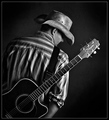
| 06/13/2008 07:53:22 PM |
A Loaded Six String on My Backby timfythetooComment: Love the title. You have some very strong compositional elements here. The guitar tilted at the diagonal of which the lines follow or nearly follow the opposite corners of the photo. The guitar slung on the back of this cowboy invokes the imagery of the 'singing' cowboy and the song "Home on the Range". The B&W compliments the photo nicely for it helps us focus on the details such as the textures in the hat and the contrasts in the shirt and neck of the guitar. Really nice B&W tones in this one - very dynamic and not flat. Lighting is for the most part wonderful. My only two critiques which would have bumped this into the 8 or higher range is that I wish the cowboy had turned just enough so we would get a true profile - one that would not have his chin hidden behind the shoulder. The second is that the lighting be just a bit more under the brim of the hat to see the eye and the nose in the profile. Having a stronger side profile of this cowboy I feel would heighten the visual interest. Bumping up to a 7. |
 Photographer found comment helpful. Photographer found comment helpful. |
| 06/13/2008 07:41:56 PM |
Well Worn, The Cowboy Way.by IvoryComment: Some really nice tone-mapping on this composition. I like that the western boots step up as the front and center main subject of this photo. The background also adds visual interest for we see a cow pasture (at least they look like cows more than horses to me) and some barns along with fence. That backdrop also shows the working environment of the main subject. Love the details and the highlights & shadows on the boots. The only critique I have is that the backdrop is tilted to the right whereas the boots are level this makes the world seem lop-sided and appear odd to the eye. Having the horizon level as well as the main subject would be less confusing to the eye. |
| Photographer found comment helpful. |
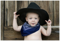
| 06/13/2008 07:35:32 PM |
Little Buckarooby pearlseyesComment: Great lighting and strong composition on this portrait of a young un'. This little cowboy is the main focus of this photo and the color, focus, lighting and details are excellent. Love the texture of the wood on the barn door that acts as the backdrop for this cowboy. |
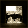
| 06/13/2008 04:21:30 PM |
At Day's End by LydiaComment: Love the silhouette of this cowboy and his best bud, the horse. Also the composition is very strong with a frame within a frame - the dark barn acts as a frame that shows us a moment frozen in time as the cowboy gets ready to saddle up and ride his horse. I also like how the background is in nice focus showing us the outside environment of trees and fence. We really get the sense of a ranch in a forested country. Another strong element in the photo composition is the choice to have that backdrop in sepia. That gives us the feel of not only a time of the ol' west but it also compliments the main subjects which are in silhouette. Color would just compete and draw the eyes attention away from the main subject and may or maynot add to the mood that you have captured of the ol' west. Good job. |
| Photographer found comment helpful. |
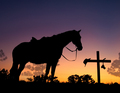
| 06/13/2008 04:07:21 PM |
Eternal Friendship by senor_kasperComment: Oh wow way to do a shot to honor a fellow DPCer! This has many elements of JawnyRico's blue ribbon The Cowboy - from the sunset hues to the silhouette of the main subject. But that is where it stops for now the horse is without his rider. His friend has passed. In memory of JawnyRico there is a cross bearing a cowboy hat and a camera (nice touch by the way) Lighting and compositional elements are very strong in this photo. The title also strengthens the emotions and mood of the picture. Very well done bumping up to 9. |
| Photographer found comment helpful. |
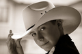
| 06/13/2008 04:00:52 PM |
White Hat in B&Wby jgriecoComment: Very nice tones and contrasts. Strong composition with the subject filling the frame and wonderfully lighted so that we can appreciate the details of this young cowboy (no deep shadows fall on the young man's face to obscure his features). Love the hand on the brim for it seems like he has turned his attention to us and is about to take off his hat and say "Howdy Mam'" or "Howdy partner". Very strong personable shot for your subject immediately greets us as we look at the photo. This one lassos an 8. |
| Photographer found comment helpful. |
| 06/09/2008 11:33:19 PM |
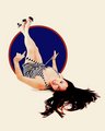
8x10-CRW_5330a_dpc.jpgby dsa157Comment: Holy cow! Had I not seen the original photograph I would have thought this to be a vector art pin-up. This definately exudes the mood and still of the old pin-up art. Since the 40's pin-up style was the mood and feel you were going for in the final edit I would say you have nailed it. The pose & dress (with bold contrasting striped dress) of the model was excellent and works well against the backdrop of the circle - and the ivory color to the background just gives a feel of aged, but well loved 'poster'/magazine/calendar paper. |
| Photographer found comment helpful. |
| 06/09/2008 11:24:23 PM |
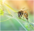
beeby yankoComment: Very nice final version here. I like how you cropped to bring us closer to your main subject. The original was good but bringing us closer to your main subject is a definate plus especially when you can see more details. In the close-up version we really get to see the details in the 'hairs' on the upper body of the bee and the eye (love that gleam that really comes out and is more noticable with the post-processing). I also love how the background colors have shifted to a more pastel hues - perfect complimentary backdrop for this bee for it invokes the idea of Spring with all the soft colors of that season in the mind of the viewer. Well done. |
| Photographer found comment helpful. |
| 06/09/2008 11:19:16 PM |
A L L U R Eby pawdrixComment: Finally getting back to the June before & after side challenge postings. Wonderful editing job you did here! You did an excellent job pulling out the details from the original. The tonal range on her skin is excellent with barely a shadow to hide the features of her face. Her eyes, especially the one on the right, is much more visible to look upon here in the final edit. Love the sepia for it adds a bit of an timeless classic feel to this portrait. |
| Photographer found comment helpful. |
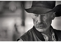
| 06/09/2008 11:11:00 PM |
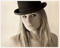
Dewy Matthews - Cowboyby IvoComment: Fabulous dynamic tonal range -B&W tones really showcase this cowboy. Dewy's face is illuminated wonderfully (no shadows under the brim of the hat). We see all the features and years of experience not just upon his face but in the look in his eyes. Great focus too. Main subject is showcased in sharp detail while the background is blurred. There may be some action going on in the backdrop as that we can see movement (ranch or rodeo as that I think I see a fence?) but that does not in any way distract our attention away from the main subject. Excellent capture. |
| Photographer found comment helpful. |
Home -
Challenges -
Community -
League -
Photos -
Cameras -
Lenses -
Learn -
Help -
Terms of Use -
Privacy -
Top ^
DPChallenge, and website content and design, Copyright © 2001-2026 Challenging Technologies, LLC.
All digital photo copyrights belong to the photographers and may not be used without permission.
Current Server Time: 06/20/2026 01:35:46 PM EDT.