| Image |
Comment |
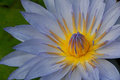
| 03/11/2009 06:32:16 PM |
Water Princessby k9logicComment: Really beautiful floral image. Love the details we see in the inner portion and the texture/veins I see in the radiating petals. Colors are wonderful too...the gold hue is vibrant and a deep rich color. But because it is the soft lavenders on the petals themselves look juuuusssst a *tad* washed out. Tis odd because the purple/lavenders in the center portion of the flower are a lively vibrant color...perhaps tis because they have more pigment. I do wonder if just a slight boost in saturation levels would make it stand out a bit more. Nonetheless a beautiful flower shot. |
 Photographer found comment helpful. Photographer found comment helpful. |
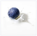
| 03/11/2009 06:27:29 PM |
Blueberry Splash Reduxby h2Comment: Wonderful colors and GREAT details in this well timed capture! Love that we can see some details on the blueberry - some interesting patterns and variations of colors on the surface. Great timing on capturing is as it makes a splash in the milk - most definitely requires a great amount of patience so hats off to you on that factor. I also love the colors - the pristine white of the milk really showcases the blue of this small fruit. |
| Photographer found comment helpful. |
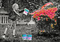
| 03/11/2009 05:10:11 PM |
I'm Ready for Spring! Are you?by HeiSchComment: Oh this is absolutely clever and well presented!!!! The attention to detail is something that also makes this composition enjoyable to look upon. *LOVE* the expression on the child as he joyfully and with much glee tosses the color on the bushes. I like how the 'cans of paint' are Scotts brand...a brand of turf and plant feed. I guess they have now gone into paint colors now;-) And the paint can colors are labeled with the season and the color too! The black and white treatment is great for you have a nice dynamic range of tones. |
| Photographer found comment helpful. |
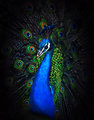
| 03/11/2009 05:04:59 PM |
Proudby SJCarterComment: Absolutely stunning colors in this capture of this proud and bold peacock! Love those rich sapphire blues that play well with those sparkling emerald greens. Yes, I am using gem colors to describe the adornment of this bird because it was a symbol of royalty so why not have it's colors reflect that:-) I like how you have the surroundings a dark color/black so that these colors can really pop visually of the page. My only critique is that the tail feathers and the smaller emerald green feathers could be a tad more sharper to show more of the lovely detail and texture of this majestic bird. |
| Photographer found comment helpful. |
| 03/11/2009 04:59:23 PM |
One and lonely.by anferhComment: Simple and elegantly minimalistic. The lone cow stands there in the snowstorm. The bleak, stark surroundings show it is indeed very lonely but the whiteout also speaks of freezing cold. The cow seems to look at us/me/you and wonder what the heck is he/she doing out here?!?!?!:-) That lone fence post that we see here also seems to be 'signaling' the number "one". One cow all alone and one lone fence post with no others in sight. |
| Photographer found comment helpful. |
| 03/11/2009 04:52:56 PM |
Don't Rushby RompyComment: Good eye! Title fits what we see perfectly in the visual. The billboard sign that says "Rush" paired up with the crosswalk sign of "Stop, Don't Walk" was a great catch. Love how the composition is angled because everything is turned at some angle or such that it gives the sense of motion. The One Way sign points one direction, the Rush (Limbaugh) sign pointed in another direction and then smack dap in the middle is the sign for you to stop. Conflicting messages all around if not for the majority of the image utilizing the B&W. The red of the hand is bold, vibrant and really STANDS out from all the other directions seen in this composition. The black and white tones are also dynamic with excellent contrasts in light & dark. |
| Photographer found comment helpful. |
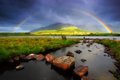
| 03/11/2009 04:05:27 PM |
Rainbow at Inaghby seanmcfotoComment: Very lovely! Love how you captured this full rainbow that arcs over the landscape. The composition is great because you have it composed such that the bow seems to enclose that middle mountain range I see here. I also like how you included the stones that cut across the water in the forground. They are like stepping stones that beckon one to skip across them to get closet to the rainbow. Also the way the rocks are arranged is in a slight curved arc that subtly mimics the arc of the rainbow - a mirroring of patterns that adds visual interest to the overall scene. The colors of the rainbow are very lovely and vibrant, but the greens of the landscape seem a tad too oversaturated. Mayhap you boosted the color/saturation levels? If so maybe you could tone down just the greens a tad to appear less oversaturated. Other than than a lovely scene and great capture. |
| Photographer found comment helpful. |
| 03/11/2009 03:59:00 PM |
Heads'lsby codyslettenComment: Let the winds gather in your sails and take ya to some beautiful locals with golden beaches and lush tropical vegetation. And if you have a fear of heights just don't look down from the crow's nest:-) Look forward. Glad I can enjoy the view from the safety of the ground. I like how the white of the sails contrast wonderfully off of the deep, deep blues of the ocean waters. Tis a shame though that the same breeze that was billowing the four bottom sails also blew the top one into the scene that can be seen in the lower bottom left corner. The composition improves even more had that not been there because then it becomes a study in appealing shapes and colors as the billowing triangles cut across the cobalt blue waters. |
| Photographer found comment helpful. |
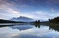
| 03/11/2009 03:51:41 PM |
Silent Stillby RodertComment: You have some lovely soft pastel colors that blanket the sky and are reflected in the lake. It makes me think of an lazy relaxed breezy day fishing by the lakeshore. You also have that wonderful mountain range in the backdrop that adds great visual interest to the scene. My only real critique is that while I love the soft pastel colors I really think that the mountains themselves could use more contrast so that they are really eyepoping as this bold & dark majestic towers to the sky. You could achieve that by bumping up the contrast and the saturation levels but then you would loose those wonderful pastel colors/soft hues that appear everywhere else. The only way I see to accomplish making the mountains stand out more is to select just them feather to avoid sharp edges and then bump up contrast and saturation levels. Not to much though just a tad to give more of a contrast with it's surroundings. |
| Photographer found comment helpful. |
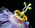
| 03/11/2009 01:36:29 PM |
Fleeting Passionby dswannComment: You have captured some really beautiful details and stunning colors seen on this passion flower. I have seen these flowers up close and they really are exotic and beautiful to look upon. I like how you composed the shot such that the center portion of the flower is at the diagonal; seeming rising up and touching the top right corner. That adds alot of visual interest to this floral shot. The colors really pop visually off of that dark background. |
| Photographer found comment helpful. |
Home -
Challenges -
Community -
League -
Photos -
Cameras -
Lenses -
Learn -
Help -
Terms of Use -
Privacy -
Top ^
DPChallenge, and website content and design, Copyright © 2001-2026 Challenging Technologies, LLC.
All digital photo copyrights belong to the photographers and may not be used without permission.
Current Server Time: 06/20/2026 06:35:42 PM EDT.