| Image |
Comment |
| 11/21/2009 05:16:04 PM |
Never Forgottenby franktheyankComment: A composition that shows the price of freedom - those who served, fought and died to preserve the ideals of freedom and what this nation stands for. Yes, their sacrifice is a part of the American landscape on several levels. Lighting is good as is the colors of this shot. However the visual appeal could have been greatly improved had you made the utmost of leading lines and your vanishing point. Show us the lines of graves that span a great distance. Show us - make us understand how many have laid down their lives for what we enjoy today. Pull back a little such that you can have one tombstone that we can read that dominates the bottom left hand corner but then compose the shot that the line it begins ends at the top right corner. The way the eye travels the leading lines near and far getting a sense of distance - of great sacrifice. My other suggestion is that if you have a camera with the capabilities of swiveling the viewfinder down such that you can hold the camera above you to shoot down you might want to take advantage of it - and even if not sometimes just trying it from a new angle might result in the capture you wanted or a happy accident. The full on straight shot may not give you the depth you want to show us. Taking the shot from a slightly higher angle with the leading lines & vanishing point in mind would, I feel, show more rows of graves to fill the frame. Further giving the viewer the scope and impact of how many lives made the sacrifice. |
 Photographer found comment helpful. Photographer found comment helpful. |
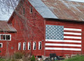
| 11/21/2009 04:57:38 PM |
Barn Sidingby patchesComment: Nice find on this barn:-) The composition invokes the idea of farmers and crops - an occupation that feed the nation. Old style farming is going the way of pioneer days with the advances of technology and just fewer individuals going into it. It is part of a vanishing America, but definitely part of the American historical landscape. The large painted flag of the U.S. on the side just further cements that idea and imagery. The composition has some weakness' but has potential to move into an above average shot showing a slice of Americana. The first thing I would recommend is not crop your subject too much - like avoiding cutting heads off in the family portrait pull back so that we can see the full shape of the barn. I know you wanted to call most of the eye's attention to the U.S. flag painted on the barn but you are chopping out the other half that makes this an image of Americana. Show us the barn in full - not too far back but just enough that the whole fills the frame with mayhap a bit of sky. The second thing that detracts from the overall visual appeal of the image is those tangle of bare branches the fall across the front of the barn like deep scratches marring the surface of a painting. Generally if it cannot be removed then see how it looks at part of the composition - maybe it can add to it. I think pulling back to include the tree in your composition with help add to the rural feel of this slice of Americana. Paint it into the scene instead of trying to chop the tree out and only succeeding in removing a portion of it. |
| Photographer found comment helpful. |
| 11/21/2009 04:39:47 PM |
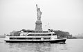
Liberty boatby abrakatebraComment: This brings to mind the ideals that 'America: the Land of Opportunity' and that so many immigrants have come here through the ages (and still do) seeking the American Dream and a better life. The deck is full with people not just seeking a glimpse of Lady Liberty but also to set foot on the shores that provide them with 'life, liberty and the pursuit of happiness'. I find it very interesting that you composed your shot to have Lady Liberty appear that she is the center of the boat - that she is part of the boat that is bringing the people to shore. She is the 'mast' that supports the 'sails' that draws/propels this boat and the people to a better future. I believe that was the intention in your framing rather than waiting for the boat to appear off to the side:-) Now the critiques. It is a good and interesting shot that has potential. Mother Nature never co-operates when you want her too! The blown out -whitness- of the sky looks harsh and bleak - not something you want when invoking ideals of hope and better futures. I don't know if you would have had the opportunity to wait till a better sky was available but a nice cloudy or whispy sky would certainly improve the visual appeal of the photo. The tones/contrasts on the boat are nice and dynamic but there could be a tad more contrast on Lady Liberty herself - again, I think the root of the problem is the great stark whiteness of the sky that great expanse of 'white' is not broken up with 'textural' clouds and as such gives the photo a washed out appearance. |
| 11/20/2009 01:16:17 PM |
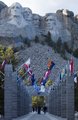
Their Spirits Live Onby adamwebComment: Nice shot of Mt. Rushmore:-) I love the leading lines with the pathway of flags that leads the eye right up to the main subject. While a good shot there are some things that could be done to move it into a above average shot. This scene has a lot of potential. First, I noticed the angle of the flags would match rather nicely with the downward triangular slope of the loose rocks. Shot at a lower angle looking up those flags could then act at the pointed up "V" shape that outlines that loose rock slope & the bottom half of the composition *AND* act as a leading line/up arrow that subtley points up at the presidential monument. Shooting from a lower angle and better use of the leading lines presentation to complement the scene would also take focus off the bland white featureless sky. Lastly, I think that the shot could do with just a touch more contrast (bump it up a little in PS) to define the areas of light and dark on the monument itself; not too much just a little more to make it pop a little more such that it does not appear too washed out compared to the bottom half of the composition. |
| 11/20/2009 09:27:11 AM |
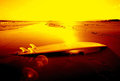
Endless summer Australiaby John WhiteComment: Endless Summer...and to catch the perfect wave:-) Seen parts of the film but not all and I see the strong connection you are establishing here in the shot. The colors are really bold and vibrant reds, oranges and yellows. While the colors are eye-catching and appealing you want to be careful not to have too much of it. While it is really cool how the fins on the surboard appear to be superheated hot (perhaps a subtle referance to how bloody hot it is down under;-) ) the sky being a flat tone of pure yellow is not as appealing. Perhaps just adjusting the composition to just include the ocean waves, the surfboard and the sand with a little bit of the sky would have been more visually appealing ( love the appealing fade in's of the colors from yellow to orange to reds and then the dark blacks as the eye travels from the background to the foreground). The other thing that prevents this photo from moving up into the extraordinary category is the blown out highlights on the surfboard (some of the lines are lost on the curve as the sun plays upon the top middle of the board) and the sunspots. The sunspots and those blown highlights are distractions and blemishes that prevent the shot from moving to good to great. Possibly changing the aperature or angle would have removed the problem but the strong sun might still cause havoc. Not sure what camera you might have but some camera's come with a lens hood attachment that stops the flares from showing up in your shot ... if you don't have it sometimes (certainly not all for it depends on angle) just simply putting your hand over the top of the lens (like when you put your hand up to your forehead to block out the sun or look off into the horizon) might do the trick. |
| Photographer found comment helpful. |
| 11/20/2009 09:09:03 AM |
Of Courage, Peace and Quiet Strengthby jegerComment: The red hue of this maple leaf is a splash of bold and eye-catching hue that leaps off the dark background. The visual was obvious that this is a representation of Canada. But I was curious about the title...so I googled it:-) I found that it is part of the lyrics in a song about Canada.
Oh, Maple Leaf, around the world, You speak as you rise high above,
Of courage, peace and quiet strength,
Of the Canada I love.
Understanding that now adds more poetic strength to the message of the photograph. Love the details that we can see here for this one bold and brilliant red leaf stands out from all the other leaves that are brown and under the surface of the water. This one leaf - this spirit of the country - stands strong. One small critique is that I wish the 'arms' of the leaf in the bottom right were in sharper focus like the rest of the maple leaf. Still an above average shot and lovely photograph. |
| Photographer found comment helpful. |
| 11/20/2009 08:54:10 AM |
The Maestroby robm001Comment: Nice capture of the enthusiastic directing of this musical conductor:-) Lighting is good. Focus is just a tad soft on the face and raised hand. Aside from that wonderfully exuberant expression on the gentleman we see the U.S. flag held promeniently in his lower hand. I could almost hazard a guess that the orchestra is playing Star Spangled Banner:-) The shot is good but I only see what might be the music rather than 'hear' it. It is tough to capture sound but you *can* give one a sense of the music. You are halfway there with the conductor, but where are some of the musicians he is conducting? I feel that if you showed us some of the musicians playing instruments in the backdrop or off to the side it would have a much greater impact with *showing* us the music. It doesn't have to be the whole orchestra for you don't want to lose whom the main subject is to the crowd. It could just be the musicians in the forefront...just enough so that you show us whom he is conducting and the action of the musicians playing their instruments. |
| Photographer found comment helpful. |
| 11/20/2009 08:41:22 AM |
Educationby Vic_87Comment: One of the Founding Father's of the nation (George Washington) & school desks speaks of USA being a land of opportunity and learning. Having read quite a few books (from my bookclub) about life in other nations and how little opportunities there are for woman and young girls I appreciate what I have in the U.S. even more. Now your picture conveys the message of open education for all and a land of opportunity...but I have a sneaking feeling that not many are stopping to *really* look at what you are trying to present/say here. The photo is good but I see so much more potential for this. The biggest area that I would recommend to improve the appeal of the image is better use of leading lines and DOF (depth of field). The shot is from a almost straight on angle. If you moved slightly to the left and angled the shot at a 35-45 degree angle to the painting of George Washington I believe you would get the outside line of those desks leading straight up to the bottom corner of the painting. Now depth of field can be best accomplished by a higher aperature setting (usually 8 or better) where the foreground and background are in sharp focus. That means that your shutter speed is going to be slower and thus you will need a steady hand or surface to avoid camera shake. Not easy in low light/indoor conditions but you have the desks there to set the camera on to keep it immovable while the shutter is open and taking the shot. Having the the desk in the bottom left corner foreground in sharp focus will act as the beginning 'path' for the eye to travel on as the line of desks leads the eye to the painting. Lighting is good in this shot so illumination is spot on. One last think to note is be careful with your horizon. The lopsided tilt of the door to the straight angles of the photo itself gives the world a tilted horizon that 'disorients' the viewer. |
| Photographer found comment helpful. |
| 11/18/2009 11:19:08 AM |
Vodka, the Russian Spiritby BudyaComment: I love the vibrant 'ice' blue tones in this shot. Very catching and attractive colors and the composition is simple and clean. Lighting is spot on. While the technicals of the shot are really great, the composition relies a little to heavily on the title to make a connection to a country. Without a recognizable liquor bottle or even a small flag to identify the country WITHIN the shot there is no way to identify this spirit with the country. While this is very definately on the high end of an above average shot that attention to detail WITHIN the shot (a small flag, a map of russia, or a liquor bottle with russia's name on it) to define the main subject would have placed it in the exceptional category (8-10 range). |
| Photographer found comment helpful. |
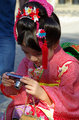
| 11/18/2009 10:43:29 AM |
Kimonos (and Cameras)by Pug-HComment: The colors on this candid are lovely. The kimono as a symbol of japanese culture comes across with the dress this little girl is adorned in. It also *seems* to brush/touch upon the stereotype of the Japanese tourist always taking pictures with the camera. I say seems because that has been a stereotype but I think it is much more interesting to note that it is human spirit to want to capture the beauty or feeling of an event that they experience. That is what I see in this young girl as she stops to look at the picture she has just taken. This candid tells me a story of this young girl at a local cultural fair that is 'documenting' her day spent there. But there is one thing lacking - what is the emotions: sad, happy, wistful, etc. The biggest weakness is that we don't get to see her eyes and face much. The eyes and facial expression could tell us so many things including emotion. I would have liked to have seen more of her face and eye expressions. I know she is absorbed in the camera and her gaze in downwards. It would have been a difficult but perhaps not impossible shot if this was taken at an angle that was more lower to the ground looking up rather than it being a straight & level shot as it appears to be. As that this appears to be a candid picture it might have been fortuitous to take several more shots with the young girl looking up and showing us her facial expressions as she looks around or searches for next picture to capture:-) |
| Photographer found comment helpful. |
Home -
Challenges -
Community -
League -
Photos -
Cameras -
Lenses -
Learn -
Help -
Terms of Use -
Privacy -
Top ^
DPChallenge, and website content and design, Copyright © 2001-2026 Challenging Technologies, LLC.
All digital photo copyrights belong to the photographers and may not be used without permission.
Current Server Time: 06/21/2026 04:45:52 PM EDT.