| Image |
Comment |
| 01/27/2010 09:52:52 AM |
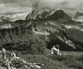
Wondering in Silenceby AgaricusComment: You have got a really fabulous backdrop - the scenery is wonderful with the clouds sweeping over the mountain and the gradual layered rise of the landscape up to that mountain. The addition of the person adds a sense of scale - but also could help convey a mood of contemplation and/or introspection. What really kills the overall visual appeal, at least for me, is the odd slight green tinge with sepia like type tones. Color can help invoke or strengthen a mood or feeling. Converting this to straight B&W and then do a Color Balance to cool blue tones would give it a slight blueish tone would not only increase visual appeal but could convey a mood of sadness or feelings of calm or serene beauty(see Duotones IV challenge entries 8,10,17 ; Duotones III # 16 and Duotones II #1 for examples of what I mean). This would be such a stunning picture but color tones bring down its potential! One doesn't have to go the cool blue duotone route - even if this was a B&W with strong dynamic range in the shadows/highlights/midtones (sometimes a straight conversion to greyscale makes these areas flat so you have to do some adjustments) it would be wonderful photo. |
 Photographer found comment helpful. Photographer found comment helpful. |
| 01/26/2010 10:56:04 PM |
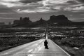
Aweby LevTComment: Wow, awe is the right word for this! Love the leading lines of the road that my eye can literally travel on as it ventures off into the distance to see the impressive mountain structures and those wispy white rolling clouds. And those clouds are mesmerizing too! I also love the addition of the person in the composition. As always it is the details that can add an extra dimension to the shot - he is wearing a cowboy or cowboy shaped hat. I see this as an emotive/conceptual photo that speaks of the cowboy taking the long road home. The great wide west spreads out before this lone cowboy - the road is his direction - as long as he stays on the path he can never get lost. I would love to see the color version but I suspect the colors and details on the 'cowboy' would be more evident and thus destroy the cowboy imagery. The B&W presentation is just wonderful - bumping up to 9. |
| Photographer found comment helpful. |
| 01/26/2010 10:42:17 PM |
The Lessonby jhomrighausComment: This is such a great 'captured moments' shots - it has some Norman Rockwell potential - Love the tentitive pursing of the lips and first foray into playing the piano with that one finger on the key. It's that facial expression and the body poise that makes this shot. Now, this is a good shot but there areas that need improvement before it makes that leap to spectacular. First off I think that the color robs the attention away from what should be played up - the first lesson and all expressions and feelings the is expressed in body language. I think mood & feel would be better emphasized by B&W. But be careful in the conversion for sometimes a straight conversion can leave the B&W tones flat - you may have to play with Shadows/Highlights/Midtones and/or Brightness/Contrast as well as a small Clarify boost to get a good dynamic range. The other area that needs improvement is that the white piano keys are too blown out and you have lost significant detail. Not sure what PP can be done to bring it back for it looks pretty washed out - maybe you have another shot that you used a different aperature setting to let less light in that the keys are not blown out. If not I would suggest a selective edit on just that section, feather to not get jagged edges and then play around with some features to boost contrast and see if it looks natural. Lastly, I think it would be wonderful to include the full torso of the teacher in the shot instead of having him cut out - he too is a subject in your shot for while the main subject of focus is the boy, the teacher is here as the supporting cast. Including him fullly would just make your picture all the more richer in story. |
| Photographer found comment helpful. |
| 01/26/2010 10:08:58 PM |
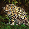
First Day Outby JuliBocComment: Aaaawwww, what a cute sight to see - momma and her baby cub out in the fresh air! I think it is a good shot and average but it has potential to become a spectacular shot. As with any live models (be it animal or human) interest is always stronger if one can establish eye contact. If the baby leopard's face was looking more in our direction so we could see the darling eyes and face it would be all the more captivating. The protective momma looks down at her offspring but I can see a little of the fierce protectiveness in her eyes - but just a little more tilt to the head would show us more of her eyes and the protective stare. It is all in the timing and patience - sometimes you will get the shot and others not. If you have a rapid-fire or contineous fire feature on your camera this would have been a good opportunity to use it. Once you got the focus - then a quick click of the shutter at the moment you want would then take 4-5 quick shots one after the other. This would capture the movements and maybe one would capture the shot where eye contact is made. Of course with this feature it will then take a minute for the card to store and read it before you could take the next burst - so you have to choose the moment to click wisely. Now the colors - the reds and greens seems super saturated, some areas on the coat of the mother have a bit too much yellow tone in the spots. Keep the tones more to a natural look - if you want them to look a little more rich in Post-Processing play around with the Shadows/Highlights/Midtones or just contrast in the Brightness/Contrast levels but be careful here too for it is easy to go overboard in this direction as well. Playing around with the shadows and contrasts can also bring out some nice details as well - i.e. further showing more details in the direction of the hairs in the coat of the mother leopard. |
| Photographer found comment helpful. |
| 01/26/2010 09:51:13 PM |
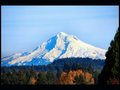
Mt Hoodby Reedman18Comment: This is a good shot of that majestic mountain. Mt. Hood looms in the distance. There are some nice, rich, colors in the tree canopy but the picture suffers greatly for lack of color balance in the blue/white tones on the main subject itself. Getting a perfect balance of white snow with the correct color for shadows and highlights is difficult. The shadows on the mountain is saturated in blue tones - unrealistic blue tones. Post Processing and/or bumping up the saturation most likely turned the well balanced tones overly bluish. Playing around with RGB by only lowering the Blue Channel (not too much past -5 because then you will rob your sky of blue tones unless you do a selective edit) and also Highlights/Shadows/Midtones could get it to look more natural. |
| Photographer found comment helpful. |
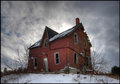
| 01/26/2010 09:42:28 PM |
Abandonedby mBastinComment: That is definitely one warped and wonky abandoned house. Colors are good and composition while straight on makes this house interesting because it shows off the weird ways the house leans and the cloud cover seems to extend out from behind it. While a good shot - it just lacks something at would give this a little more umph; something that would make the eye linger that much longer. What that would be ....hmmm, one suggestion but definately not the only one is to create a mood or play up a mood. The title is abandoned, well the house is obvious but mood could be emphasized by footsteps in the snow that are facing away from the house. Or you could go the total opposite at go for a humor angle: place a "For Sale: Cheap" sign in front. Just one additional detail can add spice/mood to a photo composition. If you don't want the 'set-up' scene but want something natural then it might be harder for Mother Nature would have to provide something like say some dark and brooding clouds - it would give a dark and moody feeling to the shot. |
| Photographer found comment helpful. |
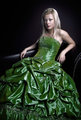
| 01/25/2010 11:48:13 PM |
Mademoiselle Mby QartComment: Absolutely fabulous lighting in the full scale portrait! I JUST love the way the light falls upon the model's face and dress creating lovely highlights and shadows! And the rich green color of her dress is stunning. This is a wonderfully done portrait ....and stunning too; this portraiture reminds me of how royalty would pay to have their portraits done. |
| Photographer found comment helpful. |
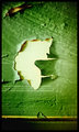
| 01/25/2010 12:25:10 PM |
Chip's Best Sideby colorcarnivalComment: Well the colors are great.
I tried, I really, really, really tried to see the face, but I can't FIND it! All I DO keep seeing is the outline of a butterfly flying sideways in that paint chip! |
| Photographer found comment helpful. |
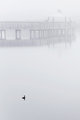
| 01/25/2010 09:02:46 AM |
The fogby TammsterComment: Fog can make places take on a mystical, magical look - otherworldly. This pier and the ocean is enshrouded in it. Colors have retreated and all the world is bathed or reflected in pearl-grey white sheen. The lone bird floats on what now looks like a glass-like surface. The mood of the photo is of solitude and the feel of it is cold and very chilly. Nothing is there - the quiet pier is only visited by the lone bird. The grey-white hues that dominate the photo convey a great sense of chill and cold wind. The photo is above average but I think it has potential to be even more visually appealing. The composition of the photo is in the vertical which I don't think is allowing it to have it's full visual impact. A horizontal crop would be more flattering for not only would you give your audience a 'wide screen/big picture' view of this world but it would complement & parallel the horizontal lines of the pier. |
| Photographer found comment helpful. |
| 01/25/2010 08:48:13 AM |
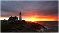
First lightby DeniseComment: Gorgeous seascape you captured here! Classic lines of composition with the lighthouse on the rocky shoreline to one side, the morning sun rising in the near center, and the sweeping expanse of the ocean on the other side. A great balance of visually appealing elements set in this scene. Great, but not perfectly aligned - yeah, I know picky, picky...but if you crop the scene so the rising sun appears dot center of the composition you would get the perfect balance of these elements. Not to mention the possibly of fully cropping out that extra structure to the left of the lighthouse and main house that does nothing for the composition. I think the main element dominating the left portion should be just that main house and the lighthouse - any other buildings just bled attention/focus away from those two taking center stage of the left third of the photo. Colors- colors are absolutely beautiful adding vibrancy and more beauty to the seascape. |
| Photographer found comment helpful. |
Home -
Challenges -
Community -
League -
Photos -
Cameras -
Lenses -
Learn -
Help -
Terms of Use -
Privacy -
Top ^
DPChallenge, and website content and design, Copyright © 2001-2026 Challenging Technologies, LLC.
All digital photo copyrights belong to the photographers and may not be used without permission.
Current Server Time: 06/21/2026 07:49:51 PM EDT.