| Image |
Comment |
| 10/27/2010 03:20:28 PM |
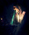
Santana - "Black Magic Woman"by bryanbrazilComment: Good lighting on the model that shows off the body form - Model's sultry pose matches the sultry sound of Santana's song/music. Good choice in going with the B&W for it really shows off the way the light falls (shadows and highlights) plus it ties in nicely with the 'color' of the song it alludes to. I think that the composition just needed one little thing that would give it a stronger tie to Halloween WITHIN the shot rather than relying on the title so much....not sure what I could suggest perhaps a small bottle that reads 'witch's brew' or a small temporary tattoo of a witch's cauldron or the words Salam. A witch's hat would have been too much - a subtle touch is what I think would work best so as not to overpower the model. |
 Photographer found comment helpful. Photographer found comment helpful. |
| 10/27/2010 03:10:33 PM |
"Witchy Woman" - The Eaglesby kingskingdomComment: Great colors, lighting and focus. Interesting 'mask' that she has on - the dots make me think of reptile's skin. Green being the stereotypical witch skin color - but she appears as a beauty. Mayhap her true skin color is showing through the beauty mask - a wicked beauty. |
| Photographer found comment helpful. |
| 10/26/2010 09:03:29 PM |
Sepulchral Ghoul (Legion of the damned)by ShutterPugComment: Disturbing - check. Creepy - check. You know, if one had this outside on the lawn as a Halloween decoration all the little kids would walk to the other side of the street to avoid the house. This composition evokes the horror side of Halloween very well. Just two critiques. The glowing green/blue projectile vomit keeps in line with the stereotypical color of vomit and ghostly/supernatural color presentations. But I wonder if it would have been more creepy and disturbing if you had gone with a different color. Red being the color of blood would introduce a whole new level of horror plus red contrasts well against black so it would really pop visually. The last small critique I have is that the spew probably should be seated a little lower close to the bottom lip so that it looks more like it is truly coming out of the mouth. |
| Photographer found comment helpful. |
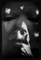
| 10/26/2010 08:44:39 PM |
Watching Meby JutildaComment: Heh, very clever. I did not notice the main face that held all the faces within the composition until a second longer look. I kept getting drawn to the face with the expression of horror as a hand covers the mouth. The processing and feel of the overall composition invokes a Hitchcock look and mood which captures the spirit of the challenge. Now the critique, not to sure that the thin red border that outlines the composition compliments the shot. The composition has the mood and feel of a old B&W Hitchcock movie thus the introduction of color in the border doesn't fit well. |
| Photographer found comment helpful. |
| 10/26/2010 08:34:51 PM |
|
| Photographer found comment helpful. |
| 10/26/2010 04:05:17 PM |
DSC_6697-Edit-Edit-Editby Ja-9Comment: Cropping is better - now the ends of the dark 'path' touch more of the sides of the composition. I think it could do with just a 'touch' more of shadows and highlights to add some more depth to the shadows and highlights (I looked at it in Paintshop Pro tweeking the Shadows to -8 and the Highlights to +2 and it has a little more detail ...you could especially see more of the tree reflections in the dark path ---don't know if that is a good or bad thing). The blue hues in the middle composition are a tad pale...mayhap a touch more on the color adjustment of RGB with Blue; not much just a touch. I like that the path from the sky to the dark road is more visible. The artsy crowd will be more receptive to the picture but the 'can't stop to smell the daisies' crowd will just not get it. Other title suggestions: Pathway From the Sky, Blue Horizons Flow Down, Reflected Path...hmm wonder if I could think of a play on the line 'The woods are lovely, dark and deep' (from Robert Frosts Poem)
.
.
BTW, If there was more time to contact SC to see if the following is legal in Basic (I think it is but I am not 100% sure and I'd hate to steer you wrong) -- make copy of original, run it through Topaz set at Photo Pop or Color Stretch and then put this into new layer over original set at Normal 50-70%. |
| Photographer found comment helpful. |
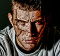
| 10/26/2010 09:42:58 AM |
Can I Play with Madness - Iron Maidenby MikeComment: Great processing in the 'cracked skin' - truly plays well into the song title. He is cracking such that we are beginning to see the madness come through. I especially like how you paid attention to the detail of showing the maddness in the eyes as well. The flames of anger and insanity burn within his eyes. Normally, I don't like the overprocessed look that captures and shows off every pore of the skin but in this composition it works. The 'heavy detail' processing gives the image a gritty feel that compliments the mood and feel of the shot. |
| 10/26/2010 09:36:25 AM |
Zombieby h2Comment: Love the mood and feel you captured here with this nighttime shot of the zombie. The shadows on the ground and the streetlamp lighting of the scene makes your capture both haunting and scary - most especially since it projects the horror of encountering a zombie could occur in the streets of anytown. I do have two critiques on the composition that I think would improve the visual appeal even more. First, the seems to be a huge amount of detail on the leaves and texture of the road - oversharping/heavy Topaz editing. I think bringing that down a notch will still show detail but not to the point of it being too glaring. Lastly is that 'never have a lightpole or tree' appear to be growing out of the model's back or head. It detracts attention away from the model. Changing shooting angle slightly, having the model his position away from the pole or both would have eliminated the problem. |
| Photographer found comment helpful. |
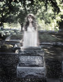
| 10/26/2010 09:19:58 AM |
Spookyby JaimeVinasComment: Indeed, very spooky and well done. 'A young woman haunts the graveyard' reminds me of the ghost story of a young woman whom is either standing outside a cemetary or bridge that a motorist stops to give a lift home. When they arrive at her 'home' she has disappeared from the car leaving the motorist to knock on the door of the house only to find that the grieving parents tell of their daughter being dead for "x" number of years. O.K. now back to the photo composition. I like how gave this has an ethereal quality. Nighttime would be more spooky but then you would not get the bokeh circles of the leaves in the backdrop - which compliments the 'ethereal'/otherworldly feel of the photo. The spookiness comes from the ghostly woman who stands at her grave. She seems to be more 'phase-shifted' rather than having see-through quality that stereotypically ghosts appear. I don't think that harms the composition overall just presents a different take. Exposure and lighting a great. I actually Googled "Spooky" because I wasn't sure if it was a song title - not only did I learn it was but I also found out about a song title from Davie Bowie that I did not know about: "Please Mr. Gravedigger" |
| Photographer found comment helpful. |
| 10/26/2010 09:00:42 AM |
Monster Mashby dtallaksonComment: Ha! Very creative. It is that little arm hanging out of the pot that the eye notices first before discovering all the other details of the composition. Nice work in the details - the green arm and the 'Mashed People" 'Potato Mix' plays well into the Halloween theme and captures the song "Monster Mash" in a humorous way. The one biggest thing that could greatly improve the composition is the lighting - location is a very tough thing with getting excellent lighting that leaves faint or no shadows in a kitchen stove setting. Natural lighting streaming in from a window (if possible) would help but it would have to be in conjunction with two desk lamps with the same strong lighting (60 watts or above) on either side of the oven aimed at the pot. To fill out the frontal lighting you could use the flash unit on the SLR camera but to avoid hard/harsh shadows you would cover the flash unit with one or two thin layers of tissue paper (which is what I did back with my Recipe (Food) III entry) |
| Photographer found comment helpful. |
Home -
Challenges -
Community -
League -
Photos -
Cameras -
Lenses -
Learn -
Help -
Terms of Use -
Privacy -
Top ^
DPChallenge, and website content and design, Copyright © 2001-2026 Challenging Technologies, LLC.
All digital photo copyrights belong to the photographers and may not be used without permission.
Current Server Time: 06/21/2026 06:50:53 AM EDT.