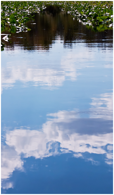
Cropping is better - now the ends of the dark 'path' touch more of the sides of the composition. I think it could do with just a 'touch' more of shadows and highlights to add some more depth to the shadows and highlights (I looked at it in Paintshop Pro tweeking the Shadows to -8 and the Highlights to +2 and it has a little more detail ...you could especially see more of the tree reflections in the dark path ---don't know if that is a good or bad thing). The blue hues in the middle composition are a tad pale...mayhap a touch more on the color adjustment of RGB with Blue; not much just a touch. I like that the path from the sky to the dark road is more visible. The artsy crowd will be more receptive to the picture but the 'can't stop to smell the daisies' crowd will just not get it. Other title suggestions: Pathway From the Sky, Blue Horizons Flow Down, Reflected Path...hmm wonder if I could think of a play on the line 'The woods are lovely, dark and deep' (from Robert Frosts Poem)
.
.
BTW, If there was more time to contact SC to see if the following is legal in Basic (I think it is but I am not 100% sure and I'd hate to steer you wrong) -- make copy of original, run it through Topaz set at Photo Pop or Color Stretch and then put this into new layer over original set at Normal 50-70%. |





 Add photograph to your favorites
 Add photographer to your favorites


 Photographer found comment helpful.