| Image |
Comment |
| 11/02/2010 09:51:17 PM |
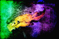
Floaterby KelliComment: Love the colors that span the composition - from a rich green to the autumn yellow then the lush purple. The transition of colors makes me think of autumn. Great texture overlay - the rough and gritty look gives us the sense of touch of what autumn might feel like. |
 Photographer found comment helpful. Photographer found comment helpful. |
| 11/02/2010 09:46:17 PM |
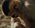
overlay1by DeniseComment: I really have to install better quality glass...these monkeys keep throwing stones and breaking the windows:-) That was the first mini 'story' that went in my head upon looking at the image. Great overlay, makes us think/feel that we are looking at this monkey through a broken window. |
| Photographer found comment helpful. |
| 11/02/2010 09:42:02 PM |
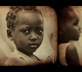
Two Girlsby gsalComment: I really like the presentation that these photos are in a well loved album...the fingerprints are a nice touch. The photos really take on a keepsake and cherished memories feel with the processing you added. |
| Photographer found comment helpful. |
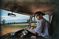
| 11/02/2010 02:18:40 PM |
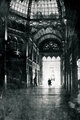
one day...day oneby nixterComment: The addition of texture to age the photo really calls the attention more to the shapes and light shining through that arched ceiling and decorative windows. It gives off a feel and mood of being 'well-traveled' - a familiar and comforting setting. The silhouette of the person injects a human element into the composition and adds interest - are we meeting this person at the station or is it a picture of ourself arriving/leaving (tells a story) |
| Photographer found comment helpful. |
| 11/01/2010 07:56:45 PM |
On the Roadby BarbBComment: Nice subtle texture around the edges - gives the photo a well worn and handled feel. Nicely done and complements the image well without overpowering it. |
| Photographer found comment helpful. |
| 11/01/2010 07:54:14 PM |
#1by Eagle40Fox2Comment: Heh, an "I see you" moment (both for the model looking on at the photographer and the viewer who gets to see the photo). I like the texture and sepia type color - gives it a grungy on assignment mood and a feel that this was taken long ago. |
| Photographer found comment helpful. |
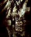
| 10/30/2010 08:45:01 AM |
Welcome to My Nightmareby rozComment: Going to go back to my above and below challenge commenting: Hello neighbor!:-) Congrats on the top 10 placement.
I like how the 'nightmare' radiates out from the person/sleeper. Her silent scream is heard as we get to see the imagery that haunts her...and that skull with the eyes in it very definately FREAKY! Good choice with the sepia/B&W tones for a color version would have made it far too busy to absorb. Here the vision/all parts of the composition is easy to take in and appreciate. Great job on the reflections too! |
| Photographer found comment helpful. |
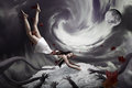
| 10/27/2010 05:36:45 PM |
Fear of the Dark by gyabanComment: With the warped arms and the stretched body of the woman it makes me think of the poster for Gilliams' 'Fear and Loathing in Las Vegas'. However, the overall warped style makes me think Tim Burton/Burtonesque. Composition is very well done and I can very well see this in the top 10. This captures the fear of falling and the fear of being 'chased/captured'. Those disembodied hands reaching out to grab her is very macabre and frightening when you think about it. The full moon is a nice touch for one thinks of all the supernatural beasties that come out during a full moon. |
| Photographer found comment helpful. |
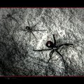
| 10/27/2010 03:42:37 PM |
The Black Widowby MaryOComment: Great texture - the grittiness adds to the feel of the composition. Love the B&W treatment for it really allow the spiders to visually pop off the page. The red of the hourglass on the abdomen and the thin red border also stands out - nice splash of color. The border is a little odd and I don't think it complements the image- most visually appealing wide screen treatments are long and rectagular in nature but here the main composition is closer to squarish in dimensions. It doesn't give it that wide open feel instead it makes it feel confined/blunted/caged. Nice addition of the spider crawling at the bottom of the border - a little hard to see because of the black on black. I think it would be more 'visible' if you had put it on the border on the top right corner crawling to the left. It would be more readily noticed. Speaking from my days back in advertising the human eye tends to fall/look at things from right to left (that is why magazine advertisers always go for the right hand page when buying spots) |
| Photographer found comment helpful. |
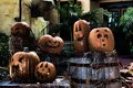
| 10/27/2010 03:27:37 PM |
"This is Halloween" by Danny Elfmanby dianapf1Comment: Great faces and focus on these pumpkins! Pumpkins with spooky, scary or silly expressions carved in them very strongly suggest Halloween. I do have one critique that I think would have made this composition/capture far stronger in it's visual appeal and connection to Halloween. Halloween is all about what is out there during the night - during the day it is not so scary. But at night that is when the spooks come out to play. I am sure that the pumpkins lit at night look awesome and a photo of them at night would have moved the shot from good to exceptional. |
| Photographer found comment helpful. |
Home -
Challenges -
Community -
League -
Photos -
Cameras -
Lenses -
Learn -
Help -
Terms of Use -
Privacy -
Top ^
DPChallenge, and website content and design, Copyright © 2001-2026 Challenging Technologies, LLC.
All digital photo copyrights belong to the photographers and may not be used without permission.
Current Server Time: 06/21/2026 08:32:23 AM EDT.