| Image |
Comment |
| 12/04/2005 10:22:47 PM |
Defiantby seriocomicComment: Your muted colors are great for this, I love how you have the low view without the foreground being so blurry. I dont like the sky much but The shell stands out so much Its hard to focus on anything else so it didnt effect your score. |
 Photographer found comment helpful. Photographer found comment helpful. |
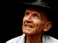
| 12/04/2005 10:20:12 PM |
Ol' Blue Eyeby samtrundleComment: Such character. I like how you didnt try to smooth anything out, and the light just hilights every crease. |
| Photographer found comment helpful. |
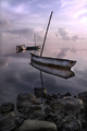
| 12/04/2005 10:18:02 PM |
A Tranquil Reflection by JeanComment: Thought I had already commented on this....
Colors are gorgous, I love how your boats look like they are floating in the clouds, there isnt a real line between the two. I would maybe like to see some more of the character of the boat come out. Very incredible picture 10 |
| Photographer found comment helpful. |
| 12/04/2005 05:03:21 PM |
FRAGILEby RikkiComment: Too much sharpness on the hair and eyebrows, too much glow on the eyes. It looks a bit over worked. I love how you set this up, The eyes are gorgous, the crop and the scarf are great though. |
| Photographer found comment helpful. |
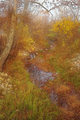
| 12/04/2005 05:00:06 PM |
Mystical Creekby tsheetsComment: On second look Im bumping it up, I like the colors and the reflection off the water. Its maybe a bit too "dramy" looking, soft and out of focus but I think I like it. |
| Photographer found comment helpful. |
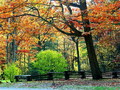
| 12/04/2005 04:51:09 PM |
another season gone byby echo54Comment: Colors are great, stunning really. The fence is a nice touch. It lacks sharpness though and maybe is a little small. |
| Photographer found comment helpful. |
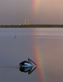
| 12/04/2005 04:49:04 PM |
after the rainby StagoleeComment: Love how you captured the birds and the rainbow. The bird in front needs to be sharper, maybe. |
| Photographer found comment helpful. |
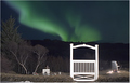
| 12/04/2005 04:46:37 PM |
Aurorasby IceRockComment: The glow off the gate is too much. I like the idea of a graveyard and the aurora but the gate and the shiny off the right one I didnt like |
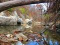
| 12/04/2005 04:45:21 PM |
Natures Autumn Paletteby VanGoghComment: I love your colors, the log across the top frames it nicely. The sharpness just isnt there, maybe more contrast so your rocks pop out. |
| 12/04/2005 04:43:31 PM |
Dreamy Angelby xlr8tnComment: Too light blue for me. I like the crop and positioning. I like the windblown look but the blue kills it for me. |
Home -
Challenges -
Community -
League -
Photos -
Cameras -
Lenses -
Learn -
Help -
Terms of Use -
Privacy -
Top ^
DPChallenge, and website content and design, Copyright © 2001-2026 Challenging Technologies, LLC.
All digital photo copyrights belong to the photographers and may not be used without permission.
Current Server Time: 07/17/2026 06:51:10 PM EDT.