| Image |
Comment |
| 07/01/2006 02:15:13 PM |
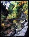
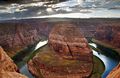
Arch Bridgeby NeuferlandComment: How can this pic have no comments??
Really, what can I say that you don't already know here? Just a fantastic example of simplistic gradeur. Gorgeous colors, awesome leading lines, beautiful textures. Great sense of "being there" with you. This picture really captures your experience of this place and brings it to life.
Picky bits that I can say: the web version here needs some final sharpening. The tiny bit of blown out sky is a wee bit distracting to me, but not a fatal flaw by any means. Maybe you can burn it enough to make it look just more like overcast clouds? You might try to add some vignetting with burn or a filter, and then dodge the bridge and burn the trees to give it more punch and draw the eyes to the bridge some more.
Overall fantastic, probably an 8 from me. Hope this is in some way helpful. ;) |
 Photographer found comment helpful. Photographer found comment helpful. |
| 06/27/2006 11:47:07 PM |
Xraodsby jadComment: sweet, I'd crop a bit off the right though. |
| Photographer found comment helpful. |
| 06/24/2006 10:33:48 AM |
Mixing of Colorby deepfrog17Comment: Holy crap that's cool! Man, this is kind of what I was hoping for with my entry. Good work! |
| Photographer found comment helpful. |
| 06/23/2006 09:15:18 PM |
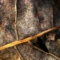
Dessicated.by wavelengthComment: Originally posted by Ecce Signum:
Coming from my 1-4-0 thread ...
I really like your composition here but as has been said already the main stem should be in sharp focus, as it was advanced editing I'm thinking the gaussian blur isn't the reason for the lack of sharpness? |
Hmm, should have blurred on a separate layer and then masked or erased it on the stem maybe.... |
| 06/23/2006 11:52:57 AM |
|
| Photographer found comment helpful. |
| 06/22/2006 12:49:15 PM |
Stationeryby SinkyComment: This is a very nice shot and VERY graphically clean. I would have used a higher (smaller) apeture to get all of the tacks in focus myself, and spaced the tacks in a perfect triangle surround the lower right thirds intersection. |
| Photographer found comment helpful. |
| 06/22/2006 11:23:25 AM |
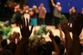
hands lifted highby irishblueComment: like the idea, but I would rather see the nearest persons head, maybe a portrait orientation with their shoulders and up. |
| 06/21/2006 01:08:56 AM |
|
| 06/21/2006 01:04:34 AM |
|
| Photographer found comment helpful. |
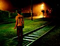
| 06/19/2006 01:33:19 PM |
fading awayby arsenalComment: Arsenal!! Schweet picture, your style so fits this challenge dude. |
| Photographer found comment helpful. |
Home -
Challenges -
Community -
League -
Photos -
Cameras -
Lenses -
Learn -
Help -
Terms of Use -
Privacy -
Top ^
DPChallenge, and website content and design, Copyright © 2001-2026 Challenging Technologies, LLC.
All digital photo copyrights belong to the photographers and may not be used without permission.
Current Server Time: 06/11/2026 11:53:32 AM EDT.