DPChallenge: A Digital Photography Contest You are not logged in. (log in or register
 
Browse Settings
Currently viewing:
Registered UserKiwiShotz

Show comments:

Per page:

Order:

Comments:


Comments Made by KiwiShotz
Pages:   ... [119] [120] [121] [122] [123] [124] [125] ... [279]
Showing 1211 - 1220 of ~2789
Image Comment
Dog Day Afternoon
01/07/2006 06:09:59 AM
Dog Day Afternoon
by mrmorris

Comment:
And the shape is ... ?
Photographer found comment helpful.
"O" i-see
01/07/2006 06:07:23 AM
"O" i-see
by DanielCzaja

Comment:
This si a really interesting image, perhaps a little too centred but then I get thrown with the title which I can't relate to the image :)
Blue Moon Rising
01/07/2006 06:04:46 AM
Blue Moon Rising
by karmat

Comment:
Gee there's some interesting elements here. I guess visually my eye isn't sure which one to go to and then the title throws another one at you and it really get s very confuzzling
Photographer found comment helpful.
Sticking the clouds
01/07/2006 06:03:15 AM
Sticking the clouds
by greslizzz

Comment:
That's a pretty dramatic sky. I don't quite understand the title sorry
Photographer found comment helpful.
Oranges are round!
01/07/2006 06:02:13 AM
Oranges are round!
by carlo

Comment:
Yes they are .... but they're also "orange" :)
Photographer found comment helpful.
glasses
01/07/2006 05:38:44 AM
glasses
by photogrl

Comment:
::: Critique Club :::
Welcome to DPC and your first Challenge Kristy, I'm so glad I get to do your first critique.

First Impression - the most important one:
First impression is that its all a little confusing. Clearly it's glass stems but determining what it's all about takes a little longer and you have to hope that people will take the time. So anything you can do to make them stop and look is a good image.

Composition:
Just right. The stems form a Leading Line wihich draws you into the image like a row of trees in a Belgian country lane. It doesn't need the top part of the glass(es) nor the bottoms - they're implied. You show a sophistication in composition that says you're not a beginner in visual arts.

If there's a composition niggle it is with whatever is in the background that looks like a distant glass stem but clearly isn't. Of course it's easy for me sitting here and being wise after the event but even an old dark towel thrown over that thing would have powered up your image even more.

Subject:
Great. The stems are very recognisable and the repeating pattern just reinforces it. It's "on challenge" which is a great start in the scoring stakes and goes down well with the voters.

Technical (Colour, focus, and light):
Here's where I think you lost a lot of votes and the comments really do suppport that. All images need a Point Of Interest for the eye to gravitate to. Because you have ended up with a shallow depth of field, that point of interest is very difficult to find. The result is that the eye wanders around not quite sure where to settle. As I said above, at least you have the leading lines to help but I fear the lack of focus is just too hard to overcome.

To grow its vote?:
Depth of field is just a god-awful thing to get right, especially when you're getting close to a subject, yet control it we must. There's so many combinations involving focal length of the lens, distance from subject and aperture that all I can suggest is putting aside a couple of hours with Google and your camera and trying different stuff.

Summary:
Don't despair, despite a major depth of field issue and a confusing point of interest, you scored surprisingly well! A 5.2 is not a bad score so we look forward to your next one.

It's been a pleasure, contact me on PM if you'd like to follow up on anything

Brett
PawnOfTheWorld
01/07/2006 01:59:37 AM
PawnOfTheWorld
by seebrown

Comment:
::: Critique Club :::
Having not entered Username, it's great to be doing a critique in it. One thing you learn is that people have some very weird usernames - the mind boggles.

Great fun to do a critique on your image but it is more difficult if you don't give us detailed information in your photographers comments. When we do a critique, we go past just the photographic result or post processing, that's what voters comments do. The critique looks at what you were trying to achieve, how you wanted it to look and what issues you had in getting the image captured and ready for voting.

First Impression - the most important one:
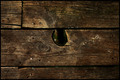
Interesting, I instantly liked it. It does what it is supposed to do - stop you from passing on, it engages you to look further into the image = first base.

Composition:
I'm really confuzzled here because it looks fine but hasn't scored well and something about it just doesn't gel. I suspect that composition rather than any other factors is where it didn't grab hearts so lets look at that.

Part of the difficulty is for the viewer to decide what the Point Of Interest is. Was it your intention that point to be the pawn, the centre of Africa or the whole lit area as a unity? Once decided, that area will have the most impact on a thirds intersection.

One of the other useful things to note is that the eye enters bottom-left and exits top-right. Ignoring the type reversal, I wonder what impact change mirroring the image would have.

Is there too much neutral black space below the globe? I'm really not sure, but it would be fun to run some test prints and get family/friends to choose a favourite.

Subject:
Bang on challenge, interesting, very differnet, creative and pushing the boundaries. In effect, good choice.

Technical (Colour, focus, and light):
10/10 for the lighting. You've really worked hard at this, it shows and it works. The complete blackout all around africa is terrific as it gives the drama and imact needed to be noticed in this tough environment. Well done.

To grow its vote?:
If you do try some composition variations, let me know what worked best.

Summary:
A really good image, well conceived but not well received. I'm probably as mystified as you as to why not and would be really interested in any tests you do.

Brett
Photographer found comment helpful.
Maternal Magic
01/05/2006 08:20:19 AM
Maternal Magic1st Place
by LindaLee

Comment:
Brave and good stuff. It takes confidence to go the blurred route and you have pulled it off superbly
Photographer found comment helpful.
Mother Mary
01/05/2006 08:19:27 AM
Mother Mary
by NstiG8tr

Comment:
This probably a little too close to representing someone else's artwork as I guess you didn't do the setup or lighting? If you did then I apologise
Photographer found comment helpful.
r.i.p.
01/05/2006 08:18:17 AM
r.i.p.
by focus57

Comment:
I wish I could read it .. is it mom?
Pages:   ... [119] [120] [121] [122] [123] [124] [125] ... [279]
Showing 1211 - 1220 of ~2789


Home - Challenges - Community - League - Photos - Cameras - Lenses - Learn - Help - Terms of Use - Privacy - Top ^
DPChallenge, and website content and design, Copyright © 2001-2025 Challenging Technologies, LLC.
All digital photo copyrights belong to the photographers and may not be used without permission.
Current Server Time: 09/10/2025 07:52:46 AM EDT.