| Image |
Comment |
| 03/09/2008 11:04:33 PM |
womenby AliciaComment: I'm not sure what processing you did, but I really like how this came out. You've captured quite the expression there. My little nitpick would be what appears to be a mouth towards the top; somehow it's begging for attention. |
 Photographer found comment helpful. Photographer found comment helpful. |
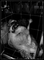
| 03/08/2008 10:28:19 PM |
j i l t e dby rozComment: This is a really tough DQ, Roz. But the picture holds it's own and is fantastic no matter what happens at DPC. |
| Photographer found comment helpful. |
| 03/08/2008 12:06:32 AM |
Moving Canvas by owenComment: Congrats on your blue - this was one of my favorites of the challenge. |
| Photographer found comment helpful. |
| 03/07/2008 11:57:09 PM |
|
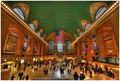
| 03/07/2008 11:54:55 PM |
grand central terminalby k4ffyComment: Cool perspective and good job getting the exposure right. I'm getting a bit of a color cast on my monitor; it seems yellow, probably due to the lights. |
| Photographer found comment helpful. |
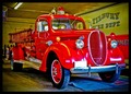
| 03/07/2008 11:53:05 PM |
If only firetrucks could talk, by ckfire1923Comment: Great title, I often wonder the same about old vehicles, buildings, etc. This looks a bit for me, perhaps a little less saturation would make it stronger. |
| 03/06/2008 11:23:03 PM |
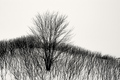
___by undieyatchComment: The B&W is great on this; really nice job on getting it to look like this. I don't know if it's from the overall processing or output sharpening, but I see a bit of haloing around the edges of trees. Or maybe it's just jpg issues, not sure. |
| 03/06/2008 11:20:22 PM |
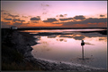
swampby alexgarciaComment: Nice, dramatic sky and good choice of colors. It may be just an illusion, but the horizon looks tilted down a bit to the left. |
| Photographer found comment helpful. |
| 03/06/2008 11:18:24 PM |
On Top of the Worldby MAKComment: Those colors are absolutely stunning; this makes me want to visit this place. The HDR effect is a bit overdone for my taste. |
| Photographer found comment helpful. |
| 03/06/2008 11:17:15 PM |
pairsby tnunComment: I like candid shots like this where you can find people doing their own thing, totally oblivious. This makes me wonder what the guy's up to - a date perhaps? I see a slight greenish color cast on my monitor; I removing that could make this a stronger image. |
| Photographer found comment helpful. |
Home -
Challenges -
Community -
League -
Photos -
Cameras -
Lenses -
Learn -
Help -
Terms of Use -
Privacy -
Top ^
DPChallenge, and website content and design, Copyright © 2001-2026 Challenging Technologies, LLC.
All digital photo copyrights belong to the photographers and may not be used without permission.
Current Server Time: 06/25/2026 08:21:33 AM EDT.