| Image |
Comment |
| 11/04/2005 11:59:21 PM |
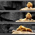
King of the Zooby alternaruleComment: Very cool, what a great idea, kind of a panoramic series. The color of the lion is bold and majestic just like the lion. You have a little bit of a halo around the mane in the top photo. Again, super cool! |
 Photographer found comment helpful. Photographer found comment helpful. |
| 11/04/2005 11:41:24 PM |
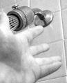
Grande Finaléby GeneralEComment: The strong part of this photo is that it is telling us a story. The negative is that I think you have competing focal points in the composition. De-emphasizing the hand in some way might help, or maybe rather the showerhead since the photo is about the singer. Message edited by author 2005-11-04 23:42:21. |
| Photographer found comment helpful. |
| 11/04/2005 11:34:22 PM |
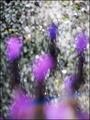
Flowers Never Bend ...by GeneralEComment: Hmmm...I like it, bold color contrasts are the strong point. Abstracts are tough for mass appeal, perhaps if there was some sort of interesting pattern to ease the eyes. I think the eyes just tire out searching for something. |
| Photographer found comment helpful. |
| 11/04/2005 11:29:34 PM |
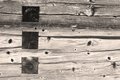
47 Steps - 1by alfrescoComment: I agree with the other comments pretty much. The photo's got texture and the subject is good. Maybe so stronger contrast to people to stop and look closer. Contrast emphasizes texture, I think. This on would be fun to experiment with high contrast. |
| Photographer found comment helpful. |
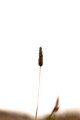
| 11/04/2005 11:25:53 PM |
Perseveranceby alfrescoComment: I like this photograph, you have great contrast and detail, just not much of it. There just doesn't seem to be enough there to get that coveted second, deeper look. Maybe get closer to the subject or get more of these stems in the photo. I definately don't think it is uninteresting as you suggest. |
| Photographer found comment helpful. |
| 11/04/2005 11:13:25 PM |
Cocoby RikkiComment: Cute cat, he has pretty cool eyes. Very difficult subject to photograph, I know my dad has an all black dog and I have no good pictures of him. They just confuse our TTL meters. I think the natural light suggestion is good, go all manual and use your spot meter setting, and meter on something middle grey in the near vicinty. I don't think the white background works very well, it makes the cat look like it was cut out with scissors. |
| Photographer found comment helpful. |
| 11/04/2005 08:20:20 PM |
Picnic in Cathedral Parkby ElemmennopeComment: I agree with Digitalknight, this is a terrific photo. I think there are a great many elements to be discovered if you take the time. My favorite is the repeating arches, each inside of the next. The picnicing couple in the photo. This one I really can't offer any improvement critiques. One reason this probably didn't score higher is that voters were looking for photos with an exaggerated upward perspective. It meets the challenge in my opinion, its from the ground up and has dramatic effect. |
| Photographer found comment helpful. |
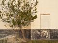
| 11/04/2005 06:26:30 PM |
Go Astros!by DelfeyeComment: Hey I remember seeing this one before. I like the composition of this photo. I also like character of the "rough around the edges building."
I think this one might look better without the tree's shadow, it makes that area of the photo very busy. Maybe you could also bump the contrast and saturation a little in post editing. |
| Photographer found comment helpful. |
| 11/04/2005 06:16:51 PM |
De Vrouw Leentjeby AzrifelComment: Very nice photo, I like your exposure and and contrast. I'm not real sure about the composition though, the boat to the left just kind of peeking in, seems to unbalance the photo a little. Maybe if there was a little more of it in the view? Definately don't crop it out. |
| Photographer found comment helpful. |
| 11/04/2005 05:28:08 PM |
aaronoutside2_filtered.jpgby trobergeComment: I'm not very good with portraits, but it looks as though your meter was being fooled. Does your camera allow you to override the exposure? I think offcentered and tighter compositions are always better for portraits. That would also eliminate that stick out of the head look from the newer fence plank in the background. |
| Photographer found comment helpful. |
Home -
Challenges -
Community -
League -
Photos -
Cameras -
Lenses -
Learn -
Help -
Terms of Use -
Privacy -
Top ^
DPChallenge, and website content and design, Copyright © 2001-2026 Challenging Technologies, LLC.
All digital photo copyrights belong to the photographers and may not be used without permission.
Current Server Time: 05/07/2026 04:18:30 AM EDT.