| Image |
Comment |
| 02/03/2006 01:23:29 AM |
Old and Newby wsteynComment: Usually I dont mind borders...but this one takes a little away IMO. Still nice compostion and color contrast on the pic. |
 Photographer found comment helpful. Photographer found comment helpful. |
| 02/03/2006 01:22:07 AM |
|
| Photographer found comment helpful. |
| 02/02/2006 07:48:21 PM |
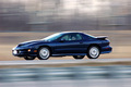
Speedby danw791Comment: Hi from the Critique Club...
First impression: well composed, with an interesting pan effect.
Composition: Good placement of subject, might have been strengthened by cropping out just a little more of the foreground. Blue color is nice and the way the angle of the road slopes with the direction of travel as it gives the picture a nice feeling of motion(in addition to the panning technique).
Technical: Great job on the panning, your skill should work well in the current open challenge.
Score/Challenge result: 5.2xx is a very respectable score and I suspect that in a fantasy challenge many voters didn't give you enough credit for the panning technique you used. Also, along those same lines, many voters might feel that a car is not interesting enough to give a high vote. So, bottom line...your technique makes a potentially uninteresting subject interesting.
And...Make sure you enter something in the panning motion challenge this week :)
any questions?? just PM me.
Mark
|
| Photographer found comment helpful. |
| 02/02/2006 12:25:56 AM |
|
| Photographer found comment helpful. |
| 02/01/2006 09:34:47 AM |
Stars and stripesby nico_blueComment: I suspected this would get hit with some anti-American sentiment. I guess we all vote with hearts on some level. Great job and deserved a higher placing. I'd like to think if I saw a well-done picture of another country's flag I would vote "somewhat" objectively. Otherwise, this is less about photography and more about a personal political statement. |
| Photographer found comment helpful. |
| 02/01/2006 09:09:47 AM |
|
| Photographer found comment helpful. |
| 02/01/2006 12:28:25 AM |
|
| Photographer found comment helpful. |
| 01/31/2006 12:29:49 AM |
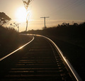
Steel Roadby cycleboyComment: HI from the Critique Club...
First IMpression: High contrast, interesting, and...what is that tree doing?
Composition: I read your comments about the picture. Your reasoning makes sense regarding the tree but for some reason I feel like it would have been a stronger image without the tree. I think its the proportion(or apparent proportion) of the tree in relation to the other plants and the telephone wires. Because the line of the wires seems to mirror the tracks, the tree breaks that line up, making my eyes jump around the picture. I understand wanting to diminish the sun in your picture, but I wish it could have been accomplished another way. The rails and their position in the frame work very well. I do think it is good that you didn't just end up with the tree on accident, you thought about its placement. This shows that you put some thougth into the composition.
lighting: ONe opinion as expressed above, otherwise this "into the sun" image works well. I definitely like the way the light defines each railroad tie and the moutning brackets holding the rails. Very Cool. Its very high contrast, and almost monotone or duotone in color.
Challenge and Scoring: 5.6 is a very respectable score. After reading your comments, it seems most were very positive. In reality, this image is not as "clean/neat" as the images that typically score well(this statement is not meant to be taken literally, just as a general observation of the DPC voters.) Keep shooting and have fun.
PM me with any questions.
mark |
| 01/30/2006 07:51:31 PM |
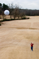
Make Par (still over 100)by tjmuellerComment: Great shot. A golf course let you play around with a lift truck.????? do you own it? :)
my only nitpik...Seemed like the ball was very high for a tee shot and it looked like a driver in your hand. Just my golf genes talking. :) good job and nice finish. |
| Photographer found comment helpful. |
| 01/30/2006 07:49:23 PM |
Fool's paradiseby dmmontyComment: This was very neat idea AND execution, a concept that eludes me quite often ;) BW is perfect for this pic.
My favorite of this challenge and one of two tens given. |
| Photographer found comment helpful. |
Home -
Challenges -
Community -
League -
Photos -
Cameras -
Lenses -
Learn -
Help -
Terms of Use -
Privacy -
Top ^
DPChallenge, and website content and design, Copyright © 2001-2026 Challenging Technologies, LLC.
All digital photo copyrights belong to the photographers and may not be used without permission.
Current Server Time: 06/26/2026 09:26:15 PM EDT.