| Image |
Comment |
| 02/16/2006 11:05:07 PM |
|
 Photographer found comment helpful. Photographer found comment helpful. |
| 02/16/2006 11:02:26 PM |
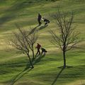
Slothby riotComment: I dont understand. I realize golf isn't exactly a marathon but at least they are walking(although they aren't carrying). |
| Photographer found comment helpful. |
| 02/16/2006 11:00:32 PM |
|
| 02/16/2006 10:59:05 PM |
|
| 02/16/2006 10:57:29 PM |
|
| 02/16/2006 10:56:29 PM |
American Idiot (pride)by sacredspiritComment: INteresting... Im sure you'll get a lot of comments with this one. The composition is good although the bullets could use a little work with their spacing and the stripes/stars accross the top are a little off kilter. Also image grain is a problem here. I personally could have voted this at least one or two points higher had it just been titled "American Pride". I think the voters would have caught the sarcasm. Instead, by titling it "American Idiot(pride)" this only serves to insult the viewer's intelligence.
That being said, still a good composition, although lacking technical precision. BTW, this was the first picture on my voting page, what a fun one to start with. |
| Photographer found comment helpful. |
| 02/16/2006 10:43:51 PM |
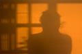
Stare at the Wallby tonyvComment: Hi from the Critique Club... Hopefully I can give you a couple of things to think about related to this picture. Feel free to PM me if you have any questions.
First impression: on topic picture, bright with a duotone type feel.
Composition: You have placed your shadow in a good place according to the rule of thirds. That said, there are several other shadows from doors/window or something covering part of your shadow. I feel the impact could have been greatly increased by moving so your shadow was centered either in the open door area on the RH or in the middle of the window to your left. Personally I think the RH open space with your shadow, accompanied by the window to your left would have been the best choice.
Technical: Lighting works in that your shadow is cast clearly, although the shadow does seem to light. Overall range of tones seems good. All objects are equadistant from the camera so depth of focus is not an issue.
Challenge: This fits within the challenge description so you wouldn't have lost any points there. More isolation of the shadow would have helped grow your vote by a fair amount.
Keep shooting.
Mark |
| Photographer found comment helpful. |
| 02/15/2006 11:51:24 PM |
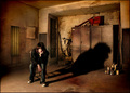
It Never Leaves My Side by Joey LawrenceComment: Hi from the Critique Club.
Uhhh. I drew this picture, why??? :) I don't feel qualified to critique your work but here it goes.
First Impression: What cool stuff was done to the walls. But, you said it was just your basic PP and you really dont remember. Guess its paint overspray. I didnt recognize the face as I've only been here at DPC for a few months, but its safe to say itll be recognized from here on out.
Composition: The paint cans were genius. even though there isn't much color in them, the little they provide makes an interesting balance to rest of the pic. Good placement. Im a fan of the minimalist type picture and this one has a some of that for me with your position in an almost empty room. you did a nice job of including just a sliver of the ceiling for proportion.
Technical: I dont care for the heavy shadows on the lh side of your face... awwh nevermind. The shadow is a little "monster" looking though so I wonder if a slighly different light positon might have given it a little more shape.
Challenge: Seriously now, you took the "mundane" idea that a shadow always follows you around, added a cool environment and turned it into an interesting picture. IMO thats what makes this pic "cool"(is cool only an 80's expression?).
As always, great job and I personally don't think people vote you up just because you are recognizable. Pretty sure your pictures would garner high scores even with one of ROFLMAO's wood modeling figures :)
Mark
P.M. if you have any questions and keep shooting. |
| Photographer found comment helpful. |
| 02/15/2006 11:33:23 PM |
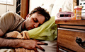
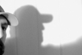
Beside Myselfby MarkArtisanComment: Hi from a Critique Club member. Here is the critique you requested. If you have any questions please feel free to PM me. Hopefully I can offer a couple of helpful thoughts.
First impression: A little grainy for my taste, and my attention goes right to moustache.
Composition: As it was a shadow challenge, the position of shadow is in a good spot, looking into the open part of the picture. As I said before, my eye goes towards the person casting the shadow first. NOt sure why, although I think it may be the eye contact made with the viewer. Image may have been strengthened a little by rotating your nose towards the wall to make a more definite shadow of your face.
TEchnical(lighting, focus): Again, grainy for my taste but that is my opinion only. It may have been your purpose. Lighting seems flat and I cant tell where your focus is placed. The white areas are overexposed, causing a loss of detail around the edges of the shadow. I believe this overexposure also lessons the impact of the shadow as it is very light in color. BW was a good choice for this particular picture.
Challenge: met the challenge, but soft focus images seem to do very poorly on DPC, even when they are done on purpose.
Hopefully there is at least one thing here that you find valuable. Keep on shooting.
Regards,
Mark
P.S. I just pulled down a 3.9xx in the motion panning so I don't consider myself an expert by any means, just someone who likes to learn by taking an indepth look at other photos. :) |
| Photographer found comment helpful. |
| 02/15/2006 05:48:30 PM |
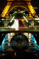
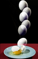
Splashby graphicfunkComment: Great job again. You are consistantly near the top and always with a new idea and brilliant execution.
I see no sticks! |
| Photographer found comment helpful. |
Home -
Challenges -
Community -
League -
Photos -
Cameras -
Lenses -
Learn -
Help -
Terms of Use -
Privacy -
Top ^
DPChallenge, and website content and design, Copyright © 2001-2026 Challenging Technologies, LLC.
All digital photo copyrights belong to the photographers and may not be used without permission.
Current Server Time: 07/17/2026 02:48:09 PM EDT.