| Image |
Comment |
| 09/29/2005 02:36:28 PM |
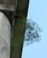
Tenacious Lifeby olddjComment: For me, I find the large object on the left side distracting and the angle makes me feel like I'm about to topple over. I keep turning my head to the right so I can see this with the tree and sky in a more "normal" position. |
 Photographer found comment helpful. Photographer found comment helpful. |
| 09/29/2005 02:35:10 PM |
|
| 09/29/2005 12:07:58 PM |
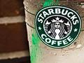
uncaffienated trendby totaldisComment: Good plug for Starbucks, but doesn't hold my interest as much as other entries in the challenge. |
| Photographer found comment helpful. |
| 09/29/2005 12:07:30 PM |
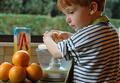
The making of ...by julesdvComment: Awww, how cute! I like his reddish orange hair - it fits well with the oranges themselves. I wish he was smilng too or looking like he was having fun. I wonder how this would look with just a bit more overall brightness? Nice entry though. Congrats. |
| Photographer found comment helpful. |
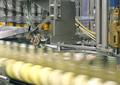
| 09/29/2005 12:06:10 PM |
Put a Lid on It!by phyattComment: Wow - I definitely get a sense of motion and speed from your photo. If someone gave this to me and asked me what the topic was, I wouldn't say beverage though. Industrial or factory, or automation, but not beverage. |
| Photographer found comment helpful. |
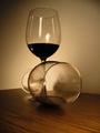
| 09/29/2005 12:05:07 PM |
Crimesonby cweedComment: My first reaction was - "don't let it fall off". The angle is a bit too much for me. I wish there was a bit more light overall. Without the red of the wine this is almost a monochrome or black and white photo (that's not necessarily a bad thing). For me, having another element somewhere in the photo would add interest. |
| 09/29/2005 12:03:15 PM |
Late night Redby coraanneComment: I like how the forground glass is laying on the table. From the title, I guess I expected to see more of the "red" in the wine, whereas it looks alot darker - almost to the point of black. I wonder how this would look if you also added some other element and off centered the glasses to add interest? |
| 09/29/2005 09:36:44 AM |
Light Desireby maxlevayComment: My favorite part is the lighting and moisture. My least favorite part is that it is set dead center and therefore lacks interest for me. Had it been slightly offset to one side or the other, I would have scored it a point higher. |
| 09/29/2005 09:35:27 AM |
Beveragesby beatles1-1Comment: Overall, the photo is a bit dark for me. The paper on the table is somewhat distracting, but I like the rectangular patterns created on the table by the window. Also, try making your photos slightly larger, using the 640 pixels or close to it as allowed by the rules. That will also have a greater impact to the voters. |
| 09/29/2005 09:32:14 AM |
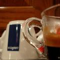
Espressoby LedZeppelin588Comment: Unfortunately, my eyes keep moving to the white mug in the background and not on your intended cup in the foreground. A bit more of that mug and less of the other, and I would have scored this better. |
| Photographer found comment helpful. |
Home -
Challenges -
Community -
League -
Photos -
Cameras -
Lenses -
Learn -
Help -
Terms of Use -
Privacy -
Top ^
DPChallenge, and website content and design, Copyright © 2001-2026 Challenging Technologies, LLC.
All digital photo copyrights belong to the photographers and may not be used without permission.
Current Server Time: 07/26/2026 01:25:23 AM EDT.