| Image |
Comment |
| 10/22/2005 09:27:10 PM |
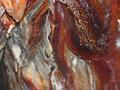
Naturel Beautyby mbanter32Comment: The highlights from the flash are a little harsh here and there, but you did capture some rich rust tones. Reminds me of underground caverns I've toured in upstate NY. |
| 10/22/2005 09:26:09 PM |
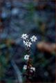
What!? Summers Over?!by daizyComment: I actually like the left hand side of your photo (the background) the best. The tan/brown background element on the left is distracting and my eyes keep getting drawn there and away from your main subject. |
 Photographer found comment helpful. Photographer found comment helpful. |
| 10/22/2005 09:24:43 PM |
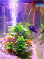
Confused?by cizkoComment: Not a bad shot. I like the fish and the plant in the middle. I find the blurriness of the right hand side detracts from the overall photo. I wonder how this would look if you cropped it in a bit more from the right? |
| 10/22/2005 09:20:11 PM |
That!by TheLittleIslandComment: My eyes follow where your subject is pointing and that leads me right out of your photo and I ignore the right half of it. Also, with his left hand at his waist...it makes me think he need to use nature's bathroom. |
| 10/22/2005 09:18:44 PM |
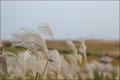
Wind blows.by ChinhyukComment: I've been viewing your photo for a few minutes and I'm not sure how this fits into the what category for me. I really like the lighting on the stalks, yet compared to other entries doesn't quite meet the challenge for me. |
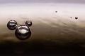
| 10/22/2005 09:17:28 PM |
Mystical Orbs, Mickey Mouse or...?by dr3amzComment: I can see the likeness of the mickey head outline - although with an enlarged ear
:-) For me, I would have liked a bit more of the bottom cropped off as it pulls my eyes to the bottom of the photo, when I think the lighter areas at top are more interesting. |
| Photographer found comment helpful. |
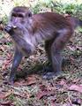
| 10/22/2005 09:15:58 PM |
Now you see this!by cfooComment: I like the animal's stance you captured. The overall color and saturation looks a bit...odd to me. I also wonder if a photo like this would work better as a horizontal so the tail could fit in and not be cut off? |
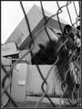
| 10/22/2005 09:14:40 PM |
WHATS He Upto??by doctabrezComment: I like the off centered composition. The highlights are a bit bright on my screen. I wonder how they would look toned down a bit. Also, when I look at his head the fabric in the background makes it look like he has a couple of horns coming out of his head - especially at the top and to the right. |
| Photographer found comment helpful. |
| 10/22/2005 09:13:13 PM |
|
| Photographer found comment helpful. |
| 10/22/2005 09:11:37 PM |
whiteby ThiRodriguesComment: My least favortie part of your photo are the benches (?) in the background. My favorite part is the shadow. I wonder how this would look if more of that large element at the top was cropped out a bit more? |
Home -
Challenges -
Community -
League -
Photos -
Cameras -
Lenses -
Learn -
Help -
Terms of Use -
Privacy -
Top ^
DPChallenge, and website content and design, Copyright © 2001-2026 Challenging Technologies, LLC.
All digital photo copyrights belong to the photographers and may not be used without permission.
Current Server Time: 07/28/2026 09:46:12 AM EDT.