| Image |
Comment |
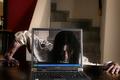
| 10/31/2005 08:09:46 AM |
Samara by kiwinessComment: I've only gone through about ten entries, but this is the second laptop shot...interesting. Seems to be a popular prop :-) Nice composition and setup. Dark and grunge seem to work well here on DPC - good luck in the challenge. |
 Photographer found comment helpful. Photographer found comment helpful. |
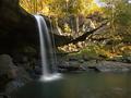
| 10/31/2005 08:07:53 AM |
See-Through Fallsby alanfreedComment: This looks like such a peaceful, and photogenic place. Very nice indeed. Pesonally, I would have scored this higher had it been in the Shutter Speed challenge. |
| Photographer found comment helpful. |
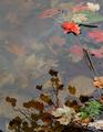
| 10/31/2005 08:06:47 AM |
Red Leaf on the Lakeby Prof_FateComment: My favorite part of your photo is the upper right hand corner. I like the red leaf on top and then the red leaves beneath the water. |
| Photographer found comment helpful. |
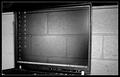
| 10/31/2005 08:05:53 AM |
Bricksoftby marvinComment: I did take my eyes a minute to figure tis out - point for creativity. I think with a bit more sharpness around the laptop it would be even more effective - for me. |
| Photographer found comment helpful. |
| 10/31/2005 08:05:04 AM |
|
| Photographer found comment helpful. |
| 10/31/2005 08:04:04 AM |
Transparent Buildingby NekoNitaComment: Good, strong shot of the building at night. I wonder how this would look with more of the bottom cropped out? |
| Photographer found comment helpful. |
| 10/31/2005 08:03:00 AM |
refraction through glass marblesby myceliumComment: Very cool. I look forward to reading how this was done once the challenge is over. My favorite part is the large one in the middle and the three on the right hand side. |
| Photographer found comment helpful. |
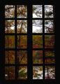
| 10/31/2005 08:01:31 AM |
Abbey Windowby KaDiComment: Nice photo. I like the silhouetted window - it's a very strong element. |
| Photographer found comment helpful. |
| 10/31/2005 08:00:30 AM |
Clear indulgenceby dmmontyComment: A good idea. I like how the bottle looks through the glass. For me, I would have cropped this closer to your subjects though. Both objects are vertical, but your frame is a horizontal. To me, that makes it look kind of..."squished" - whereas changing this to portrait (or vertical) would enhance. |
| Photographer found comment helpful. |
| 10/30/2005 07:34:26 PM |
Just Lookingby tazzaComment: What a sweet face. For me, I think I would have liked this pulled back just a bit and maybe a bit more focus or clarity around those big eyes. |
| Photographer found comment helpful. |
Home -
Challenges -
Community -
League -
Photos -
Cameras -
Lenses -
Learn -
Help -
Terms of Use -
Privacy -
Top ^
DPChallenge, and website content and design, Copyright © 2001-2026 Challenging Technologies, LLC.
All digital photo copyrights belong to the photographers and may not be used without permission.
Current Server Time: 05/10/2026 08:07:28 PM EDT.