| Image |
Comment |
| 02/18/2006 09:28:04 PM |
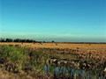
Farming In The Evergladesby LVEComment: For me, if you cropped more from either the top or bottom of your image to remove the horizon from the "dead" center, it would be more effective. The foreground doesn't hold my interest much, but I like the field in the middle and the sky. |
| 02/18/2006 09:26:37 PM |
|
 Photographer found comment helpful. Photographer found comment helpful. |
| 02/18/2006 09:25:35 PM |
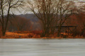
accross the frozen riverby jholderComment: The structure is interesting. I think if it were cropped out a bit more from the bottom and maybe not quite so...orange on the land it would be a more effective and interesting image. |
| 02/18/2006 09:23:52 PM |
Cowboy's Prideby JRalstonComment: It took my eyes a moment to recognize the cowboy hat. For me, had there been a bit more light and definition along the brim, I would have scored it better. |
| Photographer found comment helpful. |
| 02/18/2006 09:23:00 PM |
|
| 02/18/2006 09:22:15 PM |
Retiredby whiteroomComment: While I think your image fits the challenge it seems overly processed and too black, but then again, I'm not a big fan of the grunge look that seems to have taken hold here at DPC. |
| Photographer found comment helpful. |
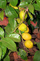
| 02/18/2006 09:21:22 PM |
Rural Citrusby kama0529Comment: Your flash appears a bit harsh. A different lighting source might produce a better result. |
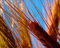
| 02/18/2006 09:20:25 PM |
Amber Waves of Grainby banmornComment: I like the contrasting colors. It took my eyes a moment to realize what it was. I wonder how this would look if you pulled back just a bit, letting the viewer see more of the grain/stalk. Good natural lighting and colors though |
| Photographer found comment helpful. |
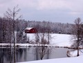
| 02/18/2006 09:19:00 PM |
Snowy Sundayby woodseyComment: When I first looked at your image, I cocked my head sideways to match your horizon. I think if your photo was rotated a bit counter-clockwise and maybe a bit less red or stronger whites on the snow, this would be a great shot. |
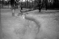
| 02/18/2006 09:17:38 PM |
A Creek Runs Through Itby melissiaComment: Personally, I always like to see an image that is close to the maximum allowed 640 pixels. Gives me a good overall sense for the photo. The upper middle portion of your shot seems most interesting, but again, I really wish it was larger. |
| Photographer found comment helpful. |
Home -
Challenges -
Community -
League -
Photos -
Cameras -
Lenses -
Learn -
Help -
Terms of Use -
Privacy -
Top ^
DPChallenge, and website content and design, Copyright © 2001-2026 Challenging Technologies, LLC.
All digital photo copyrights belong to the photographers and may not be used without permission.
Current Server Time: 05/10/2026 09:02:58 AM EDT.