| Image |
Comment |
| 02/26/2006 08:24:01 PM |
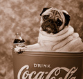
Have A Coke and a Pug !!by ShutterPugComment: I had decide to only cast votes until I saw your image. Oh My God! What a hilarious, absolutely fantastic image! I've never been a fan of this particular breed, but again, just too funny and cute. It's the pug poster pooch for Coca-Cola. Good luck in the challenge. 10 |
 Photographer found comment helpful. Photographer found comment helpful. |
| 02/23/2006 10:40:30 PM |
|
| Photographer found comment helpful. |
| 02/23/2006 10:38:29 PM |
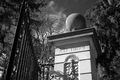
The Old Gateby drake217Comment: The light you've captured in your photo makes this ordinary, uninteresting subject...interesting. Nicely done. |
| 02/23/2006 10:36:56 PM |
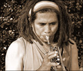
Sax soloby burtctComment: I like your image and choice of duotones. There's something...odd...about the line around the hands themselves that make them appeared cut-outs or something. |
| Photographer found comment helpful. |
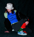
| 02/23/2006 10:26:37 PM |
My Own Styleby angela_packardComment: Ah, I think the shirt pretty much says it all. I have a feeling you had fun putting on the most funky things you could find. I especially like the green socks. |
| Photographer found comment helpful. |
| 02/23/2006 10:25:48 PM |
2006by Postgate1Comment: I like the free feeling pose. The lighting could use some work and I'm not sure what that white string is, but for me, it would be a better image without it. |
| Photographer found comment helpful. |
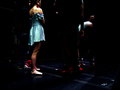
| 02/23/2006 10:24:55 PM |
Stands out in the crowdby qwhartonComment: Both of the light lit people stand out to me, but my eyes keep getting drawn to the blurred one and away from what I think was meant to be your main subject, her. |
| Photographer found comment helpful. |
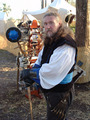
| 02/23/2006 10:23:58 PM |
The Heighth Of Swordmaster Fashionby sickdogComment: The thing I like best about your image is the swordmaster himself. The thing I find detracting is the business of the item behind him - it keeps pulling my attention away from him. |
| Photographer found comment helpful. |
| 02/23/2006 10:23:14 PM |
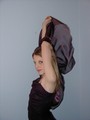
Purple Formalby 4forfunComment: For me, this might work better had her body been more partially turned to the camera rather than a straight side shot. Also, the line down the right hand side is very distracting, along with the dark spot by her raised arm. |
| 02/23/2006 10:22:08 PM |
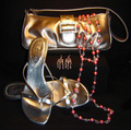
Step Out in Styleby Kris287Comment: I like your idea, but for some reason, I can't explain (and this may not make any sense) your composition feels forced...or...stuffy...something about it looks...rigid. Sorry I can't put it in better terms. |
Home -
Challenges -
Community -
League -
Photos -
Cameras -
Lenses -
Learn -
Help -
Terms of Use -
Privacy -
Top ^
DPChallenge, and website content and design, Copyright © 2001-2026 Challenging Technologies, LLC.
All digital photo copyrights belong to the photographers and may not be used without permission.
Current Server Time: 05/10/2026 06:02:12 AM EDT.