| Image |
Comment |
| 08/11/2007 05:25:36 PM |
|
| 08/11/2007 05:24:19 PM |
Shake And Go Racers...GO!!by MrEComment: Without the benefit of your title, its very difficult to see what this is - for me at least. All my eye truly sees and focuses on is the yellow stripe. |
| 08/11/2007 04:50:39 PM |
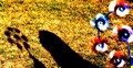
Mill in the Windby gerhardsComment: Interesting image. My eyes either want to look at the shadow only or just the pinwheels on the right, but not both together. A bit too saturated in the ground colors for my personal taste. |
| 08/11/2007 04:49:20 PM |
|
 Photographer found comment helpful. Photographer found comment helpful. |
| 08/11/2007 04:47:45 PM |
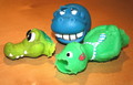
Toysby kabirComment: Well, those are definitely a bunch of toys. My eyes wander all over and there's no real focal point for them. Also, if you can, try to utilize the full 640 pixel area we're given for our entries. Bigger sometimes has a better impact. |
| 08/11/2007 04:46:21 PM |
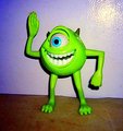
My friend Mikeby GThumbtackComment: For me, the background and the flash area in the upper right don't work. I think if you werre to add another element or two or put Mike outside peering through some leaves or something, might make this more interesting. |
| Photographer found comment helpful. |
| 08/11/2007 04:44:07 PM |
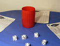
Yahtzeeby whiterookComment: Good concept, yet the setup seems a bit..I don't know...too far spread apart? Maybe a different background or if there was some writing on the score sheets. Seems to be lacking a unifying cohesiveness for me. |
| Photographer found comment helpful. |
| 08/11/2007 04:42:54 PM |
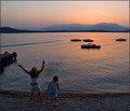
Standoffby posthumousComment: For my concept of this challenge, your photo doesn't fit as well as others. I do like seeeing this in b&w and I like the angle you took it from. |
| Photographer found comment helpful. |
| 08/11/2007 04:41:52 PM |
Damaged Toysby ccaComment: Lol - they kind of remind me of my dog's toys after he's gnawed on them for a while. I think maybe a black background would add a bit more of a dramatic effect, for me anyways. |
| Photographer found comment helpful. |
| 08/11/2007 04:40:33 PM |
My World in a Bubbleby NorthernCanuckComment: For me, your image would have been more appealing if the bubble were a bit more in focus or if there were other element(s) in your photo to add interest. |
| Photographer found comment helpful. |
Home -
Challenges -
Community -
League -
Photos -
Cameras -
Lenses -
Learn -
Help -
Terms of Use -
Privacy -
Top ^
DPChallenge, and website content and design, Copyright © 2001-2026 Challenging Technologies, LLC.
All digital photo copyrights belong to the photographers and may not be used without permission.
Current Server Time: 07/28/2026 12:30:22 AM EDT.