|
|
|
Showing 1011 - 1020 of ~1483 |
| Image |
Comment |
| 01/22/2003 09:24:11 PM | Loading Onlyby GotchaComment: I am not sure how you did this, but I love the effect you have created, really changes a boring scene into something very interesting. Good Luck! |  Photographer found comment helpful. Photographer found comment helpful. |
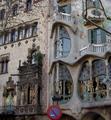
| 01/22/2003 09:17:20 PM | Signs by Antoni Gaudiby bcncrazyComment: What a fantastic building, would have done so well in the windows and doors challenge, however is a bit weak on the signs! Still, I love this! Isn't this the same architect whose ideas they are thinking of using for the Gound Zero site? |
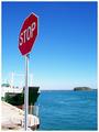
| 01/22/2003 09:12:46 PM | The Obvious!by GraciousComment: I love the composition of this, also good use of DOF to emphasise the sign. Good Luck | | Photographer found comment helpful. |
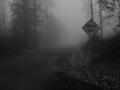
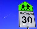
| 01/22/2003 09:10:21 PM | Onward by AlecComment: What a great, atmospheric shot this is, with the road sign totally matching the mood of the scene. Good Luck! |
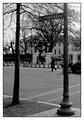
| 01/22/2003 09:05:47 PM | 1600 Pennsylvania Ave.by iraeComment: This is a great street scene and great in B/W. Not sure that the road sign element is strong enough, but I still like it! |
| 01/22/2003 09:03:53 PM | | | Photographer found comment helpful. |
| 01/22/2003 09:02:52 PM | War signby bkumerComment: This is a great shot, very interesting wall behind and great use of title to tell a story. Perhaps colour saturation could be boosted a bit on the sign. |
| 01/22/2003 08:51:15 PM | My New Tatooby AnachroniteComment: Critique Club
Composition-Content
Now this one really deserved to win! Something we can all relate to and the best DPC fanatic picture I have seen on this site! Really got me lauging! I love the composition of this, really looks like someone just got a new tattoo and showing it off to their friends. Great simple composition, with the hands perfectly placed and the dark clothing, the jeans just showing enough detail but without distracting from the point. "Cheeky" but no crude!
Background
I like the way that the black T.shirt has faded into the background, creating negative space and once more allowing the viewer to concentrate on the interesting part! Perhaps the highlights from the belt on the left, behind the arm, could have been covered up, a minor detail.
Technical
You had a few comments that the lighting was a bit dark, personally I think that the lighting is pretty good here, with the skin being evenly lit, with no blown out parts. The lighting is strongest on the DPC logo which is good cause it brings attention to it, not that anyone could miss it! Focus seems spot on, with the Logo in sharp focus but the hand on the right slightly softer.
My Opinion
I think that this is a great shot, perfectly fits the challenge, definitely gets a few laughs and is technically well done. Just a shame that it wasn't in the top 3. B/W issues, bare skin issues, who knows? I think that this should be the new DPC advertisment. Anyway, hope that this helps yo and Good Luck in the next challenge. | | Photographer found comment helpful. |
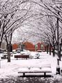
| 01/22/2003 08:31:29 PM | Thames Street Parkby brianedenComment: Critique Club
Composition-Content
This is a lovely winter scene, the way that the canopy of trees leads you into the picture is great. The angle that this has been shot from is good, with foreground, middle and background interest. I think that cropping out the grey building would have enhanced the composition a lot, and provided better balance in colours and also given more impact to the red building. Cropping until the edge of the second tree on the left would have been good, IMO.
Background
The background (minus the grey building!) really sets of this picture, with the path of trees naturally leading you into thebackground, nice and easy!
Technical
Focus seems a tiny bit aoft on the bench in the foreground, I wonder if deeper DOF would have worked here. I think that you have done a pretty good job of capturing the true colour of snow, someone mentioned that it looked a little pink. To get snow pure white, you should do exposure bracketing, if your camera has it! +2EV for sunlit snow and +1.5EV for overcast snow, plus or minus to achieve the correct results. I tried this recently and was quite happy with the results.
My Opinion
I think that this is a very pleasing picture, a lovely quiet view of city life. I think that probably some of the voters didn't see this as a strict landscape, perhaps costing you a few votes. But, Congrats on a lovely picture and Good Luck in the next challenge. |
| 01/21/2003 11:01:29 PM | |
|
Showing 1011 - 1020 of ~1483 |
Home -
Challenges -
Community -
League -
Photos -
Cameras -
Lenses -
Learn -
Help -
Terms of Use -
Privacy -
Top ^
DPChallenge, and website content and design, Copyright © 2001-2026 Challenging Technologies, LLC.
All digital photo copyrights belong to the photographers and may not be used without permission.
Current Server Time: 07/18/2026 01:46:15 AM EDT.
|