| Image |
Comment |
| 09/26/2005 06:32:29 PM |
Sympathyby justin_hewlettComment: A nice photo of the flower. Very good colour and nice sharpness on the flower. Unforunately, that sharpness came with a fairly well defined background. I would have liked a little more blur on the background. I think it's a good fit into the challenge. |
 Photographer found comment helpful. Photographer found comment helpful. |
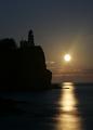
| 09/26/2005 06:30:07 PM |
Encouragementby Links 2 3 4Comment: A nice shot. Well placedsilhouette, IMO. There seems to be a hot pixel or 2 on the lower left corner. I think it's a decent fit into the chalenge, but a flash of light from the lighthouse would have really added some pop to the encouragement theme. Overall, good work. |
| Photographer found comment helpful. |
| 09/26/2005 06:27:00 PM |
New Homeby frogletComment: Very cool look at the roof lines Makes for an interesting composition. The lighting is a little flat ... I would have liked to have seen something a little more dramatic. JMO |
| Photographer found comment helpful. |
| 09/26/2005 04:01:41 PM |
Loveby pedahel7Comment: I think this works as a greeting card. The composition is nice and the red colours realy stand out nicely. For a greeting card, Ithink that the grain works. |
| Photographer found comment helpful. |
| 09/26/2005 01:40:30 PM |
Thinking of Youby irikaComment: Overall, a nice photo and a good fit into the challenge. I really like the shallow DOF. A minor point ... There is small dot along the top of the image that looks like a dust spot or maybe an imperfection on the flower. |
| 09/26/2005 01:02:15 PM |
Thinking of Youby sherComment: A really nice shot. I like the tones and the texture. The lower part of the image is really nice, but I find the upper part to be a little distracting. It may be the brightness of the water or the slight lack of focus, I'm not sure. |
| Photographer found comment helpful. |
| 09/26/2005 12:46:27 PM |
Memorial dayby jonasvalComment: The image is very good. I think the composition and the processig have been well executed. The gradient in the sky is a bit strong maybe. For me, this challenge requires an appropriate title for it to fit well in the challenge. I'm not American, but I believe that Memorial Day is a remembrance for those that fought in the war. This image doesn't really seem to fit with the Memorial Day title. JMO. |
| Photographer found comment helpful. |
| 09/26/2005 12:39:34 PM |
Condolencesby OzzieComment: Very ice image Wonderful colours ... yellow on blue is always agreat colour combination. I think the crop on the right side is a little tight. Other than that, I really like it. |
| Photographer found comment helpful. |
| 09/26/2005 12:38:02 PM |
Thinking of Youby milo655321Comment: Wonderful use of shallow DOF. Works well in the challenge. The white flowers in the background are a bit of a distraction. |
| Photographer found comment helpful. |
| 09/26/2005 12:36:15 PM |
friendshipby suemackComment: Very cute and I think very fitting into the challenge. The soft quality of the feathers gives this a greeting card feel. I would have liked to have seen some catchlight in the eyes to be top quality. Overall, a very good challenge entry. |
| Photographer found comment helpful. |
Home -
Challenges -
Community -
League -
Photos -
Cameras -
Lenses -
Learn -
Help -
Terms of Use -
Privacy -
Top ^
DPChallenge, and website content and design, Copyright © 2001-2026 Challenging Technologies, LLC.
All digital photo copyrights belong to the photographers and may not be used without permission.
Current Server Time: 07/17/2026 05:01:49 AM EDT.