| Image |
Comment |
| 05/03/2006 03:06:05 PM |
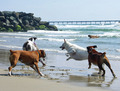
Dog Days of Summerby JeffryZComment: Nice take to the challenge. The main probably here is the contrast. It fine on the foreground but with the rocks in the back and the water it just looks flat. Not anything you can fix in basic editing really so I probably would have tried to minimize that problem when composing this (i.e. more beach in the shot or have the dogs closer to the water if possible). |
 Photographer found comment helpful. Photographer found comment helpful. |
| 05/03/2006 02:52:39 PM |
|
| 05/03/2006 02:50:58 PM |
|
| Photographer found comment helpful. |
| 05/03/2006 02:49:24 PM |
|
| Photographer found comment helpful. |
| 05/03/2006 02:47:03 PM |
|
| 05/03/2006 02:45:57 PM |
|
| Photographer found comment helpful. |
| 05/03/2006 02:41:47 PM |
|
| 05/03/2006 02:41:23 PM |
|
| Photographer found comment helpful. |
| 05/03/2006 02:40:11 PM |
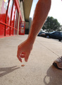
See A Penny and Pick It Up...by island_girl1Comment: The background is a real issue for me. There's just too much happening back there (i.e. lots of contrast and color) which pulls my eye to the center rather than the hand and the penny. Probably a better way to shoot this was to face the wall or something more uniform so that the hand and penny stand out more. |
| 05/03/2006 02:36:26 PM |
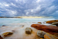
Life's a Beachby aznchic88Comment: Nice take to the challenge. The main issue here for me is the lack of good tonality. It just looks too harsh. Maybe use a gradient adjustment layer and bring down the opacity to produce better color transitions. |
Home -
Challenges -
Community -
League -
Photos -
Cameras -
Lenses -
Learn -
Help -
Terms of Use -
Privacy -
Top ^
DPChallenge, and website content and design, Copyright © 2001-2026 Challenging Technologies, LLC.
All digital photo copyrights belong to the photographers and may not be used without permission.
Current Server Time: 06/21/2026 12:41:20 AM EDT.