| Image |
Comment |
| 05/13/2006 10:54:46 PM |
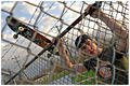
No Entryby Joey LawrenceComment: Comment:
Greetings from the Critique Club...
Ha! I almost commented on this earlier today but didn't and then it pops up as my next image to critique in queue. Go figure.
Anyway, I thought this was fantastic. I simply don't get the lousy score at all. What's not to like? The subject stands out despite everything around him. The composition, DOF and all of the little details from the barb wire to the power lines rule. Your images always have a lot to say and this is another one. Hopefully you have something in the Environmental Portrait challenge because there are few if any that I would rather see an entry from than you. Heck, just reshoot this one! :P
Sorry I wasn't any help. This is perfect and fits the challenge, IMO so just ignore the score would be my suggestion. |
 Photographer found comment helpful. Photographer found comment helpful. |
| 05/13/2006 10:41:23 PM |
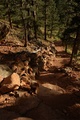
Life is a journey, not a destinationby essieComment: Comment:
Greetings from the Critique Club...
A really good image, with excellent detail and tonal range. From the looks of it a few people thought this image was too dark. I don't get that because it looks fine on my monitor, which I purposely have slightly on the dark side. That's a shame because this is a good image and an excellent challenge entry to boot.
Beyond the monitor issues I think people overall had trouble seeing the path mainly because it leads into the woods rather than into an opening. If this was advance editing I might suggest some spot editing to make the path appear a bit more visible. Other than that this works. As someone mentioned, this could work as an inspirational poster as is. So congrats on a nice capture and better luck next time. |
| Photographer found comment helpful. |
| 05/13/2006 10:27:44 PM |
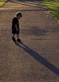
Me and My Shadowby wavelengthComment: Comment:
Greetings from the Critique Club...
Such a cute image and a wonderful take to the challenge. I really like the composition and the pose just rocks. The main thing holding this back in my opinion is the patches of grass. Had those not been there the simplicity of this image would have been even more pronounced and would have boosted your score much higher, IMO. It seems trival but those little things end up meaning alot in these challenges.
Regardless, of your score this is a real winner. There is nothing about this that looks contrived, which is a great thing to capture! Good luck in the future. |
| Photographer found comment helpful. |
| 05/13/2006 10:17:17 PM |
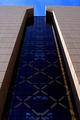
Tuning Inclineby bladComment: Comment:
Greetings from the Critique Club...
First off, let me say I like the color and detail a lot. The quality overall is really good, IMO. However as was pointed out, the imbalance in the composition detracts somewhat especially this being an entry for the rhythm challenge. The main thing that brings that out for me is how the light is hitting the building on the right side particular the bottom where the lines of the building exit the frame. Even though the lines running down and away appear to leave the frame at the same area the lighting makes it look like the right side exits further down, if you know what I mean. What I might have done to compensate would be to get more of the lower part of the building in the shot so that those lines running down would both exit at the very bottom corner of the frame.
As far as the top not being straight, obviously you could fix that in camera but also in post by just rotating it slightly and then cropping it a bit tighter to get your rectangle crop back. That actually doesn't bother me as much as the bottom part.
Other than that it's a really good image. It's full of color and it's very rhythmic. A perfect choice for the challenge! |
| Photographer found comment helpful. |
| 05/13/2006 10:00:58 PM |
Stand On Your Own Two Feetby OriontjComment: Comment:
Greetings from the Critique Club...
Hi Todd. I really like your shot and the idea behind it. As a challenge entry it works the theme really well, IMO.
As mentioned during the challenge that dark barrier at the top really takes away from this image. Might I suggest taking a different angle perhaps further to the right or left of your subject, just enough to allow you to crop off that barrier. Or maybe have this person swim out to the barrier and stand on it instead? :P
Seriously, the barrier is the main thing but you probably already new that. The other thing is the image is on the small side. Taking advantage of the 640 width limit is really to your advantage especially in shots like this. It just gives a better impression about the quality when it's larger.
|
| Photographer found comment helpful. |
| 05/13/2006 09:41:14 PM |
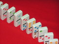
Dominoesby elisabComment: Comment:
Greetings from the Critique Club...
Let me start out by saying this fits the challenge pretty well. Generally speaking, the colors are good which make the subject (dominos pop). Also the crop works however you may want to try it in a square crop in the future using that diagonal layout.
The main problem with this photo, IMO is the background particularly that top right corner. I see blotches in that area, which makes me think it's the result of jpg compression when you saved this. Looking at the file size, which is only 50 kb seems to confirm that. In the challenges you are allowed up to 150 kb and I would highly recommend you saving it as close to that as possible so you can keep as much detail as possible or in this case avoid unwanted detail. If this isn't the result of that then I would try lighting that corner better or using some other background for the shot, one that is more uniform in hue.
Other than that background issue the image is ok. The only other thing I might suggest is to take a different angle rather than shooting from above like you did here. Something much lower where the dominos look larger than life would have really added some much needed wow factor.
That's it. I wish you good luck in future challenges. If you have any questions about my comments feel free to PM me. |
| 05/13/2006 09:20:29 PM |
Think Of Meby msieglerfrComment: Comment:
Greetings from the Critique Club...
First off, let me say this fits the challenge pretty well. As for the image itself, the composition is what strikes me the most. It's really quite unique but better than that it just works. It conveys boredom and solitude which goes well with the title so good job there.
Technically, there are some issues namely the lighting. The bright background is fine but the lighting on the cat doesn't transition well. For example the cat's back there is this "banding effect" going on. It goes from bright white to gray to pure black in three steps. Maybe you wanted the harsh look but a more seemless transition would have probably gone over better with the voters. Also, if you had more light cascading over the cat you'd have captured more detail in the fur.
That's it. The image is good and as far as I'm concern this could be used for a varity of things (i.e. post cards) especially with that solid black area which could be used for text. So just take these suggestions as ones geared toward doing better at DPC where detail is king. :) |
| Photographer found comment helpful. |
| 05/13/2006 04:48:42 PM |
|
| 05/13/2006 04:47:01 PM |
|
| Photographer found comment helpful. |
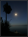
| 05/13/2006 04:45:35 PM |
All is stillby PaulEComment: Too bad the moon (or star?) wasn't higher up. Other than that this is perfect. |
| Photographer found comment helpful. |
Home -
Challenges -
Community -
League -
Photos -
Cameras -
Lenses -
Learn -
Help -
Terms of Use -
Privacy -
Top ^
DPChallenge, and website content and design, Copyright © 2001-2026 Challenging Technologies, LLC.
All digital photo copyrights belong to the photographers and may not be used without permission.
Current Server Time: 06/21/2026 03:03:42 PM EDT.