| Image |
Comment |
| 05/19/2006 11:48:53 PM |
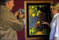
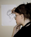
Divulge Painting Conspiracyby BrianRComment: Greetings from the Critique Club...
Overall, I liked the image. What I liked most was the color and the lighting, which gave the image good clarity. Since there are so many movies that involve painting/painters the moment I saw this it just felt appropriate for the challenge. So good choice there.
Compositionally, it works but the crop is a bit too tight, IMO. The main issue with that is the painting itself which is close to the edges. Normally I would avoid that by cropping tighter or including more space. The models on the other hand are cropped very well. I like how they are flush against the frame.
The image also seems a bit blurry in some areas. Not sure if that was part of the original image or due to neatimage. I think if this had better overall sharpeness and some more spacing around the painting this would have scored much higher.
Let me know if you have any questions. Good luck and I look forward to seeing more of your work.
Edited for clarity. Message edited by author 2006-05-19 23:51:52. |
| 05/19/2006 09:35:39 PM |
|
| 05/19/2006 09:32:01 PM |
|
 Photographer found comment helpful. Photographer found comment helpful. |
| 05/19/2006 09:16:26 PM |
|
| Photographer found comment helpful. |
| 05/19/2006 06:31:48 PM |
|
| Photographer found comment helpful. |
| 05/19/2006 03:21:49 PM |
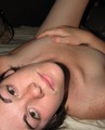
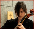
Playing for Jesusby GunnsiComment: Greetings from CTP2
Very nice portrait. This seems to be shot at a holy place so it fits the challenge as far as I'm concern. Even if it wasn't it depicts a holy place pretty well.
As for the image itself, it's pretty good. I like the composition particularly how her arms/shoulders run off both sides of the frame leaving no gaps. The cello cut off really doesn't bother me. I think you got enough of it to tell the viewer what instrument she is playing.
Regarding improvements, I probably would have liked to see her a bit more in focus since the cello is much sharper. Looking at your settings I can see where that may have been difficult to control. I know I always hate bumping up the ISO beyond 100 but maybe you should have here to geta smaller aperture setting? Also, I think having a bit more light on her face would have helped. Maybe some fill flash or a small reflector.
Overall, I like the image. In terms of the challenge theme you hit it square on, IMO. I also like how you shot something different. I tried to do the same especially since I knew I wouldn't be able to compete with those entering stunning interiors of older style churches. Since scalvert made the top ten shooting something similar I think you were on the right track. Good luck in your next challenge.
Edited for spelling. Message edited by author 2006-05-19 15:22:57. |
| Photographer found comment helpful. |
| 05/19/2006 02:57:29 PM |
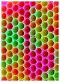
Note something?by talikfComment: Greetings from CTP2
I really like the illusion you captured. In addition to having that note in there I like how you can see this as a bunch of straws or as a bunch of tiny balls stacked together. The color also works pretty well as just an abstract even if you don't notice the note framed by it. The composition is also on target.
The only thing that seems a little odd to me are the straws that make up the note, which are not as sharp as the others.
In terms of improving your score in the challenges, I would suggest going with a cleaner look and by that I mean having those straws that define the note as sharp as the others. That's really it. I like abstracts and this is a good abstract. |
| Photographer found comment helpful. |
| 05/19/2006 02:24:46 PM |
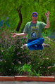
Driving People Crazyby margiemuComment: Greetings from CTP2
I like the idea. Very over the top with the number of cameras and badges he has on. For some reason perhaps due to the blur and him tilting forward, I keep thinking he's on rollerblades when he's not. If this is someone you know maybe if you decide to reshoot this idea in the future have him wear a pair of rollerblades. If you do that try out some landscape framing with him off-center to really enhance that motion and crazy feel to this subject. Or go really crazy with the composition (diagonally lined subject) to really play up the crazy theme.
In terms of the technicals, I like the choice in blurring the background a bit. However, as gazdi said, make that selection a bit tighter to avoid those sharp patches left behind. I know sometimes I make those same mistakes. It usually happens when I am too caught up in a differet part of the image trying to fix that I don't notice other things wrong. What I find helpful is to allow enough time before the deadline to revisit my edited entry so that I have a fresh pair of eyes looking at the photo and a lot of times I end up re-editing it to good results.
Other things to consider in terms of improvement would be contrast and sharpening boosts. I think there is room for more of that here. The main thing I would probably do here is make the blacks a tad blacker either by using curves or selective color if you use photoshop.
Overall, I like what you captured. The subject has very good detail and is sharp as is.
Edited for clarity and spelling. Message edited by author 2006-05-19 14:26:46. |
| Photographer found comment helpful. |
| 05/19/2006 03:46:56 AM |
|
| Photographer found comment helpful. |
| 05/19/2006 02:43:16 AM |
|
| Photographer found comment helpful. |
Home -
Challenges -
Community -
League -
Photos -
Cameras -
Lenses -
Learn -
Help -
Terms of Use -
Privacy -
Top ^
DPChallenge, and website content and design, Copyright © 2001-2026 Challenging Technologies, LLC.
All digital photo copyrights belong to the photographers and may not be used without permission.
Current Server Time: 06/21/2026 06:19:53 PM EDT.