| Image |
Comment |
| 05/21/2006 09:30:02 PM |
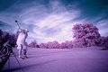
In Thoughtby gt7435bComment: Returning for comments. Nice portrait. I really like the lighting and composition best. One thing that bothers me a bit is a spot on your forehead. The highlights there seem darker. Not sure if that was a hot spot that you fixed or just so oddity in the lighting. Btw, you look a lot like the actor Woody Harrison. :P Good luck in the challenge. |
 Photographer found comment helpful. Photographer found comment helpful. |
| 05/21/2006 02:34:24 AM |
|
| Photographer found comment helpful. |
| 05/21/2006 02:23:49 AM |
|
| Photographer found comment helpful. |
| 05/20/2006 10:28:30 PM |
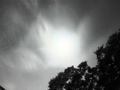
Long Night Skyby photonComment: Greetings from the Critique Club!
First off, let me say welcome to DPC! I see this was your first challenge you entered. I hope there will be many more that follow. Below is my critique of your photo. Please take these as suggestions/things to consider.
Technicals:
I'm not sure exactly what your intentions were but I think you wanted to capture the near full moon. If so your exposure time was way too much as everything in the sky got blown out. Try a much faster shutter speed (say 3 seconds to start out with) and an aperture setting around 4 or 5.6 to give you a bit more DOF. I'd rather have a image on the dark side than on the bright side since darker images are easier to fix in post processing so keep that in mind when experiementing with your settings.
Subject/composition:
The trees are a real distraction. Getting a good exposure of the night sky with the trees that close may be next to impossible so I'd suggest composing this shot different so any trees in the shot would be at a greater distance. That way any wind effects would be far less noticable. Also, I'd suggest framing the subject off-center. I assume the moon is in that bright spot so when you frame this have it more to the left preferrably.
Verdict/Summary:
The image suffers greatly due to the technicals. With time I think you can get a sharper cleaner image. Even if you wanted that bright glow in the sky the trees that close will continue to give you problems so have those at a greater distance and your image will come across better. |
| Photographer found comment helpful. |
| 05/20/2006 09:37:23 PM |
Rose Hill Churchby TwylaComment: Greetings from the Critique Club...
Interesting image. What I like best is the detail you captured on the roof and how you enhanced it in PP. By itself it would make for a good texture image in it's own right.
As for the rest of the image, it looks fine however the grass kinda bugs me to be honest. I can see you did a lot of burning but I don't understand why you did more of it on the right side and not the left. If you wanted to leave in some detail I think you shouldn't have burnt the grass tips so much that way there wouldn't be that harsh transition in the grass.
Overall, the image is good. I think you did as much as you could to bring out it's appeal. However, I feel that appeal was simply limited. What might have produced more appeal would be to have more of the roof in the shot (wider angle?) and if there was a cross up there to have it in the shot as well. I just don't feel that these windows have enough appeal to carry the shot by themselves. Maybe if they were stained glass that would have been a different story.
|
| 05/20/2006 08:49:16 PM |
Windsongby CalliopeKelComment: You know when these girls are adults you should take all your photos of them and put them in a flash movie to see them grow up again right before your eyes. It would be really cool. |
| Photographer found comment helpful. |
| 05/20/2006 08:46:41 PM |
|
| Photographer found comment helpful. |
| 05/20/2006 08:05:43 PM |
Jazzby idnicComment: So finally this is cindi and not idnic! :P I really like the lighting in this. |
| Photographer found comment helpful. |
| 05/20/2006 02:08:04 AM |
|
| Photographer found comment helpful. |
| 05/20/2006 01:59:50 AM |
|
| Photographer found comment helpful. |
Home -
Challenges -
Community -
League -
Photos -
Cameras -
Lenses -
Learn -
Help -
Terms of Use -
Privacy -
Top ^
DPChallenge, and website content and design, Copyright © 2001-2026 Challenging Technologies, LLC.
All digital photo copyrights belong to the photographers and may not be used without permission.
Current Server Time: 06/21/2026 06:22:10 PM EDT.