| Image |
Comment |
| 05/29/2006 01:00:59 AM |
|
 Photographer found comment helpful. Photographer found comment helpful. |
| 05/29/2006 12:59:35 AM |
Clock Tower [high key]by SDWComment: LOL @ you pointing out that this is high key. It shouldn't be needed but you're probably right taking no chances. As for the photo I really like it. My only nitpick is you should have burned that lower window so it's like the top one. |
| Photographer found comment helpful. |
| 05/29/2006 12:30:51 AM |
|
| Photographer found comment helpful. |
| 05/26/2006 11:34:27 PM |
Afternoon Teaby SJCarterComment: I've tried shooting something similar since I have deer that like to sit in my yard but they almost never do that with this type of lighting present. Super shot. Just food for thought, think about cloning that one strand of grass that stands out a little too much. |
| Photographer found comment helpful. |
| 05/26/2006 11:31:29 PM |
|
| Photographer found comment helpful. |
| 05/26/2006 11:29:13 PM |
Red Eyeby SJCarterComment: Very nice macro. I love the DOF. The detail and the background blur is fantastic. Just as a minor tweak I'd blend in those hot spots on the leaf so that it blends in with the rest of the color. I'd probably use selective color to adjust the whites with the fly masked out to preserve that. |
| Photographer found comment helpful. |
| 05/26/2006 11:20:44 PM |
Don't Bug Meby SJCarterComment: This came out great. It almost looks like you painted him on the spot! One thing, have you tried rotating the image 90 degrees counter clock wise? It may look better the way you have it but since he's looking down I'd see how the rotation looked. |
| Photographer found comment helpful. |
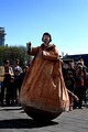
| 05/26/2006 11:07:50 PM |
artistby biggisComment: Greetings from the Critique Club!
First off, great photo. I like the oddity of this shot a lot. What hurt you the most was this being a bit of a stretch on the challenge theme. Chaimelle said it perfectly in her comment so I won't go further there.
Technicals:
The color was captured well from the sky on down. The lighting on the main subject is also good. Although I wish the crowd was better exposed. That might have been difficult to accomplish in-camera but in post editing it could have been improved using masks and curves.
Subject/composition:
I like the choice in subject. You definitely captured him in his element but as mentioned before it feels more like a candid than portrait. In terms of the composition, I liked the choices made. I only wish the build on the left wasn't there. Maybe a different angle would have eliminated that or minimized it to the point it could easily be cloned without any worries of a DQ. Personally, I think you could have gotten away with just cloning out the building as is since it takes up so little of your shot. However, to be safe I'd ask an SC about that first before doing that in the future. Just something to consider. |
| Photographer found comment helpful. |
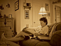
| 05/26/2006 10:42:54 PM |
HomeSweetHomeby sganeyComment: Greetings from the Critique Club!
First off, welcome to DPC! I notice you recently registered and this is your second challenge. I hope more is to follow.
Technicals:
The lighting is good. I like how the lighting falls off a bit on the edges giving it somewhat of a vignette look. Maybe for this challenge the "old feel" sepia may not have been the best choice but overall I liked it.
Subject/composition:
Good choice in subject. However, I wish she was looking at the camera to give it more of a portrait look rather than a candid/snapshot look if you know what I mean. Also, next time move the lamp a bit to the right so it is independant from her head. In terms of the composition it's good. All in all you I think you did a good job of capturing her in her environment.
Summary:
Good photo one that I think was underrated looking at the score. The processing may not be everyone's taste but it's by no means bad. Also, the image is on the soft side (i.e. not sharp). Just to let you know those types of images tend to not do as well in the challenges so keep that in mind in the future. Personally, I think it works fine here. The main thing for me is she isn't looking at the camera and therefore it's harder to "get to know her" if you know what I mean.
That's it. If you have any questions feel free to PM me. Good luck in the future! Message edited by author 2006-05-26 22:44:58. |
| Photographer found comment helpful. |
| 05/26/2006 10:28:49 PM |
Little Hands Little Feet 4by whatsthatbeepingComment: Greetings from the Critique Club!
First off, I wanted to say welcome to DPC! I notice you registered recently and this is your second challenge so far. Now on to the critique.
Technicals:
I like the lighting. It gives form to your subject's hands and enhances the sand's texture. The color is also good.
Subject/composition:
The way you composed this shot left many (myself included) wondering why you entered this in this particular challenge. There is simply not enough shown here to make it a portrait. However, challenge theme aside I think this is a good study on the kid's hands. As mentioned before the lighting enhances the hands and the sand making it pleasing to view.
The composition is ok but could be better, IMO. I think this might have worked better as a portrait oriented shot so that the hands would be positioned at the top and the sand would fill the rest of the frame. The falling sand would then give the appearance that the frame is filling up with sand. Anyway, just a suggestion. Good luck in the future and I look forward to seeing more of your work!
|
Home -
Challenges -
Community -
League -
Photos -
Cameras -
Lenses -
Learn -
Help -
Terms of Use -
Privacy -
Top ^
DPChallenge, and website content and design, Copyright © 2001-2026 Challenging Technologies, LLC.
All digital photo copyrights belong to the photographers and may not be used without permission.
Current Server Time: 06/22/2026 01:22:37 AM EDT.


![Clock Tower [high key]](https://images.dpchallenge.com/images_challenge/0-999/500/120/Copyrighted_Image_Reuse_Prohibited_339821.jpg)