| Image |
Comment |
| 06/03/2006 09:39:41 PM |
|
 Photographer found comment helpful. Photographer found comment helpful. |
| 06/03/2006 04:17:02 PM |
The Adventures of Duck Rider™by Art RoflmaoComment: Ok now we need to know the origin of Duck Rider. Can we get a glimpse from issue #1? So may questions like where did he get the cool bandanas and was his magical torch really lit by the duck's ass at Mount Vega? :P Message edited by author 2006-06-03 16:17:52. |
| Photographer found comment helpful. |
| 06/03/2006 04:12:57 PM |
|
| Photographer found comment helpful. |
| 06/02/2006 06:43:32 PM |
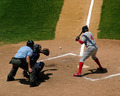
Heater Off the Left Cornerby banmornComment: Greetings from the Critique Club!
First off let me tell you I love baseball so right off the bat you have me especially since this image is so vivid in color and is super sharp! But I must find faults especially since you scored only a 5.02 which I think makes this terribly underrated, IMO.
Ok, the aspect of heat in this challenge was probably in dispute by many voters or they simply didn't understand the sports reference. In any case to help with the idea here I think you should have used a slightly slower shutter speed so you get more motion blur on the ball to convey speed. Also, like one of the commenters mentioned a swinging bat would have helped greatly. Assuming you were there for the whole game you probably could have caught an image like that. Speaking of which if you combine more motion blur and a swinging bat you would have achieved your goal of capturing that baseball heater to the max. Another good shot of this could have been a pitch inside where the hitter leans back. Obviously that's a tougher one to capture since you'd probably have to be shooting on just about every pitch to get the one like that. Anyway, just a thought. |
| Photographer found comment helpful. |
| 06/02/2006 06:35:46 PM |
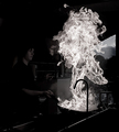
White heatby KHoltComment: Greetings from the Critique Club!
First let me say this is kick ass! During the challenge I questioned why you went b/w for this challenge. Don't get me wrong, I love this image just the way it is but I figure you might want to make it more hot looking for the drive by voters. ;) Ok, enough of that and on to the critique.
Technicals:
Perfect. I am amazed at the level of detail you captured in the flame itself. It's so sharp and full of life. The translucent parts of the flame and the clarity is what makes this one sing.
Subject/composition:
Great subject captured splendidly. I also love how you composed the shot.
Improvements:
I wish I had some good suggestions here but I don't. For just the challenge I think you should have gone with a color version even if you had to add the color in post. Looking at the top ten it's even more clear to me now you shouldn't have gone b/w, which is a shame because this image is very hot as is, IMO. Congrats on a good score and even better image. |
| Photographer found comment helpful. |
| 06/02/2006 06:20:14 PM |
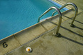
Hot Enoughby RebeccaComment: Greetings from CTP2
Great idea but the image is just so cool looking in every sense of the word :) that it fails to convey "heat", IMO.
Technicals:
Strong. Not much I can critique here. Everything from the detail on the pool side to the specular higlights on the chrome rails is just perfect. Good exposure here.
Subject/composition:
A good yet challenging subject to convey heat and I think you came real close. Composition-wise this works. I love the diagonal line and the off-center egg and rails. Really everything is perfectly placed.
Suggestions for Improvement:
The only one I have is challenge specific which is make this image look more hot looking. In other words, maybe make that pavement area more reddish in color? Not super hot red but something that gives even the slightest impression that it's hot. I think if the pavement looked hot so would the egg and so would this image in general and if that was the case this is easily a 6.5 scoring image, IMO. |
| Photographer found comment helpful. |
| 06/02/2006 06:09:36 PM |
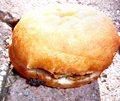
Jackpot!!by OddfrogComment: Greetings from CTP2
Great idea but the execution is lacking a bit. The highlights are too harsh but more than that the ant is just not prominent enough in the frame. For an idea like this it needs to hit you square in the face and this falls short in that area. Just as a quick fix putting that ant on top would have sold the idea much faster in my opinion and probably would have automatically gotten you a higher score.
As for improving the technicals I think if you just got down even lower the highlights problem wouldn't have been an issue plus the ant would take on more of a central role in the frame itself. Another thought would be to spin the bagel around so the ant is receiving the direct sunlight and that way you would be shooting with your back to the sun, which would also help you avoid those blown highlights. Message edited by author 2006-06-02 18:11:35. |
| Photographer found comment helpful. |
| 06/02/2006 05:50:09 PM |
Too-Much-edit.jpgby RoosterComment: I like the editing also. Regardless of that her expression and how she fits in this little world you've captured in this frame is what makes the photo. Great job capturing that. |
| 06/02/2006 05:45:29 PM |
the Agony of Defeatby margiemuComment: Greetings from CTP2
Technicals:
Your lighting and setup was very good. The end result produced an excellent tonal range.
Subject/composition:
Perfect subject. Maybe the photo needs some help with the title to show failure but really anyone can envision it in the photograph itself. In any case the image that took blue wasn't any better in terms of capturing "failure" than this so congrats on a strong take to what wasn't an easy challenge theme if you weren't shooting sports.
I like the composition but I think I would like to see more of her environment or something that tells me more definitively where she is at. I assume she is laying on a bed since you mentioned a pillow but when I first saw this I thought she was in someone's arms. I think telling us a bit more about the environment would have made this image even stronger.
Suggestions for Improvement:
I do like the crop because it shows her face up close so maybe just make the comforter? brighter so the folds can be more obvious. I would say dodge those sheens just a bit and leave the rest as dark as it is. Seeing that more would also help balance out the image, IMO. That's really it. The image has a lot of emotion and everything else is just perfect. Great image. I look forward to seeing more! Message edited by author 2006-06-02 17:46:45. |
| Photographer found comment helpful. |
| 06/02/2006 04:28:33 PM |
|
| Photographer found comment helpful. |
Home -
Challenges -
Community -
League -
Photos -
Cameras -
Lenses -
Learn -
Help -
Terms of Use -
Privacy -
Top ^
DPChallenge, and website content and design, Copyright © 2001-2026 Challenging Technologies, LLC.
All digital photo copyrights belong to the photographers and may not be used without permission.
Current Server Time: 06/22/2026 01:23:18 AM EDT.