| Image |
Comment |
| 06/08/2006 11:05:25 PM |
In A Lighter Vien II - Book Titlesby MWittComment: Is this your original? //www.dpchallenge.com/image.php?IMAGE_ID=46615. I don't get the improvement you've made here. It's funny and looks good but I feel maybe I am totally missing something here. Feel free to PM me with what you were trying to do here and what suggestions you were trying out.
Edited to add:
Thanks for clearing that up. As I mentioned the idea is pretty funny and you executed that well. I think you did an even better job of showing those lighter colored veins to pull off the pun. The smiley face seems a bit over the top but hey you're having fun. The composition is unique. I don't often see a crop like this in floral shots. Overall good job. I'm really interested to see how you accomplish this. Is that two leaves I'm looking at with one having a cutout? |
 Photographer found comment helpful. Photographer found comment helpful. |
| 06/08/2006 06:57:16 PM |
|
| Photographer found comment helpful. |
| 06/08/2006 02:10:40 PM |
Towering Curves, v2.0 (originally in Night Shot III)by MrXpressComment: No offense to your retake but I kinda like the original better. I do like how you fixed the tilt in the building but the overall "feel" of the image was better in the original, IMO. For example, the curve in the building was more curvy. The original had the curves converges at the top and swoop down giving it more of a curve. In the retake it's more spread apart from top to bottom and you lose that flowing aspect somewhat. Also, in the original the walls were a lot smoother. In the retake the rough texture is more prominent. I also like how you included the light posts in the orignal. Now maybe that was all done to fix the tilt (by taking a different angle) however, I'd rather see you fix the tilt in post rather than lose extra elements of the scene in this particular case. Now don't get me wrong, the retake is good. I just like the original better. |
| Photographer found comment helpful. |
| 06/08/2006 01:53:06 PM |
Struck by Lightningby Nikolai1024Comment: So you reshot a lightning strike? I can't find your original hence why I'm asking. If you don't mind PM me with the link to your original and I'll give it a critique based off of your improvements. |
| Photographer found comment helpful. |
| 06/08/2006 01:51:03 PM |
Waiting for Daddyby mandyturnerComment: First off let me say this is a fantastic shot. However, I feel your approach to this retake is a bit of a slap in the face to your original. I loved your original but removing the artsy elements like the strokes and the noise in the retake make it look like those were mistakes you are trying to correct. I don't think they were mistakes in the least. Anyway, that's just the impression I get. I know you aren't going to throw the other original away or anything like that. It's just now you have two great images! So congrats on that front.
Ok as for the photo itself, what's not to like? Very good detail, color and lighting. The composition is also good. The only thing I don't like too much which you carried over from the original is those hot pixels. It looks good in her blouse since it makes it look all sparkly but in her hair it just looks like the result of too much sharpening. However, it's not as noticable in this version as the original and really the only area that I notice it right away is the strands of hair right above her forehead which are contrasted strongly against the shadow of the wall. |
| Photographer found comment helpful. |
| 06/08/2006 01:30:18 PM |
Secluded Oasis (Take Two)by HornOUBetComment: This version looks a lot better. It's sharper, has better color and the original's signal to noise ratio can't even compare to this one. So great job improving the technicals overall.
The composition is ok but doesn't really add anything to the viewing experience, IMO. I actually like the original's composition better and I did something similar with a photo of mine: //www.dpchallenge.com/image.php?IMAGE_ID=294261. If you notice I cut off the top part of the trees so that I could move the edge where the land and water meet off-center. I thought it came out much better that way so if you reshoot this in the future consider every possible shot even ones that may cut off part of what you are trying to capture. |
| Photographer found comment helpful. |
| 06/08/2006 01:10:49 PM |
Great River Bridge (Nightshot 3)by fordmanf1Comment: The main issue with the original shot in my opinion was the dead centered subject. You've moved the subject just a tiny bit off center, which helps but only slightly. However, the angle you took is more interesting.
Really what would improve the shot the most is shooting it at a much wider angle. In the original you shot with a 50mm lens and I think the lowest you can go is 18mm so you might try some shots with that instead even though it's not one of your better lenses. The thing is most great bridge shots have some kind of extreme angle or composition in them and this bridge is just asking for something like that. For example, having one of those cables shot real close leading you up and away towards the bridge top. Or using your original shot in portrait orientation have the bridge near the top and the multi-color reflections fills the rest of the frame on down. In other words the first thing that grabs the eye's attention place it extremely off centered then have something lead you throughout the rest of the image. In my two examples, it was the cable and the water reflections that would be providing the leading lines.
Now, I don't know the area so a lot of this could be immposible and you've already considered them so just take them as me not knowing the area offering some suggestions. :) As is it's a good image. Good luck! |
| Photographer found comment helpful. |
| 06/08/2006 12:49:05 PM |
Burnside Bridge at Antietam Creekby novaComment: I really like the boost in contrast. The blacks are very black which allows the midtones to stand out much better. I also like the composition. The inclusion of the tree gives a very nice starting point to read this image. The bridge takes up less real estate yet it stands out more. Great job with that! |
| Photographer found comment helpful. |
| 06/07/2006 06:02:44 PM |
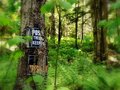
There's a placeby audinutComment: Greetings from the Critique Club!
Technicals/Setup:
Good light and color. What you kept in focus looks sharp so good job there.
Subject/Composition:
The subject is an interesting one for the challenge. I think it fits well with the song even with the trespassing sign there. In fact I think it helps not hurts the image. Besides, the spot you are standing could be your place not the actual private land.
The composition is good. I like the main tree were it is positioned and the other group of trees to the right. The two help frame the path you are headed. The skinny branch/tree is really the only thing I don't like. It divides the image so I'd think about cloning that out.
Post Processing:
I like the saturation treatment. Also, the blur gives it a nice dreamy look but for me I rather you left it out.
Suggestions for Improvement:
I think you pretty much know what needs to be improved. You mentioned removing some of the clutter and that's really the only thing I see that would benefit this image. |
| Photographer found comment helpful. |
| 06/07/2006 01:45:05 AM |
Mother Nature's Sonby BigKComment: Hey a personal best. Great concept. I think Team Outcasts is ready for season two! |
| Photographer found comment helpful. |
Home -
Challenges -
Community -
League -
Photos -
Cameras -
Lenses -
Learn -
Help -
Terms of Use -
Privacy -
Top ^
DPChallenge, and website content and design, Copyright © 2001-2026 Challenging Technologies, LLC.
All digital photo copyrights belong to the photographers and may not be used without permission.
Current Server Time: 06/22/2026 05:47:27 AM EDT.