| Image |
Comment |
| 06/26/2006 01:47:22 AM |
|
| 06/26/2006 01:41:28 AM |
|
 Photographer found comment helpful. Photographer found comment helpful. |
| 06/26/2006 01:35:42 AM |
|
| 06/26/2006 01:28:48 AM |
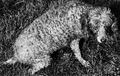
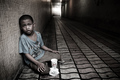
dog daysby posthumousComment: I gave this an 8 and thought it was a strong entry for this challenge. And oh yeah I got the same carbon copy comment from American_Horse. Realy nice when you get copy and paste like comments. |
| Photographer found comment helpful. |
| 06/26/2006 01:18:27 AM |
|
| Photographer found comment helpful. |
| 06/25/2006 11:36:57 PM |
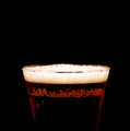
I deserve itby Haukur JoComment: Greetings from the Critique Club!
Well you can't get more indulgent than that for the common man. :P As coronamv pointed out in his comment, a thicker head would have bumped up the appeal. Also, the focus is off a bit. The lower bubbles are fairly sharp but you are not using a wide enough depth of field. I would bump up the aperture setting to at least F/8 to get more of that rim in focus.
Another thing to consider is shooting at a slightly lower angle so that we don't see the back of the rim at all. That's how you'll see a lot of glass images taken when shot head on like this.
That's pretty much it. I do like the use of negative space here and how you got the glass fading into the background. Really if you just improved the DOF so that more is sharp you would have a higher scoring image. |
| Photographer found comment helpful. |
| 06/25/2006 11:25:31 PM |
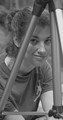
A is for Aprilby theonemuleComment: Greetings from the Critique Club!
This fits the challenge however I feel it doesn't do more than that. The cropping is too tight and the image could be sharper. Also the image has too little contrast and for a black/white image that's pretty much the kiss of death in these challenges. If you have access to a program like Photoshop or a free version like GIMP, I would make a histogram adjustment (levels or curves) to make the blacks blacker and whites whiter. A levels "auto" adjustment would accomplish that.
However, improving this photograph with editing wouldn't have gotten you a much higher score as the photo itself feels too much like a snapshot to begin with. While those can sometimes producing great candids and keepsakes they are generally not scored highly in the challenges so keep that in mind. To improve in the challenges you need something that says wow to the voter and probably the best way to do that is with lighting and color along with post processing. So if you are interested in any studio work or editing in general I would frequent the forums as there are lots of good info there to get you started. |
| Photographer found comment helpful. |
| 06/25/2006 11:05:08 PM |
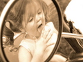
No sticky fingers on the handles, Papa is watchin!by escapetoozComment: Greetings from the Critique Club!
Very cute. The strong framing here was a plus with voters. However, the blown highlights and the low contrast held this back, IMO. I know this is a sepia image and you are not going to have true blacks but the low contrast coupled with the highlights probably gave voters the impression that these things weren't technical mistakes and not done on purpose. I do like the low contrast look you have here so maybe avoid the clipped highlights especially that area on the right corner.
As for the composition, I like the choice you made here i.e. the cropping and positiong the focal point off-centered. What I would have liked better would be for her to be looking at the viewer. However that probably wouldn't be an easy task getting her to look and capture her licking her fingers.
All in all a good entry and an even better keepsake. |
| Photographer found comment helpful. |
| 06/25/2006 10:51:04 PM |
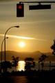
English bayby narimanComment: Greetings from the Critique Club!
Lovely sunset photo. When I first saw this and knowing the challenge theme I immediately saw the framing however, voters didn't. So in the future you may think about hitting the voters over the head with your what you are trying to convey. Now I don't always do that but it's something to keep in mind.
As for the photo itself I like what you did here. Good color, the lighting is very nice and you got some excellent silhouettes. What I don't like is the traffic light but I understand why it's there. Maybe next time find something better to frame that part like say an interesting overpass or arch? Having something solid like that would have also given voters a more obvious frame to see. |
| 06/25/2006 10:37:10 PM |
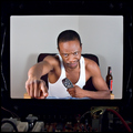
#@&!%*$ Remote!by SherwinJamesComment: Greetings from the Critique Club!
Is that really a TV or a cutout and some circuits? Really cool concept here and the execution came out well. I like the lighting and the composition works well for the subject.
You scored well but I think if your emotion was more "over the top" emotion your score would have soared higher, IMO. In other words, be more angry, get out of your chair and look like you are about to smash that tv rather than just looking annoyed. I would also move in closer just a bit so that you filled more of the space around you. There's a lot of empty space which I think hurts a bit.
Other than that this was a winner. Congrats and good luck in the future. |
| Photographer found comment helpful. |
Home -
Challenges -
Community -
League -
Photos -
Cameras -
Lenses -
Learn -
Help -
Terms of Use -
Privacy -
Top ^
DPChallenge, and website content and design, Copyright © 2001-2026 Challenging Technologies, LLC.
All digital photo copyrights belong to the photographers and may not be used without permission.
Current Server Time: 06/22/2026 02:55:42 PM EDT.