| Image |
Comment |
| 07/01/2006 10:12:38 PM |
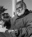
Self Portraitby posthumousComment: You sure you didn't take this 60 years ago? That smoke makes it look so old. I kinda like it. If you wanted to make it look even more like an old image I would get more of you in the shot or make it an oval crop. The way you cropped it here makes it feel too modern for me. :P |
 Photographer found comment helpful. Photographer found comment helpful. |
| 07/01/2006 09:54:04 PM |
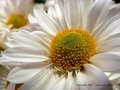
Hannahby wavelengthComment: Wow, this is a nice portrait. The clarity is really good and you didn't go crazy oversharpening it like I probably would have. The complementary colors are there but I also like how the pattern on the blouse has heart. Hearts and flowers to me are very complementary so there is that extra element present here.
If you were to reshoot this I would think about centering her in the middle. Right now you have her a bit to the left. If you want to go that route then maybe shoot landscape and have more negative space? However, I do like the portrait style especially how her hair fills the frame. Also, maybe use flowers that are a bit straight. Those look like they are wilting a bit but the color in them is very pleasing. All in all a great photo and one that met the challenge, IMO. |
| Photographer found comment helpful. |
| 07/01/2006 09:42:19 PM |
DSC_9143.jpgby wavelengthComment: I really like the way you composed this with the diagonal lines and off centered subject. The image looks good as is but also has lots of potiental in photoshop especially with shadow/highlights adjustments. I think you can make the detail in this one really come out using it among other things. |
| Photographer found comment helpful. |
| 07/01/2006 09:38:59 PM |
DSC_9137.jpgby wavelengthComment: I like this one. The desaturated sky really helps to make the subject stand out. The detail in the rocks also add strong interest. Good tonal range through out. |
| Photographer found comment helpful. |
| 07/01/2006 07:02:13 PM |
|
| Photographer found comment helpful. |
| 06/30/2006 04:29:44 PM |
|
| Photographer found comment helpful. |
| 06/30/2006 05:34:51 AM |
|
| Photographer found comment helpful. |
| 06/30/2006 02:31:30 AM |
;)by RikkiComment: Where's your hyper red key? :P |
| 06/30/2006 02:22:09 AM |
|
| 06/29/2006 05:26:33 AM |
|
| Photographer found comment helpful. |
Home -
Challenges -
Community -
League -
Photos -
Cameras -
Lenses -
Learn -
Help -
Terms of Use -
Privacy -
Top ^
DPChallenge, and website content and design, Copyright © 2001-2026 Challenging Technologies, LLC.
All digital photo copyrights belong to the photographers and may not be used without permission.
Current Server Time: 06/22/2026 06:05:08 PM EDT.