| Image |
Comment |
| 07/03/2006 04:46:55 AM |
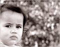
Vanity begins youngby xXxscarletxXxComment: I agree this is one of your best photos. Great idea for the challenge and as a standalone image. I love the cropping here and for some strange reason I like how each corner has something else going on in it. It's like they are also dressed up for the occasion trying to stand out. Just great little details through out and the editing is really good. |
 Photographer found comment helpful. Photographer found comment helpful. |
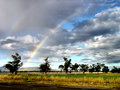
| 07/03/2006 04:41:21 AM |
Rainbowby xXxscarletxXxComment: Nice shot. I like the color and clarity of the rainbow and the rest of the scene. While I like this crop you might want to see if you like cropping the bottom part just a bit (to remove the street). I kinda like it when I resize my browser window to view it that way. |
| Photographer found comment helpful. |
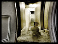
| 07/03/2006 04:31:03 AM |
The Lady In Blackby xXxscarletxXxComment: Ha. I guess I have to leave a comment now. :P
This is cool. I like the warped walls and the ghostly figure. Kinda reminds me of the movie poltergeist in the 'hall scene' at the end. |
| Photographer found comment helpful. |
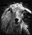
| 07/03/2006 04:18:51 AM |
A Goat's Taleby yankoComment: I thought about removing the selective desat but I wanted to include something positive in the image because this goat was rescued and the only way I thought I could convey that was with some color. The horns just seem like a good place to me but I get what you're saying. Message edited by author 2006-07-03 04:20:52. |
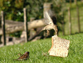
| 07/03/2006 03:57:21 AM |
'All Mine!!'by suemackComment: LOL. Nice capture indeed. The only thing holding this back from an even higher score is the background, IMO. The right side of the background is more uniform and had it looked like that throughout it would have provided a nice backdrop. Beyond that I'm not sure what else to tell you to improve. I really like the angle here with the tilt. That alone makes me visualize how this bird is trying to lift the bread. Also, good detail with the subjects and the DOF works nicely. |
| Photographer found comment helpful. |
| 07/03/2006 03:52:33 AM |
'I'm watching you.....'by suemackComment: A few things I think if done differently would have really helped your score. First, the negative space isn't helping, IMO. Since it's so busy with the bokeh it becomes a distraction so I would think about cropping this a bit tighter on the right. I do like how the face rests against the frame so that I would do again if you reshot. Also, think about cropping a bit from the top. Maybe even try an aggressive crop cutting down into her forehead. That way the face will fill more of the frame and force the viewer to take notice.
Second, I would go black/white here. With that background I don't think a color version would have been better and I don't really like the color here.
Lastly, make the facial features a bit sharper. Not too sharp but just sharper than this version. That would also bring the viewers' eyes to the face and not that high contrast background. Or simply make the background less contrasty although that may be difficult in basic editing.
Anyway, just some suggestions. I hope it didn't sound too harsh. I do like the idea especially how you made the bokeh very obvious to viewers. |
| Photographer found comment helpful. |
| 07/03/2006 02:26:30 AM |
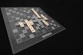
Scrabble Anyone?by Mr_PantsComment: Yeah this should have placed higher. Great product shot and clever message. The angle bothers me a little but maybe that would be minimized if there was more space between the board's points and the frame. |
| Photographer found comment helpful. |
| 07/03/2006 01:31:41 AM |
|
| Photographer found comment helpful. |
| 07/03/2006 01:29:25 AM |
|
| 07/03/2006 01:28:31 AM |
|
| Photographer found comment helpful. |
Home -
Challenges -
Community -
League -
Photos -
Cameras -
Lenses -
Learn -
Help -
Terms of Use -
Privacy -
Top ^
DPChallenge, and website content and design, Copyright © 2001-2026 Challenging Technologies, LLC.
All digital photo copyrights belong to the photographers and may not be used without permission.
Current Server Time: 06/22/2026 10:35:59 PM EDT.