| Image |
Comment |
| 07/08/2006 04:40:42 PM |
Morning Silhouetteby RikkiComment: Hadn't seen this one before. The silhouettes are awesome. Yeah and that sky is pretty out there too! :P The only thing that bugs me a little is the bird on the far right. He doesn't look as good as the other one and the rest of the silhouettes so I'd think about cloning that out before you sold this print. :) |
 Photographer found comment helpful. Photographer found comment helpful. |
| 07/08/2006 03:51:57 PM |
A Sunrise Soakby L1Comment: Really wonderful lighting on these. Was this around sunset or is there a lot of trees and such filtering the sun? |
| Photographer found comment helpful. |
| 07/08/2006 03:49:15 PM |
|
| Photographer found comment helpful. |
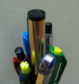
| 07/08/2006 02:46:51 PM |
THE LEADERby a_jhambComment: A little too soft for me. The leader is also not the main focal point as my eyes go to that bright shiny reflection on one of the subordinate pens. I do like the idea so here are some suggestions if you decide to reshoot in the future:
A.) Cleaner looking pens - too many specks on them and the "leader" pen could have looked more "brilliant". If the lighting was done differently (see below) I think that pen could have looked more shiny and stand out more.
B.) Cleaner looking background - The current one looks too muddy. Using a dedicated light source just for the background would help.
C.) Light the subjects from below and to the side and not from above or keep the above lighting but use it only as a fill light and not your main source. If that's your house lights then use a quicker shutter speed to reduce that lighting source or dim the lights a bit if you have that option but only if you are using other light sources like the ones mentioned above.
D.) Maybe use some more pens to fill the space on the left and right and perhaps make this a landscape shot? Including more pens would make it look more over the top which would help give this some added wow factor, IMO. |
| Photographer found comment helpful. |
| 07/08/2006 02:28:59 PM |
Official Stationery of a Stationary Violationby hopnjohnComment: Well, you took something ordinary and made it a bit more interesting to look at. I like the sharpness, dof, composition and color. The image is also very clean. Btw, is this your car? Shame on you! :P |
| Photographer found comment helpful. |
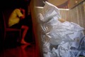
| 07/08/2006 02:26:01 PM |
Writers Blockby fullmetalfinnComment: Nice image. I like the extreme closeup and the way the waste basket fills the frame on the right. I know a lot of people hate the selective desaturation but I think here it would work nicely especially since you are trying to minimize the figure in the background already.
Btw, I'm not sure if this was your intent but that person looks like they could use some food. Those are some skinny legs. I hope their "writer's block" ends soon so some money can come in. :P Good luck. |
| Photographer found comment helpful. |
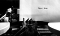
| 07/08/2006 02:15:31 PM |
Dear Momby vprndsgComment: Apparently you don't have much to say to her. :P (J/K). I like the sharpness here. Great job capturing the paper's texture and not blowing it out. The sides of the typewriter seem a bit too bright but it's not a huge distraction. Also, nice touch going b/w here. The only suggestion for improvement is have more typed on the page. It would have made the image hold the attention of the viewer longer. |
| Photographer found comment helpful. |
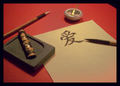
| 07/08/2006 02:12:27 PM |
Chinese love letterby kat75Comment: Nice composition. I only wish it was a bit sharper. Not saying that's always required however, I don't get the sense a softer image was the intent here. With that said, this is different and has a good crop. 6. |
| Photographer found comment helpful. |
| 07/08/2006 02:07:22 PM |
spiral slideby RikkiComment: I like how you composed the shot with the spiral starting out at the top left corner which is setup to allow you to read this from left to right. My only nitpick is the very tight DOF. Personally, I would have liked to see a bit wider DOF maybe from the left corner down to the middle and then the rest OOF. |
| Photographer found comment helpful. |
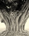
| 07/08/2006 12:44:21 AM |
banyantree1.jpgby TejComment: Kinda reminds me of the movie Devil's Advocate. I could swear I see bodies in there. :P Very cool photo. |
| Photographer found comment helpful. |
Home -
Challenges -
Community -
League -
Photos -
Cameras -
Lenses -
Learn -
Help -
Terms of Use -
Privacy -
Top ^
DPChallenge, and website content and design, Copyright © 2001-2026 Challenging Technologies, LLC.
All digital photo copyrights belong to the photographers and may not be used without permission.
Current Server Time: 06/24/2026 05:15:53 AM EDT.