| Image |
Comment |
| 05/07/2010 05:13:30 PM |
|
 Photographer found comment helpful. Photographer found comment helpful. |
| 05/07/2010 05:09:00 PM |
|
| Photographer found comment helpful. |
| 05/07/2010 05:02:51 PM |
|
| Photographer found comment helpful. |
| 05/07/2010 04:58:51 PM |
|
| Photographer found comment helpful. |
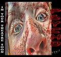
| 05/07/2010 02:03:46 AM |
Rejected!!?!by rodgers_leComment: Ha! Nice concept. I wonder though, if a subtle wave or ripple would have given it a little more coolness but I like what you did here. Now you seem to have gone out of your way to make it very unposter-like with the landscape and the border but for me they really don't bother me. What does (a little) is the black outline on the font. Actually it doesn't bother me. It's just dated and not in that hip-retro way either. Ok I said enough. Good luck. |
| Photographer found comment helpful. |
| 05/07/2010 01:52:39 AM |
|
| Photographer found comment helpful. |
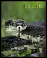
| 05/07/2010 01:50:22 AM |
The Serpent's Kissby SJCarterComment: As a movie poster it doesn't really wow you but the photo is good and you didn't go overboard with the design so good job there. The border probably wasn't a good move since it takes away from the poster aspect. |
| Photographer found comment helpful. |
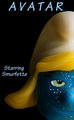
| 05/07/2010 01:45:33 AM |
Avatar Original Castingby bobnospumComment: Cute. There's an immediate connection to the challenge theme but doesn't really go much further than that. Good job though. |
| Photographer found comment helpful. |
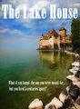
| 05/06/2010 03:43:46 PM |
The Lake Houseby tamatamaComment: Ha. I like the imagery but the bold font is a turn off. Given your theme I would have suggested something that was more subtle and faded in for a ghost-like effect or woven into the water so that it felt like it was slipping away into another time if that makes sense. Anyway, it's not a design contest. Good luck. |
| Photographer found comment helpful. |
| 05/06/2010 03:32:51 PM |
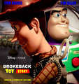
Brokeback Toy Storyby vladoComment: Nice job putting this together. The toys look good. Woody's back could use a little touchup (i.e. the haloing and edge jaggies) but otherwise really nice compositing. I like how you laid out the text. However, the blue font color at the top doesn't really go with the rest of the color scheme and is also harder to read. Well done. |
| Photographer found comment helpful. |
Home -
Challenges -
Community -
League -
Photos -
Cameras -
Lenses -
Learn -
Help -
Terms of Use -
Privacy -
Top ^
DPChallenge, and website content and design, Copyright © 2001-2026 Challenging Technologies, LLC.
All digital photo copyrights belong to the photographers and may not be used without permission.
Current Server Time: 04/30/2026 05:34:29 PM EDT.