| Image |
Comment |
| 07/06/2007 12:07:03 AM |
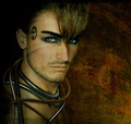
blue planetby annahComment: Ha I was right. Congrats on the HM.
ETA: It's amazing that so many figured this was hers. Message edited by author 2007-07-06 00:51:00. |
 Photographer found comment helpful. Photographer found comment helpful. |
| 07/06/2007 12:06:28 AM |
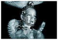
Drone-X by kiwinessComment: Probably the most finished product in the challenge. Congrats. It amazes me that a 7.42 doesn't even come close to making your profile page. |
| Photographer found comment helpful. |
| 07/06/2007 12:05:33 AM |
|
| Photographer found comment helpful. |
| 07/06/2007 12:04:21 AM |
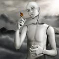
Hope by elsapoComment: Wow. Forget what I said. Voters thought it was perfect. Definitely stood out. Congrats! |
| Photographer found comment helpful. |
| 07/05/2007 08:55:50 PM |
Day04.jpgby WalesPComment: I'm a sucker for detail and this has a lot. I think your composition is ok but it's pretty basic and doesn't give this subject a new perspective. As Don mention it does kinda look like a glamour shot where the point is to simply show the beauty and be done with it. Here I wish maybe you had gotten creative and gave us a different POV. Mind you I do a lot of square crops myself but I do them for the challenges to maximize the limits of 640x but here you've got more space to work with hence the suggestion. Just a thought. |
| Photographer found comment helpful. |
| 07/05/2007 08:51:13 PM |
Sleep-walking-1.jpgby quiet_observationComment: I can see why this might appeal to some but for me it doesn't do anything. Perhaps it's because I have no fond memories of a beach that I can tie this image to so all I see is a dark beach with a lot of noise in it. Sorry just my personal bias. :) |
| Photographer found comment helpful. |
| 07/05/2007 08:40:44 PM |
Peek a Booby alexjackComment: I have to agree with the others. The lack of a face not to mention the lack of color in the skin sucks the life out of this picture. I'd be interested to know why you used selective desaturation here. I assume to make her stand out? If so why not keep her completely in color?
When I use selective desaturation I don't use it to make the person stand out from a busy background but rather to just bring out the tones more and/or when greys happen to look good with certain color combinations. None of that really applies here though. If anything your tones are a bit flat where you have desaturated. The color parts do have good contrast though so it may just be how you desatured the rest of the image.
|
| Photographer found comment helpful. |
| 07/05/2007 08:28:51 PM |
Candid - Modern Monk with a Markby Bruce_the_RobertComment: I think if that foreground shadow was more like the out of focus areas in your entry it would work just fine. In your entry I like the OOF areas as it makes me feel like I am there on a busy street watching him. |
| Photographer found comment helpful. |
| 07/05/2007 08:25:17 PM |
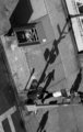
by sevilduvarciComment: Interesting how the real people are either hidden or look as if they are part of the structures allowing the shadows take on a life of their own. |
| Photographer found comment helpful. |
| 07/04/2007 04:25:22 AM |
|
Home -
Challenges -
Community -
League -
Photos -
Cameras -
Lenses -
Learn -
Help -
Terms of Use -
Privacy -
Top ^
DPChallenge, and website content and design, Copyright © 2001-2026 Challenging Technologies, LLC.
All digital photo copyrights belong to the photographers and may not be used without permission.
Current Server Time: 05/09/2026 06:25:47 PM EDT.