| Author | Thread |
|
|
07/06/2007 05:54:32 AM |
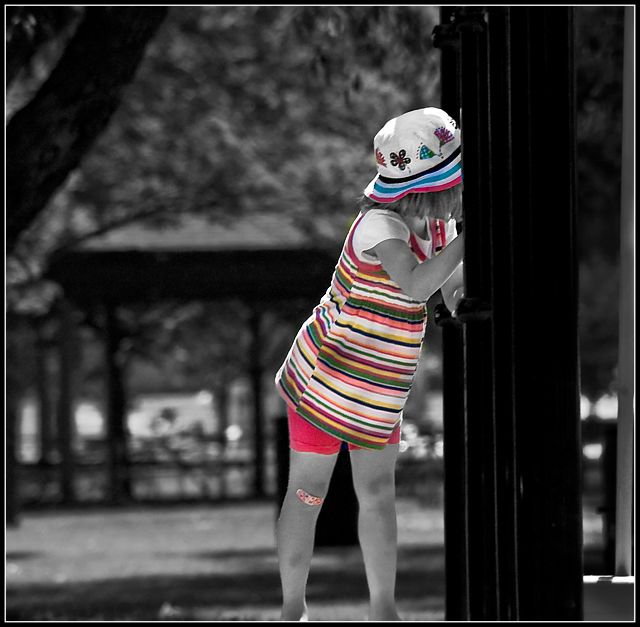
Thanks everyone, great comments. HOnestly I did the desat mostly for fun, but I'm glad you provided the feedback which helped me see the photo better. I'm posting a b&w version and a color version, if you have any additional thoughts please let me know.
Jack
Here are the other two versions

and

Message edited by author 2007-07-06 06:20:01. |
|
|
|
07/05/2007 08:54:04 PM |
|
somehow i'm wishing for a version of this picture with only her band aid saturated :) i don't know why, but i'd like it that way at this very moment. as i see it, this picture is about her clothes but not about her. any child can substitute her in these clothes and i wouldn't realize a difference. i feel like you're may be trying to make a statement about today's consumption societies by putting the emphasis on how she looks rather than who she actually is? |
|
 Photographer found comment helpful. Photographer found comment helpful. |
|
|
07/05/2007 08:40:44 PM |
I have to agree with the others. The lack of a face not to mention the lack of color in the skin sucks the life out of this picture. I'd be interested to know why you used selective desaturation here. I assume to make her stand out? If so why not keep her completely in color?
When I use selective desaturation I don't use it to make the person stand out from a busy background but rather to just bring out the tones more and/or when greys happen to look good with certain color combinations. None of that really applies here though. If anything your tones are a bit flat where you have desaturated. The color parts do have good contrast though so it may just be how you desatured the rest of the image.
|
|
| Photographer found comment helpful. |
|
|
07/05/2007 06:15:31 PM |
|
the selective desat and the tilt are making me a little dizzy. I'm not really seeing her. |
|
| Photographer found comment helpful. |
|
|
07/05/2007 04:58:23 PM |
|
Actually, I have no real strong reaction here. The colors are nice, but I'm a bit distracted by the fact that I can't see the girl's face, and the selective desat not including her skin doesn't really appeal to me. It puts all the focus on the clothes, and not enough on the girl. Maybe that's it for me, the subject you've chosen (which does seem to be the clothes) isn't the one I would have chosen! Personal preference, I guess. Technically focus is good, and composition works well, especially with the lines from the fence contrasting with lines in the girl's top. I think I would have just looked to bring her out a bit more. |
|
| Photographer found comment helpful. |
Home -
Challenges -
Community -
League -
Photos -
Cameras -
Lenses -
Learn -
Help -
Terms of Use -
Privacy -
Top ^
DPChallenge, and website content and design, Copyright © 2001-2026 Challenging Technologies, LLC.
All digital photo copyrights belong to the photographers and may not be used without permission.
Current Server Time: 07/17/2026 12:56:36 PM EDT.