| Image |
Comment |
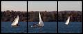
| 11/15/2005 01:29:41 PM |
November Sailby rileyComment: Yes, another single image that works. Each panel, although 1/3rd of a larger vista has its own subject and works as it's own picture. It's too bad the trees were not lit better. 7 |
 Photographer found comment helpful. Photographer found comment helpful. |
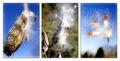
| 11/15/2005 01:28:32 PM |
Fall Flight to Freedomby jpochardComment: I think it's not bad. I like the right panel the best and the left the worst. The left either looks oversharp or overexposed. |
| Photographer found comment helpful. |
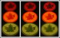
| 11/15/2005 01:27:36 PM |
Eye emotions: solemn, joyful, tiredby sz1_Comment: I like the idea, but I'm not quite sure I like the rest. ;) The center panel is not too appealing it it's "in betweenness". Before I read the title, I thought it was a progression of someone falling asleep. The color tints are ok, although a more muted pink might have been better. It's creative though. 6 |
| Photographer found comment helpful. |
| 11/15/2005 01:25:05 PM |
|
| Photographer found comment helpful. |
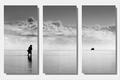
| 11/15/2005 12:32:16 PM |
Another day in Paradiseby JeanComment: Yes, this is what a one picture triptych is supposed to do. You have a continuous image, but have subjects (or lack of) which differ in each panel. Love it. I go back and forth about the 3D effect. I'll just leave it without comment. :) 9 |
| Photographer found comment helpful. |
| 11/15/2005 12:31:05 PM |
Ears Wide Openby xlr8tnComment: Looks like there is a color cast to the pictures (blue?). I love the expression on the left. The center isn't that great and the right is sorta forced. The width of panels is nice. |
| 11/15/2005 12:29:55 PM |
Connorby twm122Comment: The center a right panel are too similar. Makes the left panel stick out weird. Good portrait capture though. |
| Photographer found comment helpful. |
| 11/15/2005 12:29:06 PM |
|
| Photographer found comment helpful. |
| 11/15/2005 12:28:22 PM |
|
| Photographer found comment helpful. |
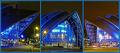
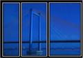
| 11/15/2005 12:27:50 PM |
Cable Stay in Blueby lkn4truthComment: Hmmm, I can forgive the noise, but I think this would have been much better had the stays been in sharp relief. They would have countered the vertical frames nicely. I like the blue. 6 |
| Photographer found comment helpful. |
Home -
Challenges -
Community -
League -
Photos -
Cameras -
Lenses -
Learn -
Help -
Terms of Use -
Privacy -
Top ^
DPChallenge, and website content and design, Copyright © 2001-2026 Challenging Technologies, LLC.
All digital photo copyrights belong to the photographers and may not be used without permission.
Current Server Time: 06/12/2026 07:45:34 PM EDT.