| Image |
Comment |
| 12/13/2005 05:08:10 PM |
|
 Photographer found comment helpful. Photographer found comment helpful. |
| 12/13/2005 05:07:27 PM |
Candle starby BrinComment: great abstract. Love the gradient fading at the corners and the square crop. 8 |
| Photographer found comment helpful. |
| 12/13/2005 05:05:55 PM |
Wick-ed! (Careful, it's hot!) by davidus428Comment: Wondeful macro. That exposure is just perfect. I'm guessing it's a bit easier the closer you get to the flame (less dynamic range). 9 - one of my top 3. |
| Photographer found comment helpful. |
| 12/13/2005 05:04:45 PM |
Extinguishing by soupComment: This is my blue ribbon winner...gorgeous. Excited to find out the technique.
|
| Photographer found comment helpful. |
| 12/12/2005 10:02:53 PM |
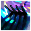
Polychromaticby funnylooksComment: Compare this shot with e301's entry for "Everyday Objects". The ideas are similar, but see how his executes better. I gave it a 5, and a few things stood out to me as problems.
1) The textured lower right corner is unsightly. I don't like it.
2) The colors are supersaturated which leads to less appealing abstraction. Particular examples are the blue/green square between the tines and the purple to the left of the "neck" of the fork. When we get such saturation, they start to look blocky and pixelated. |
| Photographer found comment helpful. |
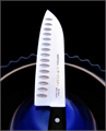
| 12/12/2005 09:55:49 PM |
Three Inch Bladeby ShaneBlakeComment: Hmm, I don't think it's bad at all. It looks like the voters didn't love it or hate it (as evidenced by the ton of 5 votes). Technically it is quite sound. Good lighting, nice background (although it looks noisy, I guess from the ISO 1000), and sharp subject. In the end, I think it has only limited potential as an abstract. We grasp it quickly and move on. It is neither mysterious (we know what it is), nor does it captivate with pattern or design (it's too simple). This is probably what limited your score in the end. |
| Photographer found comment helpful. |
| 12/12/2005 07:19:56 PM |
Ginsu Knifeby Bear_MusicComment: I gave it a 7. Personally, I think it would have looked just a touch cooler if you had cloned out the english words and just left the japanese characters... |
| Photographer found comment helpful. |
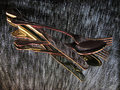
| 12/12/2005 04:40:08 PM |
Divining Rodby SJCarterComment: Maybe I'm not the best to comment on this because a) I like your work and b) I generally like selective desat more than many others on this site. That being said...
1) I'm sure there were a few DNMC. Hopefully not many, but I bet there were some which likely dragged you down a bit.
2) I think what makes the picture suffer, and I just learned this myself on a current challenge, is that leafless trees make for a chaotic pattern which isn't always visually pleasing. We quickly lose which branch goes with what and then it looks like an oversharpened bundle of lines. It isn't too terrible here because you managed to pull your subject out with the desat, but it probably doesn't help.
3) Something just seems a bit off on having both the log and the lake in color. They compete now as the subject and we lose the focus of the picture. Maybe that's all just "fancy talk", but there might be some truth there. |
| Photographer found comment helpful. |
| 12/12/2005 04:31:42 PM |
Still Life with Knifeby puzzledComment: I think you knew your own problem ahead of time. "Camera was handheld at 1/15 s." This picture needs a bit more DOF so that the subject are in focus from front to back. It looks like you didn't do a bad job holding, but I'm sure even at this aperture, the pic could have been sharper on a tripod. Abstract, to me, doesn't have to be OOF. Rather it's a picture which relies on shape, pattern, or design as its own subject. The pattern the fork makes is interesting; the spoon, less so; and the knife, even less.
I wonder, and I'd have to see this, if you upped the DOF and pushed the spoon and fork closer together, what you'd come up with. You'd have an abstracted "x" and that might be visually pleasing. I'm just guessing here.
We also know the CW says "abstract doesn't do well at DPC", so maybe a 5 was good... :) I gave it a 5 myself. Message edited by author 2005-12-12 16:32:49. |
| Photographer found comment helpful. |
| 12/12/2005 04:22:07 PM |
Dark Spots....by AzCKellyComment: Probably the biggest thing that hurt this was the DOF. Why do we want the knife in focus while having the fork and spoon OOF? It's looks accidental and doesn't seem to serve a purpose. If your subject is going to be OOF, it should be so for a reason.
I do like the colors of the silverware. The background is a nice abstract, but again, I'm not quite sure of the "why" to it. Pictures don't always need a "why", but it helps if there seems to be a unifying idea.
I gave it a 6. |
| Photographer found comment helpful. |
Home -
Challenges -
Community -
League -
Photos -
Cameras -
Lenses -
Learn -
Help -
Terms of Use -
Privacy -
Top ^
DPChallenge, and website content and design, Copyright © 2001-2026 Challenging Technologies, LLC.
All digital photo copyrights belong to the photographers and may not be used without permission.
Current Server Time: 06/12/2026 03:26:20 PM EDT.