| Image |
Comment |
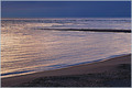
| 01/04/2006 07:16:55 PM |
The Sea Is The Mother Of Us Allby Bear_MusicComment: Nice seascape. It doesn't garner a top vote because it's a little too simple. There isn't much to just sit and stare at. But the texture is nice as is the coloring. 6 |
 Photographer found comment helpful. Photographer found comment helpful. |
| 01/04/2006 07:16:16 PM |
Watchfulby mpetersComment: A nice animal shot. Perhaps just a tad dark, but not a big deal. The uneven line is a bit distracting in the background. 6 |
| Photographer found comment helpful. |
| 01/04/2006 07:14:27 PM |
Mother Maryby hannekeComment: Maybe a little too high key. We lose some detail which, I think, would be nice. Not bad though. 6 |
| Photographer found comment helpful. |
| 01/04/2006 07:13:35 PM |
Unbreakable Bondby twm122Comment: Nice composition and lighting. I'm not crazy about the orange sweater with the maroon shirt. I would have spaced their heads just slightly further apart. It looks like mom is resting her head on daughter's hair. |
| Photographer found comment helpful. |
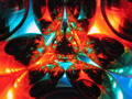
| 01/04/2006 07:08:34 PM |
Wada Fractal Patternby seebrownComment: Hmm, some of the other pattern pics I commented that the pattern was not prominent enough. Here, I'm afraid the pattern may be too prominent. There isn't much left for us to grasp, such as context. My first split-second impression wasn't too interested, but when I read your description, I was intrigued. It's too bad that you couldn't have zoomed back so we became aware that this was, in fact, four christmas tree ornaments, but still have the pattern emphasized. My first guess was a kaleidoscope which seems sorta boring.
The composition is very centered, which is good for pattern, but not good for dynamics. The colors are soothing and not oversaturated. In the end, I guess we are left a little dazzled and confused and move on because we don't know what we're really looking at. |
| Photographer found comment helpful. |
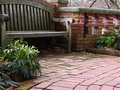
| 01/04/2006 05:30:55 PM |
Winter Garden Patternsby quiet_observationComment: It seems a common theme that images which score at 5 or below lack contrast. Also, in a picture like this (and a challenge like this), I really think about B&W. The color isn't helping too much here, so get rid of it. I liked a B&W conversion using a majority of the blue channel. (if you are using PS, just click ctrl-3 to see what it looks like). I also decreased brightness by -10 and upped contrast by +20. Finally a polarizer might have reduced the glare of the bricks a bit and brought a little more color out.
As far as the challenge, I think the picture suffers a bit because there are competing patterns (the curved bricks, the bench slats and the brick wall). The winners tended to have a picture which had one predominant pattern we could latch onto. Here we aren't sure where to concentrate our attention. |
| Photographer found comment helpful. |
| 01/04/2006 05:24:30 PM |
Zen Gardenby talmyComment: My first thought was wondering if the tree leaves were hurting the picture, but ultimately I think it be too bare without them. The subjects are nicely composed and I like the green of the moss. I think the biggest problem with the picture is how the gravel turned out. It looks far too much like noise and not enough like discrete rocks. Perhaps shooting at a different time of day would have helped. It looks like this was shot at high noon which is always a difficult time for photographs. |
| Photographer found comment helpful. |
| 01/04/2006 05:21:07 PM |
too many M&M'sby MattOComment: The good: I like the diagonal swoop of the composition and I like the choice of complementary colors.
To work on: I don't like the glare of the light. Had you been able to do this in a softbox, I think it would have been superior. The DOF idea is ok, but I'd like to see it with just a bit more focus. I tend to get distracted by foreground bokeh too as it takes up a relatively large portion of the picture. (That being said, there are many of people who can use this to good effect.)
It's interesting, but not beneficial, how the M&M's converged their colors where it's blurry to make a yellowing halo. That's not helping the pic, but I'm not sure what you could do about it.
Overall, I don't think it's a bad picture. 5.3 is probably a fair score (and not even a bad one). You did almost as much as you could with the idea, I guess there were just better ones out there. |
| Photographer found comment helpful. |
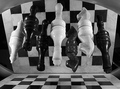
| 01/04/2006 05:16:16 PM |
Check-eredby shaverComment: I think the biggest reason your score was lower was the clutter. The pieces, although this is a cool effect, detract from the "pattern" of the board. If you look at the winners you will see simple patterns that are interesting and prominent. I lowered brightness by -10 and bumped contrast by +10 in PS and I think it gives it a little extra kick.
Composition and cropping are just fine. |
| Photographer found comment helpful. |
| 01/03/2006 01:16:10 PM |
Mother knows best, dearby TammerComment: You know, I don't know what does it, but personally I never like this shade of sky. Makes the picture look like an old slide that's faded. The composition is nice, although perhaps a tiny bit centered. 6 |
| Photographer found comment helpful. |
Home -
Challenges -
Community -
League -
Photos -
Cameras -
Lenses -
Learn -
Help -
Terms of Use -
Privacy -
Top ^
DPChallenge, and website content and design, Copyright © 2001-2026 Challenging Technologies, LLC.
All digital photo copyrights belong to the photographers and may not be used without permission.
Current Server Time: 06/17/2026 11:27:46 PM EDT.