| Image |
Comment |
| 01/16/2006 02:17:25 PM |
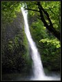
Horsetail Fallsby LucidLotusComment: Good old Columbia Basin. Great capture for a falls I've never thought was that "aesthetic". Horsetail runs so strong and narrow it's hard to get any definition to the water. You did well. 7 |
 Photographer found comment helpful. Photographer found comment helpful. |
| 01/13/2006 11:56:49 AM |
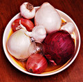
Bulbby talmyComment: This picture does need some help. I gave it a 4 on voting and the biggest reason was the color cast and overexposure. If you look at the histogram in Photoshop you will see that there is a huge spike at the right edge. This represents blown pixels with no detail. With the color sampler too you will also see that the whites are reddish. I think this is most evident on the two large onions.
The square composition works as well as the overall idea. Sometimes I ask questions like "why is the bulb among the onions?" and if there isn't a good answer I feel it seems a bit forced. I do get the roundness of everything, but beyond that (thinking this picture was on its own and not in a challenge)?
I think it does show you are being creative with your shots. Sorry I'm being a little harsh on this one. I've liked some of your other stuff. The Zen Garden was nice and I was a big fan of your "too early" shot, giving that a 9. Keep working at it. |
| Photographer found comment helpful. |
| 01/13/2006 11:39:38 AM |
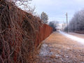
Life on the Edgeby PrismComment: You know, a 4.97 with 14 ones and 12 twos is a pretty good score. Obviously there were a fair # of people who thought DNMC. What can you do? I do think this pic needs a little kick and have two possible suggestions.
You could do the pic in B&W which would emphasize the lines of the fence and the tangle of leafless branches. I looked at it in PS and it wasn't bad. The color of the fence is nice, but there isn't much color in the rest of the picture.
Second, and either color or B&W. You need a bit more contrast. +20 in PS was good, although you had to go back and erase the contrast on the snowy path because it blows out then. The rest of the picture, however, benefits from the contrast. Many of the pictures at this score that I comment on, need contrast.
Finally a subject on the right as well might have helped. A person walking perhaps. My photos tend to be like this and not have anybody in them, but I'm starting to appreciated what even a small figure can do for the shot.
Just a few ideas. |
| Photographer found comment helpful. |
| 01/13/2006 11:23:50 AM |
Shaped Ignitionby MQuinnComment: Ha, who's looking for help at a 5.88? This is a good shot quinn. I didn't manage to vote on it in the challenge, but I like it. The purples and blues are soothing although I wonder if the purple on the right is just a bit too saturated. Nice reflection and nice composition. I may have cloned out the highlight at the very top as it competes with your spark for attention. Ditto with the blue spot on the right. Maybe just crop that out, if possible. The rest is excellent. I think i would have given this a 7. My 9-10 scores went to pictures with pure geometric shapes, which was what I, personally, was looking for (hence my entry). But this part is just perference and not critique. |
| Photographer found comment helpful. |
| 01/13/2006 11:19:44 AM |
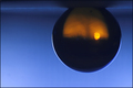
Refracted Sunsetby soupComment: I gave this photo a 6. I think it has great colors and nice composition. At a 5.4, there's less to comment on compared to many on this thread. Possible problems include the rim of light around the "bottom" (top) of the ball. I'm not sure what you could do other than clone it out, but it catches the eye too much.
In the end, the photo may just be too abstract for DPC. Rotating 180 degrees, while nice for the sunset, throws people off a bit and maybe makes them concentrate more on that aspect than on the picture itself.
It would be interesting to see a square crop. While we are trained to not like them, sometimes they work. I'd have to see it though. Just an idea. |
| Photographer found comment helpful. |
| 01/12/2006 06:23:52 PM |
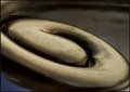
Koru in bronzeby kari1Comment: I wind up giving this advice at least a few times each time I do threads like this. The colors here are so muted that I would instantly think about B&W. You could make some excellent contrast here and then the picture becomes all about shape instead of us staring and wondering exactly what color the swirl is.
You may have confused people a bit with the title. I didn't know what a Koru was, and I'm sure a lot of others didn't either. The picture is cropped a bit too close to give us any context. So either you could have zoomed out, so we can get a clue as to what a Koru is, or (if you wanted to keep the picture all about "shape") kept the crop, but leave the name out of the title. Although it seems unfair, titles can play a role in your score. Not a huge part, but maybe a tenth or two. |
| Photographer found comment helpful. |
| 01/12/2006 06:19:28 PM |
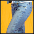
Hip 2b²by fotomann_foreverComment: You know, I'm not sure why I gave this a 5. I guess perhaps I was biased to more geometric designs. The picture, on second look, is pretty good. I'm really surprised by the 4.8. Maybe voters had the same bias.
The colors are very pleasing. The exposure is good and the picture is sharp except for the jean jacket which looks a bit soft. I'm not sure why only there, but it does. Maybe the lens. I dunno.
If I could vote over, I'd do a 6 for sure and maybe even a 7. The strongest aspect to this picture is the excellent complementary colors. The biggest problem, for your photography, is that she has her pants on. |
| Photographer found comment helpful. |
| 01/12/2006 06:12:27 PM |
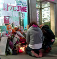
A City's broken heart - In Memory of Jane Crebaby Rae-AnnComment: I think you had a good idea here. A few of my thoughts on improvement:
1) I don't mind square crops, but I'm not sure it works here. I think we want to see more in some direction, I'm just not sure which.
2) The upper left is blown. This is a tough exposure because of the backlighting from the store. Potentially even worse than the upper left is the upper right where the highlights look pretty unattractive. (For some reason they look like shoes on display to me...) It might not have been possible to do better; you could have underexposed some more and hoped to bring the people out in levels by adjusting midtones in Photoshop.
3) There's motion blur (I think) rather than DOF blur. You were on 1/4 second and I bet it was because of that. Pretty good actually for that speed. If this is, in fact, DOF, I would have made the shrine in focus because it is just as important to the picture as the people. personally I also use the rule of thumb that if something has writing on it I make it either very sharp or totally OOF. Semi-focused writing looks bad.
I gave you a 5 because of the emotional content of the picture rather than the technical merits. Keep going Rae-Ann, I know you'll get there. |
| Photographer found comment helpful. |
| 01/12/2006 04:46:46 PM |
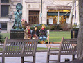
Recovering on New Years Dayby _eugComment: So we all know how bad I am at candids, so I really don't know what's possible here compositionwise or what isn't. IF you could have set this shot up any differently, I would have tried to shoot between the two front benches instead of over one. The left bench is now distracting and obscures part of our subject.
I think I would have cropped tighter. We look on the left and we see a tiny bit of SUV. Ditch it. The tree isn't a bad frame on the right, but maybe cutting off all the way past the garbage can. This makes our subject larger and we can see more easily that, in fact, they are wearing a bear hat, liberty hat, and garland.
The morning light isn't bad. It isn't spectacular, but I don't think it's hurting the picture. Maybe just a bit more contrast. I'd have to see it.
I do like the picture as a "slice of life". It is also interesting because we want to know the story of the hats. When I voted, I gave it a 6. |
| Photographer found comment helpful. |
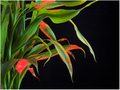
| 01/12/2006 04:11:40 PM |
Backlit Bambooby MakkaComment: This is funny. Great picture. I was just laughing at your need to put "backlit" in your title as I felt the exact same need and have a similar shot. Only criticism is I think I would have desaturated the reds some. 7 |
| Photographer found comment helpful. |
Home -
Challenges -
Community -
League -
Photos -
Cameras -
Lenses -
Learn -
Help -
Terms of Use -
Privacy -
Top ^
DPChallenge, and website content and design, Copyright © 2001-2026 Challenging Technologies, LLC.
All digital photo copyrights belong to the photographers and may not be used without permission.
Current Server Time: 06/19/2026 09:05:19 AM EDT.