| Image |
Comment |
| 02/08/2006 07:26:41 PM |
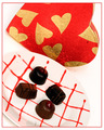
Sweets For My Sweetby idnicComment: the plate blends into the background which I think adds confusion. The chocolates, in my eye, are too arranged. I'd prefer a bit more asymmetrical in composition. I like cropping part of the heart off. Man that is one big old sensor booger... |
 Photographer found comment helpful. Photographer found comment helpful. |
| 02/08/2006 07:24:06 PM |
|
| Photographer found comment helpful. |
| 02/08/2006 07:23:11 PM |
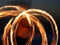
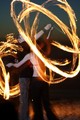
Two souls, one heart, the fire withinby danica22Comment: The biggest problem I see is that the fire pattern that the guy is making blocks both their faces. Way too bad! I really like the creativity and idea of this shot, but that hurts the picture fairly seriously. Had you been able to frame them inside the big section the pattern creates, I think you would have been onto something. There might be a slight color cast to the picture and there are two strange artifacts on their legs. A shot which had potential to go far though... |
| Photographer found comment helpful. |
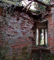
| 02/08/2006 06:49:26 PM |
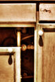
Opening - (out of focus on purpose)by Meridian SageComment: So if it's OOF on purpose, what are we gaining? Perhaps having a small DOF is what you were after. It would be nice to have the pipes in focus while keeping the cupboards OOF. That would direct the eye to the "opening". This way we just scan the picture looking for something in focus. |
| Photographer found comment helpful. |
| 02/08/2006 04:53:32 PM |
Stun Gun Artby nemesise1977Comment: To me, and I'm not an abstract affecianado, abstracts are about either color or pattern. Here the color is nice (I like that color blue) but monotone and the pattern is chaotic. I bet you would have done better by firing the shot in a more geometric fashion. I'm not saying to perfectly line things up, but perhaps have them all oriented vertically or horizontally, or have them progress in a pattern as the move across the canvas. |
| Photographer found comment helpful. |
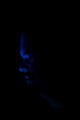
| 02/08/2006 04:50:05 PM |
Blue moodby nemesise1977Comment: This is a tough shot. I like that you are experimenting and not afraid to try some stuff. This is a real balancing act between having too much detail (and ruining the effect) and having too little (and making for a boring picture). I'd probably like to see a bit more detail or at least a bit more contrast. I'd also compose the shot with the negative space in front of the face and not behind it. I think it would be more appealing that way (even a centered composition might work). I gave it a 4 in the challenge and I think the biggest reason was there just wasn't enough to hold my interest. Keep being creative though, it's a tough thing to do, and it will come with some lumps, but it will make you a better photographer in the end. |
| Photographer found comment helpful. |
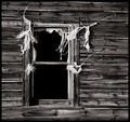
| 02/08/2006 12:05:49 PM |
Abandonedby jfwolpertComment: ha, I sure hope the zoom blur is in the original with all the hubbub going on lately. Pretty nice shot, although I wish I could tell exactly what it was I was looking at. I do like the "feel" though. 7 |
| Photographer found comment helpful. |
| 02/08/2006 11:54:19 AM |
|
| Photographer found comment helpful. |
| 02/08/2006 11:52:00 AM |
|
| Photographer found comment helpful. |
| 02/08/2006 12:19:35 AM |
Lemon Dropby RikkiComment: I am never going to hear the end of this...congrats big guy! |
| Photographer found comment helpful. |
Home -
Challenges -
Community -
League -
Photos -
Cameras -
Lenses -
Learn -
Help -
Terms of Use -
Privacy -
Top ^
DPChallenge, and website content and design, Copyright © 2001-2026 Challenging Technologies, LLC.
All digital photo copyrights belong to the photographers and may not be used without permission.
Current Server Time: 06/19/2026 03:50:24 AM EDT.