| Author | Thread |
|
|
02/09/2006 01:52:17 AM |
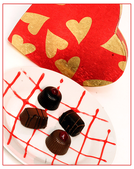
I like the colours and the tilting is brave, lighting is nicely done and your shot works, because I am definitely got in the mood of eating up a box of chocolate. :-)
I skipped voting for this entry because however it's a good one, when thinking about romance I associate to people (moreover rather adults than kids). I was confused, because I missed the people, though this was too good to vote low, therefore I skipped it. I guess a lot of voters choose voting lower instead. Don't be upset because of the final score. If you had fun making this one, that's what matters! |
|
 Photographer found comment helpful. Photographer found comment helpful. |
|
|
02/08/2006 07:26:41 PM |
|
the plate blends into the background which I think adds confusion. The chocolates, in my eye, are too arranged. I'd prefer a bit more asymmetrical in composition. I like cropping part of the heart off. Man that is one big old sensor booger... |
|
| Photographer found comment helpful. |
|
|
02/08/2006 04:54:39 PM |
|
Ok to set the stage here I would like to first say I really enjoy looking at your work, you have a great visual quality and clarity to you shots and alot of attetion to color. That aside If I did not know you are who took this shot I would not have assoicated it with you. The shot is technacally very good the DOF is great lighting is good and your usual detail and color attetion. That aside I don't really like the extreme tilt (remember this is just my opinion and I am far from an expert) Also and more importanly to me there is not a huge attetion or draw factor to me that seems like "Wow that is romance" while you have the candy and the heart box to me that does not show romance and feels more like a advertisement for candy (which isnt a bad thing in my opinion) Over all I would have scored this shot a 7 range because it was a well executed shot but just didn't have that extra draw to me that says this is the embodiement of romance.....Now I need to get some chocolate ;) |
|
| Photographer found comment helpful. |
|
|
02/08/2006 04:53:03 PM |
Just my 2 cents from doing a million dessert plates, etc.. I would always use odd numbers, 3 chocolates, or 5 rather then the 4. The sauce on the plate is distracting, Freehand piping of straight lines is tough. And we do not usually serve these kind of chocolates or petit fours with a sauce, it looks a little odd...A strawberry tart on that plate would kick butt :)
Sorry I can't resist a food critique :) If I can ever been of any help, feel free to pm me |
|
| Photographer found comment helpful. |
|
|
02/08/2006 04:52:26 PM |
I voted this one middle of the road during the challenge. A couple of reasons.
First, I didn't really say romance to me. Of all the reasons I had, that one plyed into my voting the least, because I realize how subjective that is.
Second, there are sharpening artifacts and jaggies on the edge of your plate and heart. This is something that can be avoided, and for whatever reason drives me bonkers.
Next, the color cast. The whites in this image seem to have a tinge of pink in them. I assume it's reflection from the heart. It give the image a warmer feel, but your white aren't white...
Finally, there's what I'm going to assume is senosr dust dotted over the image... I know it's basic editing, but you may want to physically clean that...
Hope this helps! =] Trey |
|
| Photographer found comment helpful. |
|
|
02/08/2006 08:04:20 AM |
Is there peanut butter in that chocolate? mmmmm
Interesting to compare this to your blue and see how fickle voters are on whites on white and lighting etc. Whilst I was doing that I had a window that obscured the right half of this image and thought, "That's a more powerful crop, at least for me" ... might want to look at that. Either way I like it.
Voters :( |
|
| Photographer found comment helpful. |
Comments Made During the Challenge  |
|
|
02/06/2006 08:34:08 AM |
|
Good lighting and nice composition. |
|
| Photographer found comment helpful. |
|
|
02/05/2006 05:50:59 PM |
|
The plate and background are a little over-exposed, and the chocolates are rather under-exposed. More diffused lighting (or even using a long exposure and painting this with light) would have helped to balance the light distribution. |
|
| Photographer found comment helpful. |
|
|
02/05/2006 03:58:34 AM |
|
Nice original concept, lovely vibrant colours. Great lighting on the chocolates.....made them look so appetising! |
|
| Photographer found comment helpful. |
|
|
02/05/2006 03:11:29 AM |
|
good still life photograph, good colors and lighting. excellent. |
|
| Photographer found comment helpful. |
|
|
02/03/2006 11:54:37 PM |
|
| Photographer found comment helpful. |
|
|
02/03/2006 11:11:38 AM |
|
|
|
02/01/2006 01:23:24 PM |
|
Aww, I really like this one, except I think that the angle is a bit much. 6 |
|
| Photographer found comment helpful. |
|
|
02/01/2006 01:17:10 PM |
|
maybe a little too bright. I like how you decorated the plate, nice touch |
|
| Photographer found comment helpful. |
Home -
Challenges -
Community -
League -
Photos -
Cameras -
Lenses -
Learn -
Help -
Terms of Use -
Privacy -
Top ^
DPChallenge, and website content and design, Copyright © 2001-2026 Challenging Technologies, LLC.
All digital photo copyrights belong to the photographers and may not be used without permission.
Current Server Time: 06/28/2026 03:41:43 AM EDT.