| Image |
Comment |
| 02/14/2006 06:10:38 PM |
|
 Photographer found comment helpful. Photographer found comment helpful. |
| 02/13/2006 12:09:23 AM |
Flame wave by kiwinessComment: Geez, rumor has it kiwiness is back in the house! Congrats on two in a row! |
| Photographer found comment helpful. |
| 02/10/2006 08:22:34 PM |
|
| 02/10/2006 08:21:41 PM |
|
| 02/10/2006 08:20:51 PM |
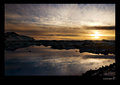
Golden Lightsby floydroweComment: Well, this is going to be one of the most beautiful sub-four scores in a while. Great shot, but this isn't motion pan at all... |
| 02/10/2006 08:17:10 PM |
|
| Photographer found comment helpful. |
| 02/10/2006 11:42:45 AM |
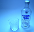
Absolut Blueby GIS_boyComment: Well, apparently we know you are capable of great work. Darn you for bumping me to 4th in shadow. Anyway, I gave this shot a 5. A few limiting factors. 1) in "product ads" I think the subject should be fully in focus. The top of the absolut bottle is soft. If this was handheld, it could have been a bit of motion blur at 1/30th. If it was on a tripod, then I would have bumped to at least f8. 2) The back rim of the glass is almost lost. I think this lends confusion to the eye. I actually can't even tell if the glass contains something or not. 3) This is small, but the perspective seems to abnormally squash the bottle.
I do like the gradient. I'm guessing, although I could be wrong, that the blue was added mainly through PP and not through lighting. I didn't find these shots as appealing as something with natural light but a blue subject. Having at least some true white in the shot was more pleasing to the eye. |
| Photographer found comment helpful. |
| 02/10/2006 11:35:50 AM |
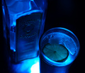
Bombay Sapphireby jduffettComment: I gave this a 6 when I voted, but did notice a few things. One, the highlight is saturated and appears to have suffered for it with some pixelation. Two, the lime doesn't look good in either the blue light or your PP color shift. I wonder if you could have lit it with a small penlight or something to give it some more natural color. Technicals are good, but a personal rule of mine is that anything with writing on it needs to be either sharply in focus or completely out of focus. Partially focused letters are a no-no. The eye hates that. If you shot on a tripod, I would have gone with more than f1.8. |
| Photographer found comment helpful. |
| 02/10/2006 11:32:17 AM |
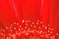
Small Bursts Of Lightby dickelComment: I think red is one of the hardest colors to capture with a Canon. At least that's my personal experience. It saturates so quickly and I think you are running into a bit of that here. The composition is nice in an abstract sort of way. Perhaps a bit more context is needed. I think we sense pretty well it's a flower, but if we were pulled back a little more, our eye might accept it better. I'd have to see it though to judge. |
| Photographer found comment helpful. |
| 02/10/2006 11:27:52 AM |
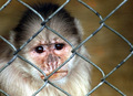
inside looking outby rachelellenComment: I think you captured a great expression. The image looks just a bit soft (especially in the nose and mouth). Were you shooting at the 300 end of the lens? Full open, I bet it's soft at that end. The eyes are nicely in focus and that's important. The background is a pleasant blur. I think the biggest limiting factor in this shot, although you made a valiant attempt at including it with your title, is the fence. It just doesn't appeal to the eye. I know you could do nothing about it, but it probably limits the shot nonetheless. |
| Photographer found comment helpful. |
Home -
Challenges -
Community -
League -
Photos -
Cameras -
Lenses -
Learn -
Help -
Terms of Use -
Privacy -
Top ^
DPChallenge, and website content and design, Copyright © 2001-2026 Challenging Technologies, LLC.
All digital photo copyrights belong to the photographers and may not be used without permission.
Current Server Time: 06/19/2026 03:50:52 AM EDT.