| Image |
Comment |
| 03/16/2006 05:20:14 PM |
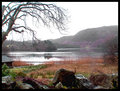
Lake District UKby RiponladyComment: is that sharpening or chromatic aberation? If it's oversharpening, how come it's only on the trees (not the reeds where it should also show) and how come it's always only on one side?) I think this is just serious chromatic aberation... |
 Photographer found comment helpful. Photographer found comment helpful. |
| 03/15/2006 03:23:21 PM |
Going Upby TechoComment: You continue to impress Techo. 6.3...nice. Top bad it just missed Top 10. I think I've had 4 12ths and I know the feeling... |
| Photographer found comment helpful. |
| 03/15/2006 03:21:32 PM |
|
| Photographer found comment helpful. |
| 03/15/2006 03:12:18 PM |
|
| Photographer found comment helpful. |
| 03/08/2006 01:05:10 AM |
Companionship by whiteroomComment: Leslie, how about you and ursula saving some ribbons for those of us with only "a few". ;) Great job!
|
| Photographer found comment helpful. |
| 03/02/2006 03:46:41 PM |
Blueby KivetComment: Hey kivet, let's see. I didn't comment on this one during the challenge, but I could have easily castigated you for not ironing your sheet. Faux pas! Those creases just sceam "amateur" even if you aren't one. I know it's a pain to iron, but you gotta do what you gotta do. I gave this a 6, which I think represents a solid picture. I just commented on the last picture that I can easily see the difference between a 5.2 and a 4.8. It holds here. I think the high key works, but I'm not positive about the high contrast. It tends to make people look harsh. Composition is nice in that it isn't centered. I think it's actually a nice touch that the head is cut off, but I bet lots of people would like to point that out as a no-no. The pose is natural, and that's a good thing. Overall I think you showed a strong work. The contrast and the wrinkles probably brought you down the most. |
| Photographer found comment helpful. |
| 03/02/2006 03:15:22 PM |
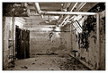
solitary...by sysopComment: To start, a 5.2 isn't bad. I can quite easily see the difference between the 5.2 pictures I comment on and the 4.8 ones. The picturee here is technically quite sound. The lighting doesn't leave us with large blown or dark areas and the texture is interesting. The composition is perhaps a bit static; everything is squared and there are no dynamic angles or points of view. The chair, as the subject, is a bit hidden by the dark debris surrounding it. If you could have, I would have either moved the chair to the other wall, or removed some of the debris right there. The picture seems to have a slight slant to the right, but that may be an optical illusion from the hanging pipe which is likely off kilter to start with. |
| Photographer found comment helpful. |
| 03/02/2006 03:09:31 PM |
Frozenby pidgeComment: I didn't see this one in voting. I like the blue duotone. Blue was hard. I commented on another that it made the sky look artificial, but here we don't have to deal with that so it works. Obviously you were trying to convey the chilly aspect of the picture. The 5.38 is not a bad score really. I think it reflects the technical soundness of the shot. Your contrast is well done; the lighting is good; and so is the composition. Ultimately, the subject probably just lacks that oomph to transport us somewhere else.
I'm not the best to comment on sharpness as my 1900x1200 screen tends to make oversharp pictures look ok. That being said, I do wonder if there is a little oversharp action going on here. If others made the comment, I'd believe it. |
| Photographer found comment helpful. |
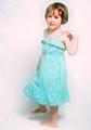
| 03/02/2006 03:05:47 PM |
Strike a poseby srdanzComment: I don't think this is a bad picture. I gave it a 5 and perhaps that was even unfair. I hit this close to the end and was starting to get voter fatigue with the posed portrait (which was 80% of the fashion challenge).
DPC may have a small backlash against "cute kids"; especially posed ones. I'm not sure. I use my kids and they have done well, but usually they are merely playing a part of a bigger scene rather than being the entire subject.
Your light is nice, I think. Fashion can definitely be high key and soft, which is what you have achieved. I've left plenty of comments on people's pictures about ironing sheets used for backgrounds. It's a pain, but those wrinkles detract. I doubt that was a big reason for your score here though as it is only noticeable in her shadow.
Really, I'm a bit puzzled by the score (even mine). On second view I'd give this a 6 which represents a solid picture in my view. Perhaps your cutie just couldn't compete with the 22-year-old vixens presented. But that may be a good thing... |
| Photographer found comment helpful. |
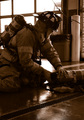
| 03/02/2006 02:56:24 PM |
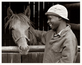
Trainingby DottieDComment: I gave this a 5. It is too dark. We cannot see detail of the subject well enough to appreciate what he is doing. It's possible the camera wasn't happy with the bright background and was trying to compensate. Fill flash might have helped. The subject matter, while not bad, isn't too exciting either. I'm not quite sure what our firefighter is actually doing (working with a fire extinguisher?); but perhaps waiting for a more dynamic or exciting moment could have boosted the score. Your conversion to duotone was well done. |
| Photographer found comment helpful. |
Home -
Challenges -
Community -
League -
Photos -
Cameras -
Lenses -
Learn -
Help -
Terms of Use -
Privacy -
Top ^
DPChallenge, and website content and design, Copyright © 2001-2026 Challenging Technologies, LLC.
All digital photo copyrights belong to the photographers and may not be used without permission.
Current Server Time: 06/19/2026 04:53:57 PM EDT.