| Image |
Comment |
| 05/10/2006 02:05:11 PM |
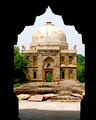
Merchant Marine Academy Chapelby kfeherComment: Nice picture for what you had to work with, but I'm afraid this is going to get seen as a dime a dozen in this challenge. Nothing gives it that extra "wow". The colors are pretty drab and the blown sky isn't good. 5 |
 Photographer found comment helpful. Photographer found comment helpful. |
| 05/10/2006 02:04:10 PM |
Untitledby TejComment: Nicely framed. a bit blown which is too bad. 6 |
| 05/10/2006 02:02:17 PM |
|
| Photographer found comment helpful. |
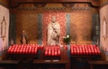
| 05/10/2006 02:00:58 PM |
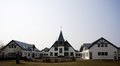
St. Joseph'sby DanSigComment: Blown sky. :( symmetric shot. :( dull colors. :( that's tough. Well, people say they like to know why people vote low. 4. |
| Photographer found comment helpful. |
| 05/10/2006 01:59:58 PM |
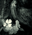
Whispers in a Midnight Garden...by RKTComment: Hmmm, ok, I was going to actually enter a nature shot if I had entered so don't think I'm DNMC for that. BUT, "holy" should mean "set apart" and I was looking for nature shots which would be quite different from a typical shot. The shot itself is nicely composed and I like the bright flower. The blurred object in the background is nicely abstract. Ok, I'll give it to you as that sorta looks like a spirit and that's what I'm guessing you were hinting at with the title. So the good and the bad are going to balance and you get a 5. |
| Photographer found comment helpful. |
| 05/10/2006 01:57:06 PM |
|
| Photographer found comment helpful. |
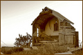
| 05/10/2006 01:55:58 PM |
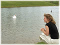
Faith After the Stormby TransitComment: I love the subject, but wish the sky hadn't been blown. It would have bumped this up into the 8-10 range. As is, I'll give it a 7 for the unique subject and nice duotone. |
| Photographer found comment helpful. |
| 05/10/2006 01:41:16 PM |
Sleep Like a Babyby margiemuComment: Yes, baby pics do suffer some here, although they don't always. I gave this a 4 for pretty well one reason. The lighting. It looks very blue which never makes skin very pretty.
Pull up your photo in PS and adjust the color balance to +30/0/-30 (meaning more red and yellow). Now go back and forth to the before and after. You can see how she seems to come to life more.
If you used a flash on the picture it is the culprit for the color cast. The camera had a tough time setting the WB because there are no true grays in the picture.
Her shoulder is also blown out which makes the eye want to drift up there instead of her darling face. |
| Photographer found comment helpful. |
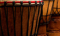
| 05/10/2006 01:31:30 PM |
Djembe Linesby tonyvComment: Before I looked at anything else I tried to guess the challenge and the score. I was right on both, so I think you did well in meeting the challenge and 5.3 is on the high side of the pictures I comment on. I could tell this was going to be there because it's a fairly decent picture. I also noticed even you didn't predict a high score.
1) It's too dark. If the front djembe could be as light as the back ones it would be a stronger picture.
2) I'm torn about B&W. pictures which have a pattern or texture as their subject do well in B&W, but I do like the rich brown you captured.
3) Ultimately, although it is a nice picture and fit the challenge well, it has a tough time competing with other pictures which accomplish those two things but also have a subject with "wow". By looking at your highest scoring pictures you already knew this... |
| Photographer found comment helpful. |
| 05/10/2006 12:50:20 PM |
The writing is on the wall ...by kari1Comment: Well, when you start by saying yourself "this is a bad pic"... ;)
I hadn't seen which challenge this was an originally wondered if it was for rhythm with the repeated lines. Being cliche, I think the perspective angle you took is too severe. The A/C unit, or whatever that thing is, is distracting and the tagging isn't even that pretty. (apparently you need some more talented vandals around your area.)
I'm guessing you knew this would score like this going in. I call that dead pixels walking. No amount of PP is going to save a picture that is uninspired to begin with. You made an attempt with the boosted contrast trying to give a edgy urban feel, but it wasn't up to the task. With this picture in mind, I suggest working more on subject choice. Look for something that grabs the eye in its unusualness, shape, texture, etc.... |
| Photographer found comment helpful. |
Home -
Challenges -
Community -
League -
Photos -
Cameras -
Lenses -
Learn -
Help -
Terms of Use -
Privacy -
Top ^
DPChallenge, and website content and design, Copyright © 2001-2026 Challenging Technologies, LLC.
All digital photo copyrights belong to the photographers and may not be used without permission.
Current Server Time: 06/19/2026 07:39:50 PM EDT.