| Image |
Comment |
| 06/28/2006 02:01:07 PM |
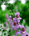
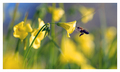
Flowers at the Sanctuaryby KenComment: You have some things going for the shot here. I like the leading line and the composition. The bokeh is nice. I think the biggest think here is the tones are very cool. Flowers, mainly, like warm and cheery tones. Banmorn may have something to say about that, but in an outdoor, non-studio shot, I would go for warmth. That's really my biggest beef with the shot.
If I changed anything else, I may recompose just a bit. I'm not quite sure about the flowers trailing out of the frame. Perhaps it would have been better if they ended before the edge. Would have to see it though... |
 Photographer found comment helpful. Photographer found comment helpful. |
| 06/28/2006 01:37:41 PM |
Violinby MrvileComment: I like the 50mm/1.8 as a lens a lot. Just be aware that at 1.8 it can be soft. You can see that in this shot. Look at the knobs on the violin. DPC loves sharp, sharp, sharp. It also looks like you or the camera chose to focus on the far right and the ornamental hole (ya, ok, I don't know the parts of a violin by name). I would have focused on either those knobs I spoke of or the strings.
The bokeh is nice, but has a bit of an issue. The two straight lines don't add anything to the composition informationally so they just wind up distracting. |
| 06/28/2006 01:33:05 PM |
Reach Outby cpanaiotiComment: A few thoughts:
1) The subject doesn't take up enough of the canvas. I would have included more or zoomed more so the current amount shown takes up more space.
2) The picture is just a tad on the dark side for a flower shot. I would have tried to boost midtones to pull it up a bit.
3) The part of the bokeh that bothers me is the halo effect on the orange in the background. It doesn't look good to me. You have a nice lens, so I'm not sure where that came from. Maybe the extension tube. |
| Photographer found comment helpful. |
| 06/28/2006 01:27:35 PM |
Fun With Lights and Glassby freakin_hilariousComment: 4.58? This was underrated. I would have guessed 5.3 or so at least. It's a nice shot. Very abstract, which isn't bad, but doesn't always fly on DPC. The bokeh is, to the purist, "bad" but only because of your lens and not because of your shot. On the other hand, those little donuts are sorta cool. Lends to the abstract quality.
In composition, I would have shifted the field of view a little to the left so as to have a bit more of the space behind the vase. I think it's a tad cramped over there as it is.
I didn't vote this one in the challenge, but I would have likely given it a 5 or 6, so I think you got robbed a bit. ;) |
| Photographer found comment helpful. |
| 06/28/2006 12:08:13 PM |
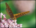
Summer Colorsby glad2badadComment: Hey! Another butterfly shot. I gave this a 6 when I came through originally. 6 to me is a solid shot so I think you are a bit underrated.
I think what hurt you the most is the razor thin DOF. It was a real balancing act in this challenge. The best shots managed to keep most of the subject in focus while having the background still all "bokehed up". When I took my shots, I would find a subject and then fire off with my finger on the dial for changing the aperture. I started at 4 and then would work my way up in maybe 2/3rd steps to about 8. Then I'd sort it out later.
Colors and composition are nice. What IS in focus is sharp and nicely done. The flowers are just a bit blown. |
| Photographer found comment helpful. |
| 06/28/2006 11:57:48 AM |
New Herbsby pidgeComment: Well, you certainly have bokeh in this shot. ;) Two things. I think the entries that did best had a completely focused subject while having a very unfocused background. Not to say that you have to do it that way, but I think the OOF portion of your subject hurt you a bit. The second also relates. Look at the four leaves above the sharp one. I noticed these when I voted and didn't like their haloing. It could totally be your lens (or it may be PP), but I would call this "bad" bokeh. The rest of the shot is pleasant, but those four leaves made me give you a 5. |
| Photographer found comment helpful. |
| 06/28/2006 11:43:27 AM |
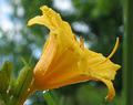
After the rainby CVetteComment: Two things I think could have gotten you closer to 6.
1) Less centered. So that means zoom back and leave some negative space on one side (likely the right in this shot).
2) Change the composition to reveal more of the "cup" of the flower. Doesn't have to be all the way, but I feel like we want more.
The bokeh is nicely done, especially for a P&S. The lighting is nice. The colors are nice too, although I think the greens look just a tad dull. I'd have to goof in PS though to see how to improve that. |
| Photographer found comment helpful. |
| 06/28/2006 02:22:04 AM |
|
| 06/28/2006 02:18:25 AM |
|
| Photographer found comment helpful. |
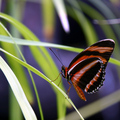
| 06/28/2006 02:16:16 AM |
Bokeh Butterflyby NelzieComment: Heh, looks like you have a fan on the comment below. Congrats on the Top 10, sorry it just missed 5th! I saw this shot and thought it was quite good. Anytime I see a comparable shot to the one I enter I worry. This one had me worried a lot. |
| Photographer found comment helpful. |
Home -
Challenges -
Community -
League -
Photos -
Cameras -
Lenses -
Learn -
Help -
Terms of Use -
Privacy -
Top ^
DPChallenge, and website content and design, Copyright © 2001-2026 Challenging Technologies, LLC.
All digital photo copyrights belong to the photographers and may not be used without permission.
Current Server Time: 06/20/2026 06:34:53 PM EDT.