| Image |
Comment |
| 07/13/2006 12:30:40 PM |
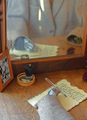
Ghost Writers on the Stormby raishComment: I think the technicals are all here on this shot. Perhaps I would have experimented with either some more saturation and/or contrast, but probably not a lot and I don't think that's going to suddenly vault you to a 6.
The picture was probably limited by the viewer having some difficulty answering the question as to what you are trying to convey or why you did this shot. The title sounds cool, but doesn't help me either. There are some shots which work in a "how'd he do that?" sense without making much sense otherwise, but this isn't one of them. I don't have other insight into what you were going for because you didn't leave any comments. |
 Photographer found comment helpful. Photographer found comment helpful. |
| 07/13/2006 12:26:10 PM |
Pensiveby danica22Comment: In an effort to increase the DOF and keep her arm sharp (there's no reason to have it slightly soft like it is), I would have changed settings to f/8 (lose a stop), ISO 400 (gain 2 stops) and shutter 1/8th (lose a stop). Then you could use Neat Image to remove any noise that resulted from ISO400 (although it is quite manageable at this setting). 1/4th is also the perfect speed where vibration from the mirror can cause problems. If the 350XT has lockup, I would have used that. I don't think that's the reason why her arm is soft, but it's just a tip.
The pose is nice. I like the composition and I like your conversion to B&W. The large earring is perhaps not my choice as it flares quite a bit there; but that's not a fatal flaw. I bet some of the low score came from people merely not thinking a model qualifies as stationary enough. The highest picture finish primarily using a model that DIDN'T contrast it with something in motion was 32nd... |
| Photographer found comment helpful. |
| 07/13/2006 11:57:41 AM |
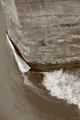
canoe after a floodby posthumousComment: One possible suggestion and one definite one.
Possibly the picture would have worked better in a landscape format with some negative space in front of the canoe. Right now I feel like it's a bit squished on the left there.
Definitely don't rely on in camera adjustments for B&W or sepia. If you have PS you can do so much better on your own. Just check out a few tutorials. I think I would have preferred B&W instead of sepia anyway. Just a hunch. Either way, the contrast on the piling could be done much better to really make it stand out in it's unmovability. |
| Photographer found comment helpful. |
| 07/13/2006 12:07:52 AM |
|
| Photographer found comment helpful. |
| 07/12/2006 01:39:37 PM |
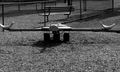
Why don't the kids play here anymoreby albc28Comment: I think the composition could have improved your score. First, the way you shoot it makes the teeter-totter look like it extends to the right beyond the seat. It doesn't, of course, but our eye is fooled and that leads to confusion. Second, the overall composition is very static (which you might think is not bad in stationary, but I think still is). By that I mean it is very centered and straight on and done at eye level. Looking for a more interesting angle may have helped. (12 inches off the ground? straight down the toy? at an acute angle?)
I agree with the black and white, but I would look for a tutorial on converting to black and white if you use photoshop or the like. There are often better results to be had than letting the camera convert it to black and white itself. |
| 07/12/2006 01:35:11 PM |
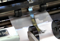
Stationery in Motionby GeneralEComment: My simple suggestion is that I would have gone with B&W. The color in the shot doesn't add a whole lot, and in those cases I always think about B&W. The shot then becomes somewhat more about the geometry and shapes. I like your composition and especially like the diagonal line provided by the roller axle (or whatever). My eye tells me I don't like the blur of the central metal piece, but I think that's personal preference. I tend to have trouble with liking motion blur.
So you use 16/64 for your high-radius USM? I've tended toward 25/40, but I also tend to do it before resize so that may make quite a difference. I'll have to goof around with that. |
| Photographer found comment helpful. |
| 07/12/2006 01:30:00 PM |
Low Tideby NuzzerComment: You have the opportunity to learn a lot on this one because there was a shot with the exact same idea which scored much better (look at 5th). What makes the difference? A few things.
1) Distracting elements. Notice that anmldoc's shot has nothing to distract in the background. It is actually quite sparse with the sky dominating the canvas. Your shot has the bright red boat in the background (the color makes our eye not sure which boat you really wanted as the subject) as well as the trees which have a ton of little detail (which unfortunately gets pretty obliterated at 640 pixels).
2) Lighting. Actually you didn't do too bad a job, but you can see how your lighting is harsher than anmldoc's. The bright sand dominates more of the canvas. I can see by the shadows you didn't shoot at midday, so that's good. I think perhaps you oversharped the picture (although you didn't mention that in your notes).
anyway, really take a look at your's vs. the 5th place entry. I think you can take quite a bit away. Good luck with future entries. |
| Photographer found comment helpful. |
| 07/10/2006 08:12:30 PM |
why....by otisXmikeComment: I'm really surprised this didn't do well on DPC....NOT. Forget the scores. |
| Photographer found comment helpful. |
| 07/10/2006 07:39:16 PM |
Quite Passionby AkchasComment: You can ask Langdon to change your title if you meant "quiet" passion. Nicely lit and she's, of course, quite beautiful. 8 |
| 07/10/2006 07:37:07 PM |
#by undieyatchComment: It looks like the glass is just a bit out of plane. I like the idea though. 5 |
Home -
Challenges -
Community -
League -
Photos -
Cameras -
Lenses -
Learn -
Help -
Terms of Use -
Privacy -
Top ^
DPChallenge, and website content and design, Copyright © 2001-2026 Challenging Technologies, LLC.
All digital photo copyrights belong to the photographers and may not be used without permission.
Current Server Time: 06/21/2026 06:50:33 AM EDT.