| Image |
Comment |
| 08/03/2006 05:03:23 PM |
Meditationby L2Comment: great capture. In zen, I'm actually looking for even more negative space, but this is a nice shot. 7 |
 Photographer found comment helpful. Photographer found comment helpful. |
| 08/03/2006 05:01:34 PM |
all is calmby owenComment: Boy, without the treeline, I may have given this a 10. With it, I think 8. |
| Photographer found comment helpful. |
| 08/03/2006 12:46:39 PM |
|
| 08/03/2006 12:22:54 PM |
hayday reflectionsby crayonComment: 5.7? Get out of here....
Ok, briefly, I like it. You know as well as I that noise doesn't fly on DPC. I like the noise. End of story. Consider it an "experimental" shot. Did you really think an image grain shot was going to score 6+? |
| Photographer found comment helpful. |
| 08/03/2006 11:29:53 AM |
Condimentaryby JengaComment: You know, this is a creative shot and I like it. I think a few people probably considered "silver" not to be black and white. That's an argument I don't want to get into. The composition is very well done. The shadows are intriguing and I like the shapes. Since this was advanced, I may have tried to fix the blemishes on the table, but I tend to like shots very sterile and clean. Others may want that slight context. The border is pretty fat for DPC (people love to chide borders). Here it does work since the shot is so geometric, but I'd be careful of something that fat in the future.... |
| Photographer found comment helpful. |
| 08/02/2006 12:11:59 PM |
Silent Movie Nerdby massmediakid31Comment: I think this is a creative shot. I'm not positive about the crop. It's a gutsy move to crop right across the eyes like that. I'd actually have to see it with more space above to judge if I like it better or not.
It seems to me there is a bit of a DOF issue. Your(?) face (if that's not you, someone must really enjoy your work...) looks like the softest part of the picture, and I'm not sure I like that since it is the place our eye is naturally drawn. The highlight on the nose and to a lesser extent the gloves is slightly blown which may add to the softness. Finally, while I can't blame the makeup artist at all (cuz I couldn't do a better job), it does seem a bit rough around the lips (the juxtaposition of the black and white). That's a nitpick, but it does take a slight polish away from the shot.
I think it was creative and you should keep using that creativity. One question was why you used a sepia filter on a B&W shot? |
| Photographer found comment helpful. |
| 08/02/2006 01:14:22 AM |
Set Free by TechoComment: well done techo. I've always wanted to do this iconic shot. |
| Photographer found comment helpful. |
| 08/02/2006 01:11:18 AM |
The Aviatorsby LERtasticComment: I don't think this is a bad shot. I do like the reflections. It's a nice touch. Other than the glasses, the rest of the face is soft. I'm not quite sure why, whether it is DOF or just a soft lens. Maybe it's processing. Either way, I don't like it. I also think the glare on his skin is a bit too much. It reveals that the whole picture has been shifted as his skin tone is very, very yellow. Not the most flattering.
On the good side, the composition is well done and I like the added feature of the blinds in the back. The lines add some extra pizzazz to the shot. |
| Photographer found comment helpful. |
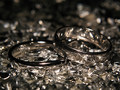
| 08/02/2006 01:06:02 AM |
Silver Glitterby meendeeComment: I haven't looked at the comments, but I bet a large part of your problem was meeting the challenge. For a picture that is supposed to be B&W, there is an awful lot of yellow in those rings.
The idea is creative and I like that. The picture is very centered which leads to a static feel. Also, the DOF doesn't help us. I would have increased it enough to make the whole ring in focus rather than having the back portion OOF. Or, if you wanted a shallow DOF, I would have focused on the back portion rather than the front because it stands out more than the front which gets a bit lost in the foil. |
| Photographer found comment helpful. |
| 08/02/2006 01:02:17 AM |
Recessby ltlmschrisssComment: Another 5.5 for me to critique. I could tell this would be at the top of the range as it has some dynamics to it, even though it's a fairly simple image. The best part is the diagonal composition you chose and the shallow DOF which puts the 3 OOF. Excellent stuff.
Would I change anything? Totally minor, but I may have moved the chalk just a bit to the left so it doesn't interfere with the 1. Other than that, I think you did about as well with the image as you could. The only problem is it's general lack of "wow". On DPC "wow" gets you to the higher scores. You can see this by the vast majority of votes being 5 or 6. People give those votes to picture which are technically well done but don't quite hold their attention long enough to get higher. |
| Photographer found comment helpful. |
Home -
Challenges -
Community -
League -
Photos -
Cameras -
Lenses -
Learn -
Help -
Terms of Use -
Privacy -
Top ^
DPChallenge, and website content and design, Copyright © 2001-2026 Challenging Technologies, LLC.
All digital photo copyrights belong to the photographers and may not be used without permission.
Current Server Time: 06/21/2026 01:36:22 PM EDT.