| Image |
Comment |
| 08/18/2006 10:26:22 PM |
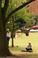
that is Brrrightby AbstractComment: Depth is bad and composition is mediocre. Maybe if he was looking as if he was fixing the cover plate.... |
 Photographer found comment helpful. Photographer found comment helpful. |
| 08/18/2006 10:25:00 PM |
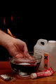
Ooph!by reubsComment: Good idea and I hope there were not too many retakes. But composition could have been cleaner. |
| Photographer found comment helpful. |
| 08/18/2006 10:23:50 PM |
|
| Photographer found comment helpful. |
| 08/18/2006 10:23:05 PM |
|
| Photographer found comment helpful. |
| 02/18/2006 09:47:48 PM |
|
| Photographer found comment helpful. |
| 02/18/2006 09:45:57 PM |
|
| Photographer found comment helpful. |
| 02/18/2006 09:44:36 PM |
Hopeby margiemuComment: The shot would have worked better without the house in the foreground. The photo looks a little fuzzy. The colours are nice. |
| Photographer found comment helpful. |
| 02/18/2006 09:43:30 PM |
|
| 02/18/2006 09:41:25 PM |
Fortitudeby SJCarterComment: I'll be checking to see if you have listed the post work done. Did you equalize? I love to show my students good examples of filters and effects well used. |
| Photographer found comment helpful. |
| 02/18/2006 09:37:02 PM |
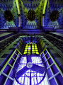
Sweet Air!by ID95008451Comment: If only the logo didn't come out so well. The symetry of the photo is nice but the fan seems out of place. |
Home -
Challenges -
Community -
League -
Photos -
Cameras -
Lenses -
Learn -
Help -
Terms of Use -
Privacy -
Top ^
DPChallenge, and website content and design, Copyright © 2001-2026 Challenging Technologies, LLC.
All digital photo copyrights belong to the photographers and may not be used without permission.
Current Server Time: 07/19/2026 05:44:10 AM EDT.